HOME | DD

samborek — Kite Shop

Published: 2009-11-25 12:53:52 +0000 UTC; Views: 9905; Favourites: 40; Downloads: 326
Redirect to original
Description 
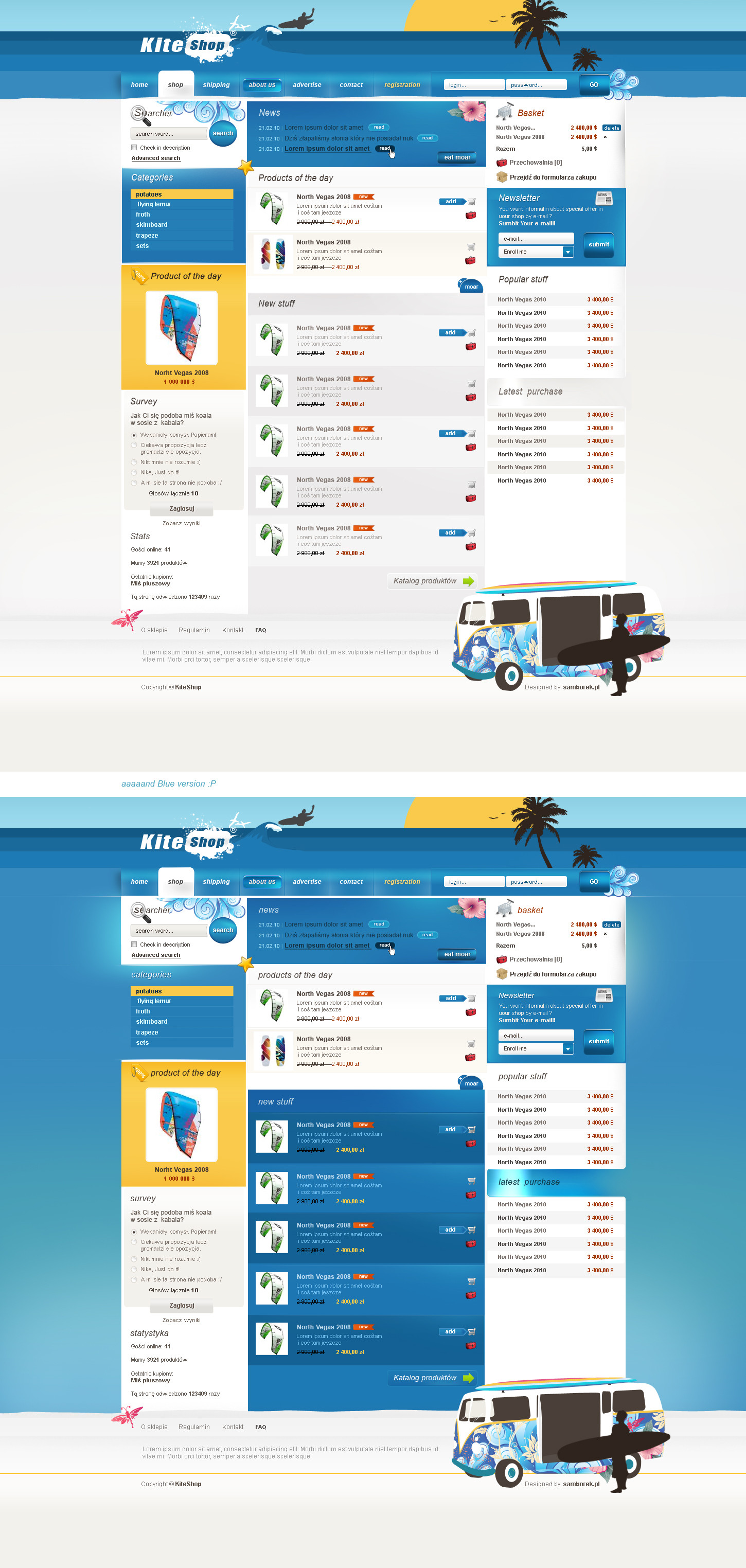
A little bit experimental design with elements of illustrations - vectors etc.
Kinda suck balls and I I'm to lazy to finish it good but I hope You'll like my Van

**Update with white version
Related content
Comments: 40

thekayleigh [2010-01-20 21:27:22 +0000 UTC]

Mówcie co chcecie ale imo najlepszy projekt samborka -.-'

👍: 0 ⏩: 1

samborek In reply to thekayleigh [2010-01-20 21:38:57 +0000 UTC]

lol xD

👍: 0 ⏩: 2

thekayleigh In reply to samborek [2010-01-20 21:42:15 +0000 UTC]

Ten design ;d jest fajny zwłascza 1 wersja

👍: 0 ⏩: 0

thekayleigh In reply to samborek [2010-01-20 21:41:46 +0000 UTC]

serio ;dnajbardziej to lubie D

👍: 0 ⏩: 0

INSEKTart [2009-12-02 07:18:55 +0000 UTC]

Ahah, jaka drastyczna przepaść między komentarzami polskich i zagranicznych obserwatorów

Mnie się podobają głównie detale, bo od strony jusabiliti stronę oceniłbym miernie

👍: 0 ⏩: 0

SAGE69 [2009-11-29 21:31:27 +0000 UTC]

Tak sobie - jak na Ciebie xD
Nie, ale ogólnie takie to, wszystkich i nikogo. Ikoneczki, pierdółeczki - i się takji smakowity placek zrobił z niebieską pleśnią

Wektorki niczego sobie, ale całość trochę taka rozdrobniona i nieposklejana kolorystycznie.

Jedz placki na 50%, bo się trochę boisz xD

👍: 0 ⏩: 0

fewela [2009-11-27 14:42:01 +0000 UTC]

very good work my friend

👍: 0 ⏩: 0

kwusherARTS [2009-11-26 13:46:45 +0000 UTC]

Sorry, ale jestem na nie. Strasznie dużo niespójności, od cholery pierdółek i szczególików... a te kategorie to dla jaj chyba? :d

👍: 0 ⏩: 1

samborek In reply to kwusherARTS [2009-11-26 14:09:53 +0000 UTC]

spaprane wiem, chyba kiedyś pobawię się z tym jeszcze

👍: 0 ⏩: 0

MishaART [2009-11-26 13:40:34 +0000 UTC]

Za duzo tego nackane... dlugo na takiej stronie bym nie posiedzial

👍: 0 ⏩: 0

bezerika14 [2009-11-25 22:15:25 +0000 UTC]

awesome layout

👍: 0 ⏩: 0

owsian [2009-11-25 21:09:43 +0000 UTC]

panel kategorie po prosto 'żondzi'

👍: 0 ⏩: 1

samborek In reply to owsian [2009-11-25 21:13:18 +0000 UTC]

żołondzi

👍: 0 ⏩: 1

TatsuLung In reply to samborek [2009-11-25 22:13:08 +0000 UTC]

a Ty jak zwykle myślisz o swoich przyjaciołach ; /

👍: 0 ⏩: 2

kwusherARTS In reply to TatsuLung [2009-11-26 13:44:50 +0000 UTC]

przyjacielach

👍: 0 ⏩: 1

TatsuLung In reply to kwusherARTS [2009-11-26 15:30:32 +0000 UTC]

taaaak, ja Was też ; p

👍: 0 ⏩: 1

kwusherARTS In reply to TatsuLung [2009-11-26 18:01:24 +0000 UTC]

taa

👍: 0 ⏩: 0

samborek In reply to TatsuLung [2009-11-25 22:17:04 +0000 UTC]

przyjacielach ^^

👍: 0 ⏩: 1

TatsuLung In reply to samborek [2009-11-26 15:30:24 +0000 UTC]

taaaak, ja Was też ; p

👍: 0 ⏩: 0

hakeryk2 [2009-11-25 20:51:14 +0000 UTC]

Powiem tak - dziś w szkole mój kumpel koder wspomniał coś o Tobie, że jest taki samborek, koleś Tworzy zajebiste layouty .. i tak mi się przypomniał layout dla PlanetRenders - stary, zyskujesz sławę nawet u mało co obeznanych w grafice

A co do pracy - układ strony strasznie mi się podoba, dość niestandardowy, a jednak ma to coś w sobie Gratulacje.

👍: 0 ⏩: 1

samborek In reply to hakeryk2 [2009-11-25 21:09:54 +0000 UTC]

haha no to mnie rozwaliłeś teraz xD
lajout Mi sie osobiście nie podoba ale Ciesze się i dziękuje za dobre słowo

👍: 0 ⏩: 0

phildesigns [2009-11-25 20:43:21 +0000 UTC]

good design, i like it

👍: 0 ⏩: 0

eXoHeartbeat [2009-11-25 20:08:58 +0000 UTC]

Great job! Love the layout and the colours!

👍: 0 ⏩: 0

tom3k3 [2009-11-25 19:36:55 +0000 UTC]

wszystkie elementy contentu sa tak zlane, ze ledwo widoczne, niebieskie guziczki na niebieskim tle to nieciekawy motyw.

pomysl jest, nawet ciekawy ale wykonanie lezy.

👍: 0 ⏩: 1

samborek In reply to tom3k3 [2009-11-25 19:54:23 +0000 UTC]

łee zdrowy rozsądek

👍: 0 ⏩: 0

eduardo-garcia [2009-11-25 17:09:18 +0000 UTC]

Very Nice

👍: 0 ⏩: 0

SlimRed [2009-11-25 17:06:41 +0000 UTC]

A long time since my eyes caught a nice design. I like it instant

👍: 0 ⏩: 1

samborek In reply to SlimRed [2009-11-25 18:00:34 +0000 UTC]

you really like it ? awkward xD

👍: 0 ⏩: 1

SlimRed In reply to samborek [2009-11-26 15:51:32 +0000 UTC]

Not one of the best ones of yours, like Planet Renders, but still much better than the ones im seeing nowadays

👍: 0 ⏩: 0

Oyaa [2009-11-25 15:20:02 +0000 UTC]

Very Nice

👍: 0 ⏩: 0

dawidmilewski [2009-11-25 14:39:45 +0000 UTC]

typo :/

👍: 0 ⏩: 0

PanthereNoire92 [2009-11-25 13:17:39 +0000 UTC]

Lepiej.
Przynajmniej coś widać teraz.
Śmieszny hover i nuda w topie.

Poprzednie lepsze, wiesz.

👍: 0 ⏩: 1

samborek In reply to PanthereNoire92 [2009-11-25 13:36:47 +0000 UTC]

szat ap Ty byś chciała nagie babki w topie jak zwykle

👍: 0 ⏩: 1

PanthereNoire92 In reply to samborek [2009-11-25 13:39:24 +0000 UTC]

Wiadomo.
Jakbyś dorzucił jeszcze nagich facetów to byłabym w siódmym niebie.

👍: 0 ⏩: 1

kwusherARTS In reply to PanthereNoire92 [2009-11-26 13:45:18 +0000 UTC]

Flagged as Spam

👍: 0 ⏩: 1

PanthereNoire92 In reply to kwusherARTS [2009-11-26 15:54:40 +0000 UTC]

Flagged as Spam

👍: 0 ⏩: 1

kwusherARTS In reply to PanthereNoire92 [2009-11-26 18:04:50 +0000 UTC]

Flagged as Spam

👍: 0 ⏩: 1

PanthereNoire92 In reply to kwusherARTS [2009-11-26 18:11:38 +0000 UTC]

Flagged as Spam

👍: 0 ⏩: 1

kwusherARTS In reply to PanthereNoire92 [2009-11-26 21:05:23 +0000 UTC]

Flagged as Spam

👍: 0 ⏩: 1

PanthereNoire92 In reply to kwusherARTS [2009-11-26 21:08:05 +0000 UTC]

Flagged as Spam

👍: 0 ⏩: 1

kwusherARTS In reply to PanthereNoire92 [2009-11-27 12:04:42 +0000 UTC]

mrrr

👍: 0 ⏩: 1

PanthereNoire92 In reply to kwusherARTS [2009-11-27 12:11:25 +0000 UTC]

Lepiej.

👍: 0 ⏩: 0

Buryna [2009-11-25 13:16:19 +0000 UTC]

Świetna robota ale za dużo niebieskiego, a za mało żółtego Ja się ekstra na webdesignu nie znam więc mogę się mylić. Wektory dobrze tu pasują.

👍: 0 ⏩: 0

adddae [2009-11-25 12:59:12 +0000 UTC]

looks interessting, but I think there is too much blue mate.
I think you have to equate the blue with other colors, like yellow. (You already use yellow, but if you use it a little bit more I think the design isn't so partial as it's now.)

👍: 0 ⏩: 1

samborek In reply to adddae [2009-11-25 13:05:50 +0000 UTC]

thanks ;] yeah about that blue mate, I really didn't know what should I do with it,
and those parts with high contrast was a little bit experimental

👍: 0 ⏩: 1

adddae In reply to samborek [2009-11-25 13:12:25 +0000 UTC]

Firstly I would use another yellow, cause in my opinion this is too pale.
Secondly I wouldn't use so much blue in the content. For example a big "bluemaker" in the design are the boxes of "new stuff" you should fix them in white.

👍: 0 ⏩: 0