HOME | DD
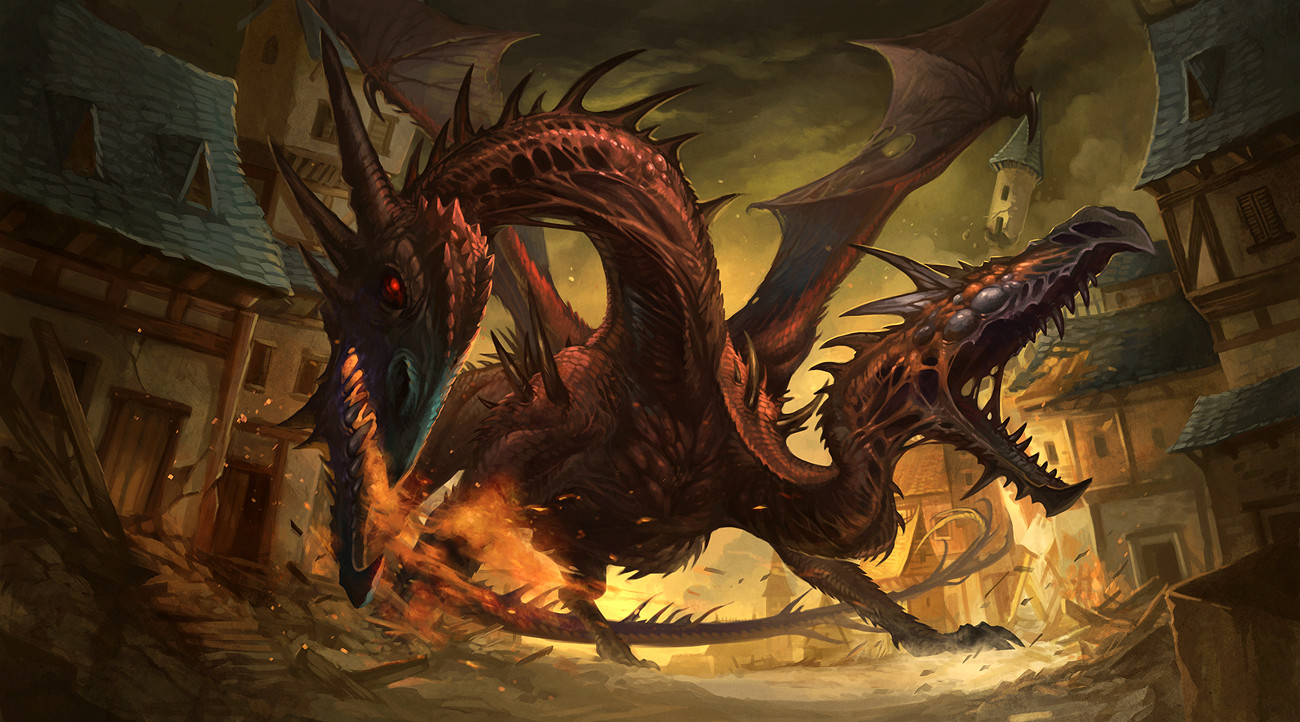
 sandara — Wyrm

Published: 2008-03-20 11:44:17 +0000 UTC; Views: 255443; Favourites: 10775; Downloads: 55164
Redirect to original
Description
thanks to everyone who gave crits and comments, they were very helpful (Smile)")
this is the final version...
i also made a rather sucky wallpaper out of it...get it here
[link]
heheh...
Related content


Comments: 431

This work is just amazing!
What program did you use?
👍: 0 ⏩: 0

I think any other figures would be a distraction.
👍: 0 ⏩: 0


Wow. Amazing. And you probably don't need anything in that corner--the focus is definitely on the dragon and its rider, so something in the corner might take away from the focus.
👍: 0 ⏩: 0

dude, that is prbly one of the coolest dragons ive seen on this entire website. Flippin awesome pose
👍: 0 ⏩: 0


")


the bottom? just draw some ppl in a mosh pit. just kidding")
👍: 0 ⏩: 0

wow, amazing
maybe add some corpses and wreckage... but it looks wonderful as it is
👍: 0 ⏩: 0

Very nice! I don't think that you should add more stuff to that perfect picture. keep up the good job!
👍: 0 ⏩: 0


It's Excellent, and your title is Wyrm, so you do not need to add anything else... I think...
It's very detailed, and the position of the Wyrm is so HOT! Keep up the great work!
👍: 0 ⏩: 0

nope bottom right corner needs to sit tight and just deal. your attention is brought exactly where it needs to be right now to a point where something in the bottom right corner would be distracting to the viewer... wouldnt know what to look at. this piece is far too gorgeous. the colors esspecially... the flow in the dragon the overall composition, the detail, just amazing thought went into this... the only thing the bottom right corner would need is possibly more contrast, make it a little darker, but thats beyond what it needs already. this piece is great.
👍: 0 ⏩: 0

absolutley great! love this
👍: 0 ⏩: 0

My gawd that's amazing O_O I love how dynamic this is!
👍: 0 ⏩: 0

melty green gooed corpses/wreckage. The rest looks great.
👍: 0 ⏩: 0

I'm in no position to critisize, but there could be some more highlights in the corner. Outline the wreckage?
I don' know.
ANIES!
It's friggin' amazing. xD

👍: 0 ⏩: 0

holy crap really awesome, really draws ur attention in
👍: 0 ⏩: 0


Thats pretty tight, good work here.
👍: 0 ⏩: 0

..WOW...!!!!!!!!!!!!!!!!!!!!!!!!!!!!!
👍: 0 ⏩: 0


*o* Ooo looks awesome! 8D great job on this!
👍: 0 ⏩: 0

i love it as is the dragon is beautful u do a very good job on this one ^^
👍: 0 ⏩: 0


i think it looks awesome the way it is
but i mean you cant go wrong with some rotting dead people though ;giggle;
👍: 0 ⏩: 0

I dont know....
I do agree with the not wanting to distract, or lead the eye off the page (used to do yearbook layouts...), or not wanting to clutter it up or ruin what looks wonderful as it is....
But I AM kind of torn, as I getting the feeling IN MY OWN OPINION <--disclaimer... that it isnt cropped well, as the wings (left side = right wing) is off the page, and there isnt much but rocks in the bottom. So it might need SOMEthing to change the feel.... but I am not certain as to what to suggest, as I said, I do agree with comments stated earlier.
On the other hand, I want to compliment your hard work and resulting success with this piece. I can tell a LOT of time went into it. The dragon/wyrm is masterfully designed and drawn and the detailing is amazing. (though the chest/base of wings where attached dont seem to be muscle-y/powerful enough to support a dragon/wyrm in and of themselves. Are you of the belief that they jump off cliffs to fly or use their fire sacks for uplift? Not trying to pick on you, im just trying to get a feel for how they work in your head, so I can look at it from your point of view to comment more insitefully...) The colors work very well together, and the shading is to die for (coming from someone who cant shade for the life of themselves... lol)
Overall, a fantastic piece, very well done, and is definately going into my favs. : ) And I already watch you, or wise this piece would earn a watch from me. : )
👍: 0 ⏩: 0

Brilliant piece!! A few warriors fighting that bad-ass Wyrm would be cool. He looks like he's ready to kill
👍: 0 ⏩: 0


That's five levels of awesome right there.
👍: 0 ⏩: 0


this is awesome! as far as adding something to the bottom right corner, I say "yes".
The main reason I say this is because that is where the dragon is looking. Regardless of where your eye "starts" when you first look at this piece (left wingtip, right wingtip, left foot, sorceress, cliff wyrm is standing on, etc)- all these things lead you to the wyrm's head..but then, yeah your eye kind of just stops, when it really shouldn't. The dynamic pose and curved composition imply that the eye should continuously move throughout the composition but this doesn't happen because the wyrm isn't looking at anything. It is in a fierce battle pose but what is it battling? This I guess is the separation between characters in pose vs catching a scene in action; much like taking a photograph. If you want it to look like a pose then leave the spot blank, but if you wish to really further the storytelling then I suggest adding something to the lower righthand corner to show actual character interaction- as if you captured that split second in time with your piece. Somethings you might want to try are a grouped silhouette of an enemy army (many figures but all overlapping to create one shape)with spears flags pointed up towards the wyrm -leads the eye back to the wyrm and also helps frame the composition...or even the silhouette of another wyrm's head looking up at the primary one..maybe mouth open since the main one has mouth closed..squealing in pain as if it just got burnt or bitten.its up to you..just be sure to keep the details to a minimum since you don't want it to look more important than the main wyrm. In anycase I just think to further the story telling you should add a supporting element to that bottom right corner. I love it though, it would make an awesome figure like the Mcfarlane dragon series as of late. Hope this crit helps
👍: 0 ⏩: 1

thanks for the crit... it was what i initially thought too... and i tried adding a mage there, battling the dragon... but in the end, it looked too cluttered and cramped, so i removed it T_T
👍: 0 ⏩: 1
your welcome. now that i look at it again, i see you were right. The glow from the sorceress' staff and the added glow to the mouth of the wyrm really help.
👍: 0 ⏩: 0


A foreground semi-blurred rock spire in the bottom right corner would really give some added depth. Fantastic mood already though!
👍: 0 ⏩: 0

I'd leave the bottom right corner the way it is. I think if you try and add anything to that area that you may over clutter the image.
As the image currently is everything pulls your eyes to the top of the image very well. It has a really nice flow to it.
👍: 0 ⏩: 0

And no, I think the bottom right corner looks fine the way it is, I think if you put anything more in the picture you'll have it too crowded looking.
👍: 0 ⏩: 0


at the bottom right corner!! ....ummm no! i think its better this way!
👍: 0 ⏩: 0


Ho shit, that wyrm is gorgeous. I love the design of the head! I don't think it needs anything. You might distract focus from the wyrm.. unless perhaps you were to make the extra something like a corpse as dark and dingy as the background which I'm sure you would anyway... XD
👍: 0 ⏩: 0
<= Prev | | Next =>