HOME | DD
 SaraChristensen — Retro Abstract
Published: 2012-06-05 01:24:48 +0000 UTC; Views: 2396; Favourites: 16; Downloads: 168
Redirect to original
Description
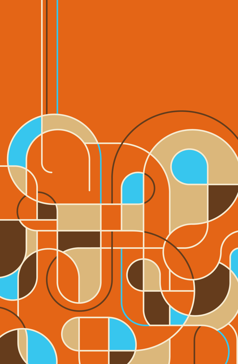
Download Size: 1836 x 2808This was a digital rendering of my final project for Composition Concepts. I used this as my proposal
for what I would create for the last day of class. I remember being inspired by a T-shirt design with lots
of loops and lines because it was somewhere between chaos and order. Because of my perfectionist
tendencies, I often lean towards order, so I wanted this final piece to show a little more spontaneity.
While the final product does look exactly like this digital representation, it certainly was very different.
I purchased a 4ft tall, framed cork board and spray-painted it orange. I then cut out the base shapes
from beige and brown craft foam and blue scrapbooking paper. All of the lines were made by pinning
beige, brown, and blue cording onto the cork board with hundreds of small sewing pins. Needless to
say, the backside of this piece is quiet deadly, lol. I enjoyed making it despite all of the tedious pinning.
Although I don't have any photos of the final piece, I can take some when I go back in September. The
receptionist at our art building was transferring to the tech department in our library, so I gave her this
as a goodbye present. She was so thrilled to have it that she said she would hang it in her office as
soon as she got moved in and that I could come by and see it any time. She is an awesome person. ^^
Anyway, I like how this came together. It's still definitely structured, but at the same time, it's a lot less
calculated than most of my work. It was actually freeing to draw lines haphazardly and place circles
on top of them, cutting and transposing wherever I saw fit. Granted, there is an underlying grid, but
I wasn't really paying attention to that as much as I was the overall composition—that was paramount.
My professor and classmates really liked it, even though it was only half out of my comfort zone, haha.
It has a strong retro feel, somewhere between Art Deco and playful aesthetic of 1960's graphic design.
This image actually makes a great wallpaper background if you rotate it once to the right. I have it up
as my background right now and I like to arrange my various desktop icons above the three lone lines.
If there's anything that you think might improve the design, let me know! I'm pretty flexible with this one.
Created in Illustrator CS5 on May 15, 2012.
Related content


Comments: 11


👍: 0 ⏩: 0

")
👍: 0 ⏩: 0

👍: 0 ⏩: 1

Haha, indeed! I tried using brighter, more saturated colors this semester.
👍: 0 ⏩: 0