HOME | DD
 sarahpicklesdill — Distillum 2-13

Published: 2011-03-09 21:51:23 +0000 UTC; Views: 1286; Favourites: 16; Downloads: 10
Redirect to original
Description
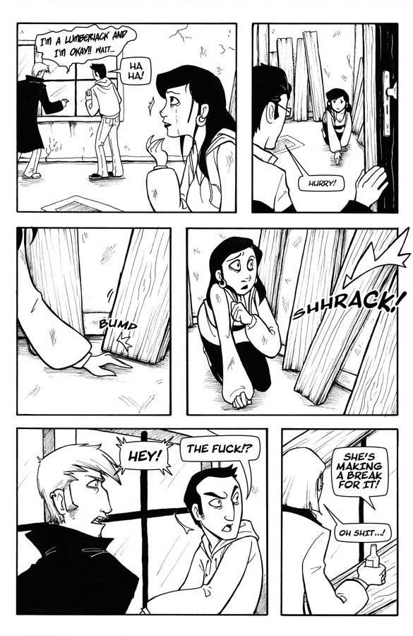
Oh holy crap. I'm pretty happy with how this came out but talk about labor intensive. More layers on this page than any other page.Feedback plox? I need to know if the foliage/trees are working.
PaintTool SAI, Photoshop
Distillum © Sarah Dill
Related content


Comments: 16

I definitely think that the trees and foliage have improved. Gooo!
I agree with the commentary about the halo-ing. I don't think you've got the halo balance perfected yet. It's a bit too obvious and it's floating them out of the panels a bit.
Consider more selective halo-ing? I think really the only place it's terribly necessary is on the black hair in the last panel. Her clothing didn't need it really.
👍: 0 ⏩: 0

All the plants look fantastic here.
And might I just say, that I've always admired your balance of black and white.
👍: 0 ⏩: 0

I think the foliage looks great :3 I know I say that all the time, but its nice.
👍: 0 ⏩: 0

Trees and foliage are looking really nice in the middle two panels, but I feel like the black is a little much in the first and last panel. In the first one, it feels a little like my eye is distracted by the trees in the bg. The pull of the trees isn't as strong in the last panel, but it's still kind of there. All in all, really nice though. I like the leaves~
👍: 0 ⏩: 0


The trees are looking a lot nicer and you should keep them this way because they pack a punch and are super sexy and unf. (Well I think they worked well, hahah!)
All that labor paid off though, because this page looks incredible, you!
Oh boy Rob. You're really looking kind of...not good.
👍: 0 ⏩: 0

In the first and last panels, the black is a tiny bit overwhelming. Or maybe the detail in the trunk is distracting from the action a bit. The rest of the time, it's great.
👍: 0 ⏩: 0

The trees are looking good. My only critique is that I don't think you need the halo around your characters in panel 2-4. And while you do need it in the first and last panel, halos like that always make me think they all have mystical glowy magical stuff around them. But from what I remember from seeing your pages in Senior, that's just something you do. So idk what to tell you.
👍: 0 ⏩: 0

Mmm I'm liking these trees and foliage a whole lot more. It has good form and isn't all in your face with detail or superstark contrast. I'm on the fence about the bark/texture though. Anywho, I like how you do their hair, and outlining with white sets them apart from the background. Great work! Lovin your story :3
👍: 0 ⏩: 0

Sweet! I have not been watching all of your Distillum updates, but am glad I finally took a peek after missing a few... your inking has gotten so much richer and more fluid since I last looked!
As for feedback, this is minor, but I would just be careful about framing issues with background elements... in panels 1 and 5, and 7 (a little bit), you notice a figure or face can get a little lost in all the black from the background, while panels 2, 3 and 4 stand out a little better. I like to squint at my pages to see stuff like that better... and yet, still goof this up all the time. Also, you could push to a full black in the leaves higher up and along the tree trunks. Your style tends to make your characters stand out anyway, with such bold figures and faces... but why not just reduce the B&W clutter a bit and make it easier on yourself? Have you ever tried drawing a page without ghosting the edges of your figures? I wonder if it would change how you compose your panels.
That said, I love the foliage!
👍: 0 ⏩: 0

The trees and foliage look better here than on any other page (save the ones you inked traditionally--HINT) and I rather like them. I do think the lineweights on the characters could be pushed just a little more--not too much, but just enough to distinguish them from the background elements
👍: 0 ⏩: 0

I wouldn't worry 'bout these trees; they look pretty convincing to me. Pages are lookin' fantasic, yep.
(And I like those ringing sound effects, heh.)
👍: 0 ⏩: 0

i agree with the first commenter, the foliage looks good and matches better than the fuzzier trees did. ^_^
👍: 0 ⏩: 0

I think the foliage looks really good. And it matches a lot better with the rest of the lineart the sort of fuzzier edged trees from before.
👍: 0 ⏩: 0