HOME | DD
 sarahpicklesdill — Distillum 2-15
Published: 2011-04-02 18:41:23 +0000 UTC; Views: 904; Favourites: 18; Downloads: 12
Redirect to original
Description
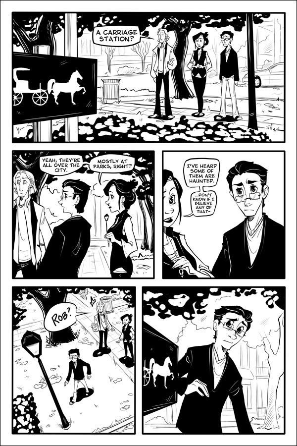
Sorry this is late! First week of class madness, and instead of waiting until Wednesday I thought I'd give you a page now because with this new schedule there will totally be another update on Wednesday anyway AHHHH.Trying to work on balancing details and spot blacks. Part of me was considering putting in tones, but I really really like working in high contrast. It seems like no one does anymore, everything is either toned or in color. What do you guys think?
OMG Distillum is almost one year old! Speshul art will be made for the occasion
")
PaintTool SAI, Photoshop
Distillum © Sarah Dill
Related content


Comments: 18

D: I've read all the pages so far... 'Dawwww.
Anywho. I love your style (especially the high contrast, it makes everything pop delightfully) and the way you draw all of the characters. They've got so much expression. Plus I'm TOTALLY dying to know what happens next! Keep up the rockin' work.
👍: 0 ⏩: 1

Aww, thanks so much! I'll keep on it!

👍: 0 ⏩: 1
👍: 0 ⏩: 0

I like the high contrast. It's more challenging than tone either, and you'll get extra artist points that you can cash in for smugness later.
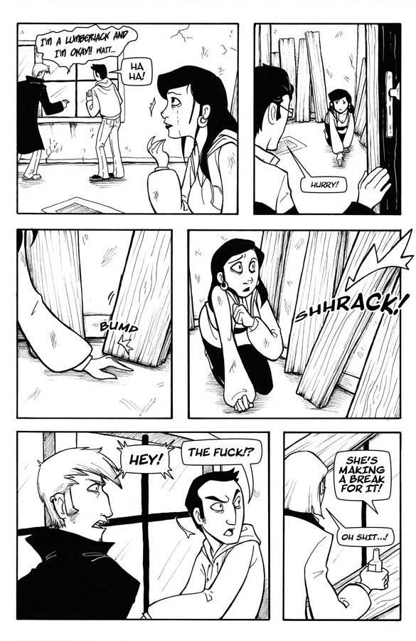
I love everyone in panel one. The poses are perfect. All "Huh?" "Uh..." "Zuh."
👍: 0 ⏩: 0

I really, really, really like how you do the contrasting, actually. Nevermind putting it in color :3
awww~ Rob you're just too cute. The sign won't hurt you... maybe... *shifty eyes*
👍: 0 ⏩: 0

The only tricky thing on this page is I'm not actually sure where the carriage sign is - Rob seems to be walking towards the lamp-post, and then suddenly he's looking around at the carriage sign. Since we only see the carriage station in the extreme foreground, it's not immediately apparent where it is - perhaps it should have been included in the downshot more prominently?
Even though is location was cleanly established on the last page, since it seems to appear/disappear in those last two panels, it's just a bit disorienting.
Otherwise, nice layout. I think your black placement is strong, a marked improvement over chapter 1. My only critique on that would be the way you've done the bushes - I understand the need to focus detail on the focal point, but the raw brush erases are fairly distracting as they read as "this is photoshop smudge" more than leaves - but that might also be due to time constraints. XD I've done that more than once.
Really nice page, pickles. Each one gets better. Your balancing of background details evoking place but not overpowering the foreground story elements is nicely handled.
👍: 0 ⏩: 1
The sign seems to be on the other side of the bushes and the lamp post. In the first page, the lamp post is to the right of the bushes, where they're standing, and on the other side is the sign.
👍: 0 ⏩: 0

YEAH HIGH CONTRAST. But then again, you know my feelings on that. It's rather obvious. Mmm. Black and white. It IS a challenge since you can't rely on color or shades of gray to get your point across. People seem to get drawn to color so much but there's something so divine about a good piece with high contrast. And I count yours among them. <3
👍: 0 ⏩: 0

NO ROB!! NOO!! I feel something interesting is going to happen Ô___Ô
👍: 0 ⏩: 0

I like the high contrast. It makes the images a lot easier to read than images that have been screen toned to death.
👍: 0 ⏩: 0

I definitely like the black and white.  (Smile)")
👍: 0 ⏩: 0

personally, i love high contrast, but yeah it does eem to be losing support D:
anyway, can't wait for the next page
👍: 0 ⏩: 0


ME GUSTA ME GUSTA ME GUSTA!!!!!!!!!!!!!!!
👍: 0 ⏩: 0

Thanks! It can get tricky but I like to think of it as a challenge

👍: 0 ⏩: 1

The result is lovely ^_^
👍: 0 ⏩: 0