HOME | DD
 sashas — Web Design II

Published: 2008-10-08 01:06:51 +0000 UTC; Views: 3270; Favourites: 26; Downloads: 170
Redirect to original
Description
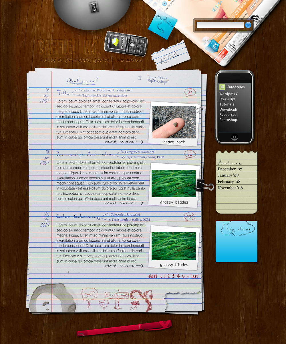
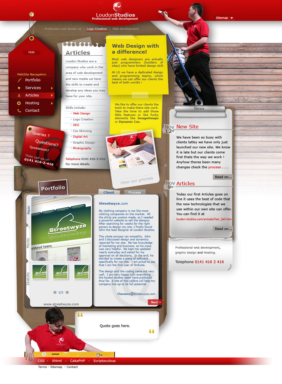
The second design for my project. LOL, now I'm done... again XD My teacher said that I can start the new project tomorrow, instead of waiting til we turn in the this project :3 I'm happy I did the project over, this one is prettier.You may see active versions of both sites here: [link]
EDIT: The navigation tabs (home, articles, news, about, & faq) don't link to anything. Normally, these would link to sister sites within the main site, however, we only had to make one page for the assignment so our task was to make these menu items rollover images (if you mouseover them, the image alters in some way.) Sorry for the misunderstanding XD
Related content


Comments: 17

Great Design. Nothing to add to that...
But why did you have to do those ugly tables and 1x1 Pixel Spacer Images?
They do make my eyes hurt. ;(
👍: 0 ⏩: 1

Eh, well, the class that this was for was a basic computer class, and for this assignment, I had to export the website from photoshop which creates these image tables, so I didn't have the freedom to code the layout the way I usually would.
👍: 0 ⏩: 0
premierpixels [2010-07-28 05:02:52 +0000 UTC]
This is unique This is my first time to see a web design with a unsual location of menu. Las Vegas Web Design
👍: 0 ⏩: 0


Beautiful design and I love the colours that you used in it.
I saw the two versions and I prefer those version (version II) too. It has better looking to see and read...
About the size of the text, I think it's to short to read well.
 (Smile)")
👍: 0 ⏩: 0

You did a great job on both, but I shall admit that I'm in love with the second one! It's really more appealing!
But, well, from what I know, everithing depends of the usage. The first one looks better, in terms of maintenance and versatility so, there's room for both ^^
👍: 0 ⏩: 0

I like the second one better also! :3 I mean, they're both really really awesome, but the second one appeals to me more. xD
How'd you make it all slanted, with vertical buttons? looks really neat. >w< I need a new design for my website actually.. are you planning on sharing a few tips in the near future?
👍: 0 ⏩: 0


awww this version is alot more artistic.
👍: 0 ⏩: 1
I concur. I think I felt freer when working on this one, since the other one was done.
👍: 0 ⏩: 1
I've noticed one small issue with the website. When I click the links in design two, they don't seem to do anything.
👍: 0 ⏩: 1
Do you mean the home, about, faq, ect... links? We didn't have to make those work for this assignment n__n''' just make roll-overs for them : )
👍: 0 ⏩: 1
yeah. XD it's cool. If you want check out [link]
I did that for an assigment.
👍: 0 ⏩: 0

Aw, thats really cute! I think I like this version better.
")
👍: 0 ⏩: 1
Yes, me too. I think this one is more personal : )
👍: 0 ⏩: 0