HOME | DD
 Saurabhinator — .Rar

Published: 2012-04-08 12:15:25 +0000 UTC; Views: 5848; Favourites: 262; Downloads: 356
Redirect to original
Description
Been bashing around this intermittently between uni where the workload is piling up. It has been a bit of a learning experience.What's been occuring lately is a bit of self realisation, There's something bugging me about the way I draw ponies and it stands out quite obviously in this piece. I've been so absorbed in trying to be good at technical perspective that I might have overlooked the importance of giving my pieces some life. I remember someone commenting that they didn't like my style, and i think I can finally grasp what it is about how I draw thats bad, and maybe it is a bit of "my style."
But I want to change that. I don't want my "style" to ever be something which anyone finds to be off turning. I've made a rather large mistake with this piece and although i recognise that one may need to make mistakes to learn from them, it still digs into my pride that my painting has to suffer for it.
That is why this painting leaves me with a feeling of unfinished business.
Anyways, how good is season 2 so far? I'm actually liking it a bit more than season 1.
wip thread for this piece: [link]
Related content


Comments: 27

I really like this picture, I think the one thing that's not quite right is the eyes. They look a little wooden and kind of take the life out of it.
👍: 0 ⏩: 0

i just can not put my finger on it but the parting some how makes her look more "male" to me then other times i have seen it whitch is odd as it is a part of her look no clue yet i think this.
but the background is breath takeing.
👍: 0 ⏩: 0

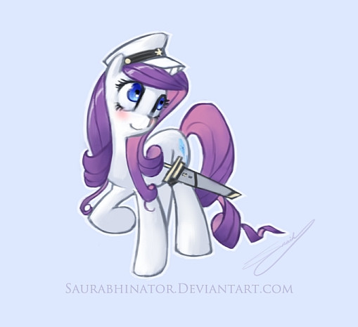
I think the biggest "error" that I can see in this piece is the way you drew Rarity's hair... her tail looks a bit "heavy"/thick I suppose, and certainly the angles and curves of her mane are a bit different from the series but I wouldn't even call that a mistake, and more like simply stylistic differences (after all, it's not like the way that *I* draw her mane is 100% true to the official art either, but there's nothing wrong with an individual artist's unique interpretation, of course). Otherwise she looks exactly as she is supposed to, with eyes full of life and sparkle and I have to wonder what mistakes you could possibly be referring to.
Technically, of course this piece is very good, and I especially must applaud your efforts with the background as I generally am too lazy to bother with them myself (unless it's a commissioned piece I'm working on). Beautiful color and shading, and I really like the way the piece was composed with the huge ravine/mountains looming up in the background... suitably dramatic scenery for my most favorite dramatic pony!
👍: 0 ⏩: 1

Well imo, the drawing is a really stale pose, or it looks too rigid. I'm trying to break our of it in all of my later pieces.
👍: 0 ⏩: 1
I suppose I can understand your feelings there, though I don't think the pose is really a detriment to the artwork in this case. But I agree that with artwork in general, expression and/or body language really can make all the difference in the world, and are vitally important.
👍: 0 ⏩: 0


BBK would be nice.  (Wink)")
👍: 0 ⏩: 0

This picture is simply fabulous! I love your shading and color and the attention you pay to blur and sharpening very refined. The only thing I could critique on is Rarity's muzzle. It is drooping rather low. This is literally the only thing bugging me about this piece. The background is lovely, the focal point is on the subject, and it is very pleasing to the eye. Rarity is a strange and beautiful creature in a strange and beautiful location.
👍: 0 ⏩: 1
 (Smile)")
You're welcome. ")
👍: 0 ⏩: 0

Yah need more rarities.
👍: 0 ⏩: 1

dat background
I think the only... "flaw" I see is that Rarity looks a bit bobbleheaded XD
awesome work nonetheless
👍: 0 ⏩: 0


At last someone who got the last twirl of her tail right
Love this!
👍: 0 ⏩: 1

Really wonderful lighting on the leafs and flowers. Rarity is just so beautiful.
👍: 0 ⏩: 0

You don't happen to have a video of you coloring the bg, do you? O_O
👍: 0 ⏩: 1
unfortunately not. I have this;[link]
but that's mainly just detailing.
👍: 0 ⏩: 1
Oh. Well that's cool
👍: 0 ⏩: 0

Ohmygodicantholyshititssogoodteachmeyourswaysmasterlkjldkfjg;dklfjl;gdkjflg
👍: 0 ⏩: 1
I am but a student of art myself.
I still feel like i have far too much to learn before someone calls me master.
👍: 0 ⏩: 0

I may be wrong, but I think the issue may be hidden in the way you shade them, the way you give the value to ponies with your shading. It feels "sculptish", "stonish". hard to really explain it, especially consider the fact that english not my native language and it is not easy for me to come up with proper definitions.
Try a bit more softer (but not just soft), more defining shading? Try to use more color gradations for it, make it "deeper", give it depth.
👍: 0 ⏩: 0
