HOME | DD
 schakalwal — WupperTALympics
by-nc-nd
schakalwal — WupperTALympics
by-nc-nd
Published: 2008-06-25 14:18:07 +0000 UTC; Views: 27313; Favourites: 355; Downloads: 836
Redirect to original
Description
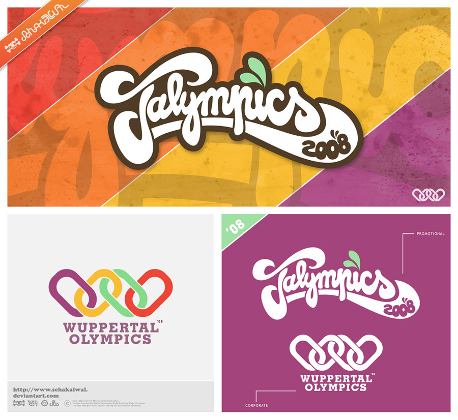
 ahoy mates...
these two logos I have created for an upcoming event which me and some other people are gonna host in my city Wuppertal.
It will be like a tournament. there will be many cool games - not only sports but also some quiz games, eating contests, some creative games and many more...
it is not yet all decided. if you have some cool ideas just give me a shout

----------------------------------------------------
about the logos
The top one is all handdrawn and then vectorized in illustrator.
It says Talympics - TAL comes from Wuppertal and is like a short form of the cities name.
The second one is referring to the olympic rings. I made four chain elements instead of the rings which form the letter W standing for Wuppertal
Hope you like those logos.
Maybe there is some more stuff about the games to come...
Related content


Comments: 130


I love how many people don't read the blurb and ask what font you used! :laugh:
Great work though, wish I could do stuff like this!
👍: 0 ⏩: 1

hahaha damn you are so right. ppl never read anything, I guess.
👍: 0 ⏩: 0

thank you mate ")
👍: 0 ⏩: 0


hi, in the logo Talympics you created or you downloaded the font?
👍: 0 ⏩: 1
i created it myself. no fonts uses, all handdrawn
👍: 0 ⏩: 0


The logo is awesome and you have really good taste for colors too 
👍: 0 ⏩: 1


haha thanks bro
👍: 0 ⏩: 1
 (Smile)")

How did you learn to draw letters like that? All of your stuff is dope! Have any good tuts on how to free hand font like that?
Keep it up
👍: 0 ⏩: 1
thanks mate, really appreciate it.
I don't really have any tuts for this kind of stuff. just using pen & paper and my imagination
👍: 0 ⏩: 0


thanks mate, glad u like it. there will be more logotypes in that style soon
👍: 0 ⏩: 1


 (Wink)")

What is the font on this picture ?
PS : Im czech...
👍: 0 ⏩: 1
the Talympics Logo is no font, it is hand drawn vectors. the bottom logo wuppertal olympics is geoslab font if i remember right
👍: 0 ⏩: 0


thank you!
there is more to come in similar style

👍: 0 ⏩: 1

you are a great artist in typography

👍: 0 ⏩: 1

candy style !! my jaws just dropped for more candies !! .. great work .
👍: 0 ⏩: 1
thank you. that's one of my fave colour schemes
👍: 0 ⏩: 0


yeah .tal
find places to paint, tell me, ill be there.
👍: 0 ⏩: 1
| Next =>