HOME | DD
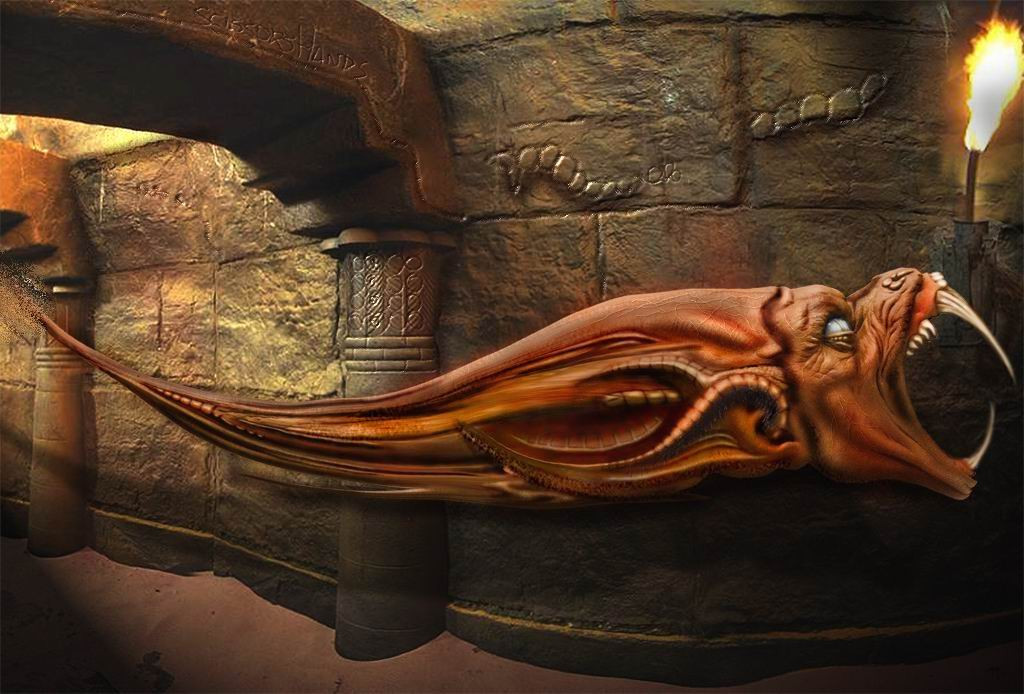
 scissors-hands — Plastic Fire

Published: 2002-05-23 10:31:42 +0000 UTC; Views: 12132; Favourites: 109; Downloads: 471
Redirect to original
Description
I am getting sick of people who comment my drawings only to insult meRelated content


Comments: 192

nice work- reminds me of Giger a bit, but an extremely clean and polished Giger....
👍: 0 ⏩: 0

Like everything but the head, the rest is awesome! The head I do not like only cauz it seems outta place. Good job, none the less!
-----
.:Scorpio:.
www.CnCGenerals.com
👍: 0 ⏩: 0


Awesome piece, but disappointed at the quality/compression of the image file.
-----
___________
+ + + + + www.njyn.tk
👍: 0 ⏩: 0

that is quite amazing great colour and flowing lines. technicaly it seems a bit rough is that because of the jpg compression? i am guessing so. also a few shadows seem to be missing but that is not critical
-----
SPONGEART [link]
👍: 0 ⏩: 0

very very good.. lol from the thumb I thought it was a strange hibrid cat lol but that's just me and my strangness
-----
:::K33p ¥0ur l!f3 fluff¥!:::
👍: 0 ⏩: 0


wow nice, anyone who insults stuff like this should be stoned.... not with drugs, with stones!!!
-----
👍: 0 ⏩: 0

how could ne one insult this?!?!?, this is fucking mad!
-----
To ReZiSt iS To PiSS iN ThE WiNd
👍: 0 ⏩: 0

first, I like this piece. The colors are just wonderful to bring out the strong idea of the piece...
second, I like the presentation of using curves, and when combining the faces it's just in harmony
third, I am a little disappointed because I think it's not in the higest quality in the full size. I think you have compressed the image in JPG right? so it's perhaps my first time to see the thumbnail is better
fourth, I like your works~ this shouldn't be missed~
-----
Night Angel- - - - - - - - - - - - - - - - - - - - -
From Angelworld, version 7 now :::
visit now the most angelic place on the net
:::>>> [ [link] ]
👍: 0 ⏩: 0

Im certainly not going to insult you in anyway... I love this piece. Its really cool. Nice piece!
-----
[link] | abnorm thinking
[link] | me
[link] | my comics dev. pack
👍: 0 ⏩: 0
onepixelsquare [2002-05-24 11:47:19 +0000 UTC]
I didn't know what I was going to get while looking at the TN...This is not what I expected, and yet I am anything but disappointed! This is great!
What size did you construct this at? I only ask because, if anything, I would say that the things in sharp focus are in danger of becoming a bit pixelly. Working up real big and then downsampling to a submittable size works wonders for fluidity of curves and tones...
Still, lovely work!
👍: 0 ⏩: 0

This looks really good, I have nothin else to say.
👍: 0 ⏩: 0


i didn't know deviantart.com was about kissing ass - instead of honest, humble opinions that are merely here to help construct upon the designer. its not suppose to be taking him down so don't get your panties in a wad....tired of seeing you KIDS overreact about one freaking 'honest' comment. if you can't live with it, stop reading the comments
or just don't post your work on a website where someone can give you a real perspective, how the peice makes him feel.
why don't you ever consider anything to be constructive criticism...?
i understand how it can be frustrating, I have been posting here for quite some time...but if you actually find yourself offended with someones comment, you should reanalyze what they are saying and "maybe" just "maybe" let it help you refine some skill, or hone a new ability.
but i suppose you can look at it however you want, i wouldn't want to have to tell you how to live or anything.
👍: 0 ⏩: 0


there is so much going on in that picture i have to seat down and see it. lolz
-----
help fight Cancer, volunteer your computer...Join team Deviant ART![link]
👍: 0 ⏩: 0

You got your fav's again so I guess that means this is good. It reminds me of a ferris wheel in North Georgia.
-----
free . your . self
👍: 0 ⏩: 0

Dont mind those who insult you, I get it to. I don't know really why, but I believe it's because they are to jealous and can't stand that someone has more talent than them. And then they feel the need to point out a flaw in every production.
So, f**ck'em, this is a wonderfull work. Lovely shapes and amazing faces.
-----
~ Mikael Cedergren
~ www.soulmethod.net
👍: 0 ⏩: 0

very nice..looks a little blurry here and there..but nice overall
-----
[sig][link]
[Link] [link]
👍: 0 ⏩: 0

meh, good work. looks too manipulated for me, and you have some wicked pixelation happening all over the peice...five or ten minutes with the smudge or blur tool, maybe take out some of the manipulated metal works, and blend in those faces! pleeease!
Is this airbrush? Looks like some poser/maya faces smudged in.
and the metal is obviously not airbrush. Iono' I really expected more from your name, maybe hype is not what it used to be. cough*
this could be really something else, unique and stylish.
but it's just unfinished
rushed if you will, but I suppose it still gets the "point" across.
👍: 0 ⏩: 0

woo, hope you didn't take the thing i said on your last piece as an insult. it certainly wasn't meant as such.
woo, DAMN, i really really REALLY wish i knew how ta do stuff like that. hats off +fav!
👍: 0 ⏩: 0

Niiiiiiiiiiiiiiiiiiiiiiiiiiiiiiiiiiiice. Different which is awesome good job brotha
👍: 0 ⏩: 0

[notaninsult]
very cool shapes indeed.
the faces are very cool addition too.
i really like this style, very stylish and surreal.
could use some more details and sharpening though but this is still definitely good work_
[notaninsult]
👍: 0 ⏩: 0


nic eone buddy, love the abstracts, and the airbrushing is intense
-----
wanna thank me for commenting on your work? do something 20x more helpful and comment on something of mine!! o.0-xO[mesh]Ox.-0.o d
[link] > check out my nifty doo zads :-P
👍: 0 ⏩: 0

that screams talent.
you are simply amazing!
keep up the good work
-----
_ _ ___delicious___[link] ___________ _ _ _
👍: 0 ⏩: 0

a little too blurred, but still very cool.... better then anything i could do
-----
smoking
[link] favourite forum thread!
👍: 0 ⏩: 0
pixelcatalyst [2002-05-24 01:38:59 +0000 UTC]
The 'fluidity' of your work never ceases to amaze me.
-----
[link]
👍: 0 ⏩: 0

this is great! as always! ur style r0x!
as the others, i hope i never insulted u...
keep on going with the excelent stuff!
+fav
👍: 0 ⏩: 0

I Love the two faces, they remind me of the Devil's Advocate...
Great Piece!
-----
Daniel
Blend-Art
[link]
👍: 0 ⏩: 0

damn nice imagery and composition, only thing i wanna say is that it looks a bit blurry, maybe sharper would have been better
good job as always anwyayz
👍: 0 ⏩: 0


Quien insulta tus trabajos, tio?
Este es cojonudo.
------
. [link] . StachtuS & ErevuS - Collaboration with Anemovatis - Final
. [link] . Join the VelociCRAPtor crew today!
Smashed up my sanity Smashed up my integrity Smashed up what i believed in
Smashed up what's left of me Smashed up my everything
Smashed up all that was true
Gonna smash myself to pieces I don't know what else to do
👍: 0 ⏩: 0

very clean and amazing. it flows very nicely. i like how the piece stands on its own on that black background, its different from your other blended backgrounds and makes this really stand out. beautiful (as usual).
👍: 0 ⏩: 0

Muy bueno, parece que se están comiendo a alguien.
Realmente genial.
👍: 0 ⏩: 0

As always, very good work!!
Just a little blurry in my opinion.
👍: 0 ⏩: 0

wow..
pero que calidad!!! esto fue un salto o solo un chispaso?... me refiero a que si estas cambiando de tecnica o esta es una obra independiente-..
me encanto el look metalico que tiene!, muy bien !
-----
* * * * * * * * * * * * * * *
. : : : K3RN3L . P4N!C : : : .
. . . . . Made in Chile . . . . .
[link]
👍: 0 ⏩: 0

The only thing more amazing than this piece of work is the fact that someone would insult you and your skill. I think you can take the comments here as a sign that the culprit behind the insults is a first-class a-hole who completely lacks artistic judgement.
You keep doing what you're doing and I'll keep getting floored by your work.
-----
I repeat myself when under stress
I repeat myself when under stress
I repeat myself when under stress
👍: 0 ⏩: 0

amazing what a bit of anger will do to a creativity....I like this one. Cool.
-----
derangement n 1. the act of deranging or state of being deranged 2. disorder or confusion 3. Psychiatry. a mental disorder or serious mental disturbance.
👍: 0 ⏩: 0

This is so bad ass. I love the fluid motion in this. The highlights and folds are just so cool in this. The faces that were included are great, I love how they look like they are trying to be free of the object. The colors are supurb I love that orange. Really phenominal work, I keep looking at it and find something else I hadnt seen before. I really love that fluid looking form and the motion captured in the piece. wow.
+fav
-----
evol e
👍: 0 ⏩: 0

who insults you!!?? they should be ........
anyway, i love this peice man, stunning work as usual!! +favs
-----
-
++ WastedYouth Programmer - [link] ++
++ deviantMAG Staff (Software Reviews) - [link] ++
👍: 0 ⏩: 0

I dont even know where people could find anything about your work to insult!! Truly stunning piece~ the smooth melted flow is fantastic as well as the colors another damn fine work of art from you
:::narrows her eyes and bares her fangs:::: now~ point me to the idiots that insulted you!!! they need to be hurt hehehe~
-----
If man were to be crossed with the cat, it would greatly improve man, but deteriorate the cat~
-Mark Twain
👍: 0 ⏩: 0

Fantastic, better than your usual work I think. I love the smooth look of it and the complexity. Great stuff. Don't listen to the insults man, as profane just said, it must be 'all jealousy' . Adding to favs!
-----
you dont need eyes to see
you need vision
cyber|crash
abstract thought - visualised --> [link]
👍: 0 ⏩: 0

This is absolutely wonderful. I really enjoy the figure heads you incorporated into this beautiful design. The hues you have used fit very nicely together. Great work, as usual.
Don't worry about pathetic insults. It's all jealousy.
👍: 0 ⏩: 0

I love it ..
very good work and good
the colors is really very good
but .. i think it is very blurry image , couse the JPG compact.
is so high
-----
__________________________________
Brazil gFx power
__________________________________
www.zaphp.cjb.net
👍: 0 ⏩: 0

one of your best works yet.
incredible image!!
-----
CSDj
put it in your ear.
www.csdj.net
👍: 0 ⏩: 0

I´m completely in love with this wonderful piece......
-----
Dark Eurídice
Raster www.rasterized.org
👍: 0 ⏩: 0

Me encanta... a primera vista me parecio un extraño instrumento musical... como un piano de pesadilla... fabuloso +fav
-----
- the narrowest path is always the holliest -
👍: 0 ⏩: 0
<= Prev | | Next =>