HOME | DD
 scorpion016 — Towering Pine
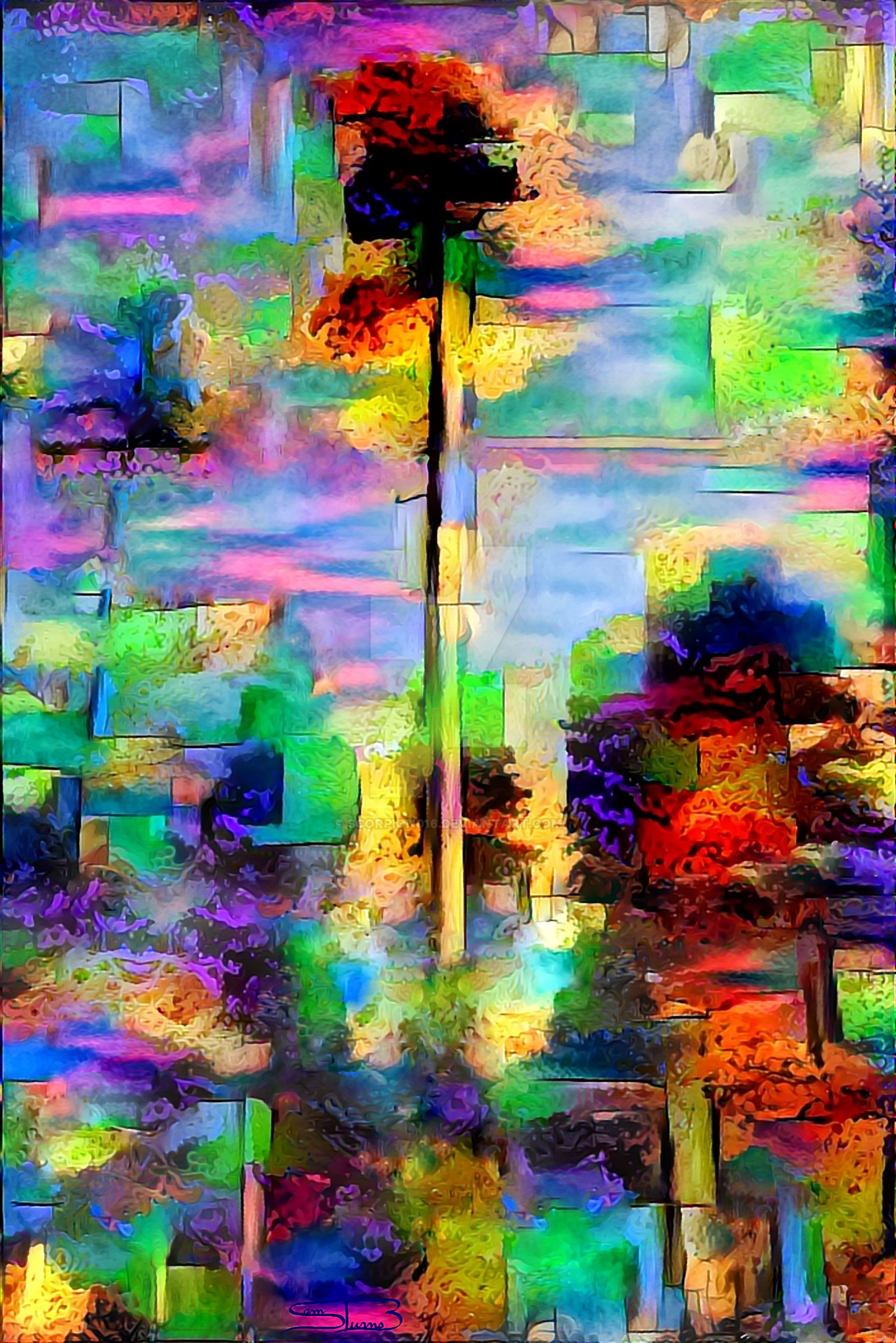
#abstract #autumn #color #forest #landscape #pine #sky #stylistic #tree #vivid
Published: 2016-11-22 11:15:52 +0000 UTC; Views: 371; Favourites: 22; Downloads: 0
Redirect to original
Description
Join me in my new project, where I apply my earliest digital style -Five Foliages- to some of my favorite trees. (Also some inspiration from Leonid Afremov)This one is a tribute to the Green Mountains, where I grew up and spent most of my time climbing trees and fighting imaginary armies with stick weapons. The beauty of a single pine tree rising above the forest continues to captivate me. And you?
Others:
Majestic Maple , Oak in Fields of Lavender , Storm Clouds over Miami , Sunset at Cherry Lake , The Lonely Willow
Prints now available!
Fine Art America
Related content


Comments: 14

Very interesting. I have no idea how you did this, you mentioned a CC0 image and a multitude of filters and tools. I'm curious, is there any way I can see the referenced image?
I do like the style, but there are a few chaotic elements that I'm less sure about... Personally, I find Majestic Maple to be far superior for a number of reasons. The most obvious one is that the above image is that there's too much going on. That would be fine if it was only one object - after all, that's part of the style - but as opposed to Majestic Maple it took me minutes to figure out that the stuff around the centre piece isn't random noise but in fact more trees. It might work if it was truly random around the centre tree, but I was immediately bothered by some pattern that I was unaware of at the time. The problem is that the colour distribution is not even and with partially contrasting colours it just doesn't look as good.
The style is amazing. It's like you had a cubist image made with wax crayons and then went over it with an iron. (I don't know if you ever tried it, but has such an interesting effect, similar to what you did here.)
I also like the distribution of complexity. There's an obious focus, surrounded by a relative calmness, framed by an explosion of colours. In my opinion, if you eleminated most of the green shades in the frame, it would look a lot more pleasing to the eye.
This is definitely you can and should work with more - it is already quite good, making one definite object stand out more and more over time and making conscious choices about the colours might make it better, I think.
ProjectComment
👍: 0 ⏩: 1

I tried to put a thumbnail of the stock for all of my trees, but I just can't figure out how. The best I can do is put a link to my stash but that obviously won't work ")
I see what you mean about the chaos around. It is quite distracting and detracting
Haha, that style sounds awesome, but I doubt it will work on a tablet
Thanks again for your input! It really helps
")
👍: 0 ⏩: 1
Thumbs in comments, replies and descriptions can only be added by Core members. Using links are pretty much your only option.
Haha, no, I don't think that would work digitally.
I'm glad you like it!
👍: 0 ⏩: 0

dude the combinations of textures and colours in this piece is beautiful
👍: 0 ⏩: 1

Beautiful.
It seems just random and chaotic at first, but then there is clearly a scheme.
How did you do it?
👍: 0 ⏩: 1
In short, I applied my painting style in an older work to a CC0 image. Then I edited it for hours using a large variety of digital tools. It's actually quite complex.  (Smile)")
👍: 0 ⏩: 1
The result was totally worth it.
It's a pleasure!
👍: 0 ⏩: 0

As the comment above what drew my attention to the picture is the notion of being similar to a digital glitch. I totally love it. Did you based on a real photo of made everything from a scratch? I'm asking because I have no idea on the process of creating such a piece of art.
👍: 0 ⏩: 1
Yep, I used a stock (CC0) photograph as a reference, and applied a style of painting I developed to the photo. That's a super short version of it
👍: 0 ⏩: 1
Wow, thanks, that seems like a lot of work...Keep it up!
")
👍: 0 ⏩: 0

I'm honestly loving the glitch fracture here, it's so cool to look at! Nice job!
👍: 0 ⏩: 1
Thanks! I am glad you like it
👍: 0 ⏩: 1
You are quite welcome indeeda, I sure do.
👍: 0 ⏩: 0