HOME | DD
 Scott-Kane — Extracerebral
Published: 2007-05-21 00:17:29 +0000 UTC; Views: 9593; Favourites: 46; Downloads: 230
Redirect to original
Description
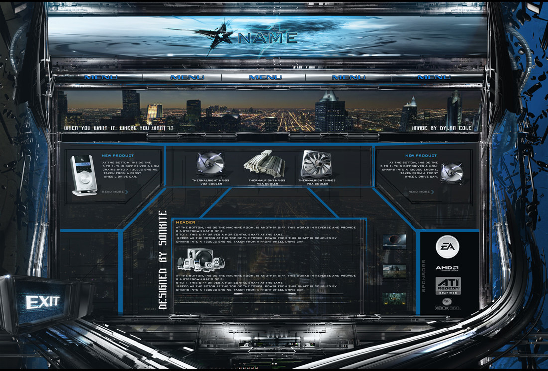
Here is an unfished piece. wich was made at start for fun!for something extraordinary!
I spended mutch love to this piece
3ds max was used too, i had allready premade some abstract shapes and composited them in photoshop
details [link]
Cheers
Scott
Related content


Comments: 52


Well this is craziest shit ever seen i can only switch colors in photoshop lol
👍: 0 ⏩: 0

looks really awesome.. I
'm currently asking me whether the bottom with its display and those abstract "cables" beneath are done by photoshop or 3dsmax.. ?
👍: 0 ⏩: 0

Great Design, but I think you could practise choosing the right font!
 (Wink)")
👍: 0 ⏩: 0


Hey,
Good work this is Akbar Shah Khan
i think you really have done very good work, keep it up.
Akbar
GreenFrag
👍: 0 ⏩: 0

")


I really love this interface 
Only thing that seems off is the menu text which is hard to read and the blue lines in the center dividing up the site seems out of place with the rest of the "look"
Other than that it's a mind blowing layout


👍: 0 ⏩: 0


")

Ok How the heck youre gonno change that in to the web aplicationa by the way Awsome idea
 (Smile)")
👍: 0 ⏩: 0

Very nice, but i dont like the menu font style, It somehow doesn't fit
👍: 0 ⏩: 0

It isnt nice...
...isnt beautiful, not perfect and of course it isnt sexy
...its AWESOME!
I love this template and i am a pure fan of the footer structure

👍: 0 ⏩: 1


that would be a lot of work to make all the animations that i have in my mind
👍: 0 ⏩: 0


my advice: get rid of the contents (pictures of products and texts), aslo delete the navigation part and the logo area.
and keep the 3d things from the border and bottom
as an ideea. this layout is great to present a big detailed photo of a product. (imagine a big nike shoe there)
👍: 0 ⏩: 1
yeah that could do too thanks men great idea
👍: 0 ⏩: 0

everything is fucking awesome, except the menu buttons (in my opinion) Great job!
👍: 0 ⏩: 1


fix the Navagation , other than that this is great
👍: 0 ⏩: 1

i definitely can't access that web since my connection is only 30kbps.
👍: 0 ⏩: 1
zomg , you poor dude , that must totally suck , hope you get broadband soon
👍: 0 ⏩: 1

why is it not available where you live dude ?
👍: 0 ⏩: 1
shared connection dude. imagine 40 people using the same cable. -_- haha
👍: 0 ⏩: 1
lol i have a monster computer , and i use a 2000 mb adsl connection ha ha ( my pc can be seen on my home pg )
👍: 0 ⏩: 0

Looks amazing mate ^^ The only thing I would be tempted to change would be the Navigation text. Its a bit hard to read on the sides.
👍: 0 ⏩: 1


Amazing..
its realy cool ")
👍: 0 ⏩: 0


| Next =>