HOME | DD
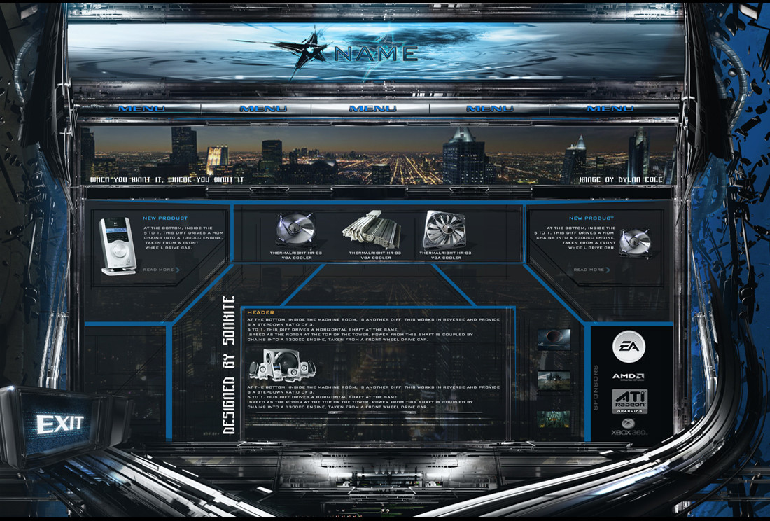
 Scott-Kane — Web Template

Published: 2008-07-28 10:22:16 +0000 UTC; Views: 6992; Favourites: 27; Downloads: 244
Redirect to original
Description
an old pieceinspired by DemonDan
© All rights reserved, do not use without permission.
Related content


Comments: 48


It's yours? You've done it?
My god, thats beautiful! ^_^
You know how to operate Ps very well! Congrats!!!
👍: 0 ⏩: 1

thanks dear now i saw your comment!
👍: 0 ⏩: 0

")


")

 (Smile)")


Nice effects and shape but i don't reall enjoy the menu font

👍: 0 ⏩: 0


still better, but the layout now needs color itself, lose the grey
 (Wink)")
👍: 0 ⏩: 1
well i tried but it doesnt looks good colored!
👍: 0 ⏩: 2
")

yea, don't make the layout colored lol, the chrome and gray is nice because it looks like metal.
Try adding some interface lights into some of the vents in the header and footer. The trick is (if you don't already know) Filter>Render>Lens Flare onto a black solid. Resize it and mes with the blending option. Then just change the color using the CTRL+U menu
👍: 0 ⏩: 2
i think it will be overloaded what you think
👍: 0 ⏩: 1
nah, its not anything structural. Just makes it more ambient, glowing and pretty
👍: 0 ⏩: 0
hehe thanks for the tutorial
👍: 0 ⏩: 0
getting better, but nav needs much work, looks flat, and also it's time to see some color on the layout
👍: 0 ⏩: 0

I like this start bur hey... WORK ON YOUR DAMN LETTER SKILLS!!!
👍: 0 ⏩: 1
Really.
Your layouts are rockin hurricanes but the text is too simple.
Try to ad some matching brush to it and it´ll be PERFECT
👍: 0 ⏩: 0

looks awesome man, but it could use some lighting and stuff. You know, the extra effects?
the base is awesome though, really good effects
👍: 0 ⏩: 1
like color, interface lights and glows. Check out some of my templates or other peoples. This has potential to be over-the-top badass
👍: 0 ⏩: 0

well done Agen hehe
👍: 0 ⏩: 0

good header... looks like u gave up on the footer... smudge it out a lil better..
👍: 0 ⏩: 1
There we go Now its worth a
👍: 0 ⏩: 0
super tight lines, and great shading, but wtf no nav
👍: 0 ⏩: 1

thanks and nice sig its ancient greek
👍: 0 ⏩: 0


