HOME | DD
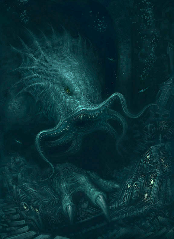
 ScottPurdy — Cthulhu Returns
Published: 2011-07-01 09:22:43 +0000 UTC; Views: 42235; Favourites: 1076; Downloads: 0
Redirect to original
Description
I was never completely happy with the old Cthulhu that I posted here [link]so I went back a few saves and reworked the big guy and decided to keep it in monotone.
Although there are elements that I liked on the first posted image, I think overall I prefer this version.
Let me know what ya think
 (Smile)")
Related content


Comments: 165
I think it has a far more underwater (and deep water) feel to it. I guess the other one has more drama because of the higher contrast, but this one has more mysteriousness-osity. Nice one!
👍: 0 ⏩: 1

Cheers Paul, that's pretty much how I feel about this one!
👍: 0 ⏩: 0

A lot better Scott, awesome image of the slimy man himself!
👍: 0 ⏩: 1
")


ctulhu looks awesome. I think the buildings are a little bit off perspective. I like that its in monotone, but I think it would be cool if there were some little part that contrasts with the rest, maybe the eye and the windows? or the mouth? Just throwing ideas
👍: 0 ⏩: 1
Yeah, although I'm not really renowned for architecture it is meant to be slightly 'off'.. all that non euclidean jabbering made me do it
I reckon it could do with slight more contrast too, cheers matey
👍: 0 ⏩: 0

I like this one best, the darker blue monotone increases the eerie factor, and Cthulhu himself seems more like a threat now that he has something to attack.
👍: 0 ⏩: 1
Thanks Kate, great gallery you have
👍: 0 ⏩: 0
<= Prev |