HOME | DD
 scruffyzero — Captain Crimsonwaves, colored.
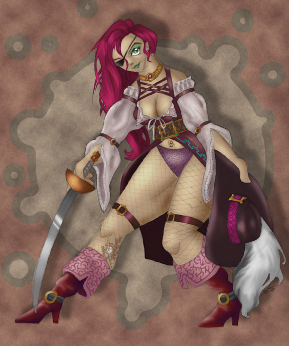
Published: 2006-08-31 07:52:46 +0000 UTC; Views: 879; Favourites: 11; Downloads: 8
Redirect to original
Description
's character, Captain Cheshyre Crimsonwaves, as interpreted, drawn and colored by me.Related content


Comments: 34

every time I see this, I live it more and more... so I am finally just going to fav it
love the color, love the guesture, love the character!
👍: 0 ⏩: 1

very glad that it appeals to you so much--thank you for your compliments and subsequent faving!
👍: 0 ⏩: 1
welcome, just can't wait to see what come next

👍: 0 ⏩: 0

Wow. Just wow, man.
The colors on this are gorgeous. I love the touches of bright aqua and green here and there that help your eye bounce around and the background splat is both fun and helps focus my eye squarely on that gorgeous, buxom lass there.
Oh, and I have a dreadful desire for that pirate outfit. Deconstructed fishnets included!
👍: 0 ⏩: 1
And if you ever find it, for all that is good, send me a picture.
👍: 0 ⏩: 0

I believe you did an excellent job with the proportions.  (Smile)")
👍: 0 ⏩: 0

Wow--the colors are a lot more muted than I'm used to seeing from you. I think I like it though. Really like how you did her face, and her makeup. The texture on the BG is tres nifty.

👍: 0 ⏩: 1
You would rather see non-muted colors? (When I started out, one criticism I recieved was that my colors were too saturated...so I've tried to dial it back, dial it back...I guess I've hit the point where folks are telling me they're not used to my art non-saturated....crazy, huh?)
👍: 0 ⏩: 1
As for me, I have an unsophisticated love of bright, chewy, delicious saturated colors. I just want to eat them, you know? Muted colors are not as tasty, though they can be nice too.
If that makes any sense whatsoever...
👍: 0 ⏩: 1
sort of, but pace yourself, or you'll end up in rehab...the colors aren't as bright there.
👍: 0 ⏩: 1

My only issue is that the liner of her boots made me think of varicose veins. ")
Seriously, though, FANTASTIC ! 
👍: 0 ⏩: 1
Apologies for the unwitting impression of veins--but on the other account, my sincere thanks!
👍: 0 ⏩: 0


nice work man, i most often enjoy your take on stuff ")
one thing i might try next time you do somethign like this would be to try and get some of that lovely texturey feel you have in the BG onto the character too so they fit together better.
👍: 0 ⏩: 1
most often? what do you take issue with? no really--I'm curious. I think your stuff is top of the game, so I'm eager for input.
👍: 0 ⏩: 1
well, in the case of this pic i notice that someone has commented on the control of your colour. or muted colours. in my opinion you really do have good colour sense and it shows when you apply it and when you dont (due to rushing or tiredness or whatever). dont take offence here, since i dont mean it that way.
also its hard to give true crit becasue i dont know you very well (or at all) and i dont know how sensitive you are, your level schooling and so forth. Personally i am not a fan of making comments from an internet perspective when not knowing the persons artistic experience becasue such comments come off simply sounding arrogant and condecending. that being said, i like your style and the compositions choices you make. the cut out animation thing is popular right now and you do it very well, i noticed it about a year ago with your firefly desktop of kaylee waiting.
i do think that colour is a tough one to get a handle on since i myself am just managing to do so now. the book "color" by betty edwards helped me so much its not funny. if there is one trick i can suggest when you are done a pic in photoshop goto image> adjust> hue/saturation. this will dial back the colours automatically until you gt a better feel for doing it yourself. another trick i used was to paint only in greyscale for a while because colour is very important but its nothing with out the geryscale values.
bleh.....i hope im not sounding preachy i dont want to lose a new internet friend.
does any of this make sense? sorry if i offend.....
👍: 0 ⏩: 1
plenty of sense. I've actually been using the hue/sat adjustment more and more recently, in no small part for the idea that I just like the effect of toning things down a notch...
i'm constantly inspired by animators and cartoonists who work in different styles, and I want to display my diversity by trying different things. i graduated with a degree in computer animation in 2005, focusing in preproduction and character design, so I'm just trying to fill out my portfolio with different characters.
👍: 0 ⏩: 1
yeah i used to work as a 3d animator and compositor for film and tv.....hated that. so i went to japan to clear my head and decided that only school would solve the problem.....and i returned for classical animation.
i think you have the cutout look down to a T. If i may sir, i submit that you need more volumetric style characters, more round shapes and 3d feel in the characters you add it to.
but i dunno. im no expert by any means. just hope i can help/support a fellow artist of age
👍: 0 ⏩: 1
I can appreciate that. And thank you--having been through lots of 3D, I felt like rebelling against it for a while..but I'll try to start back on the 3D path...
👍: 0 ⏩: 1
what i have found is using the compy to create 3D is one thing but drawing to create the illusion of 3d is far more rewarding when it works
just my final over thought 2 cents worth
👍: 0 ⏩: 0

I think its AWESOME!!! And i'm not just saying that because its my character. I love the details and the realism. She's not some skinny freak wimp. I love how she's built, i love the colors and I think you did a fantastic job.
👍: 0 ⏩: 0

Gross? Puh! Not so much  (Wink)")
")
👍: 0 ⏩: 1
Like, pirate-biased, or me-biased?
(Because either's great.)
👍: 0 ⏩: 1

why?? because she's not skinny??
👍: 0 ⏩: 0

ditto, man. its so gross i just threw up in my mouth a little. i look at it and... gah! it's gross.
👍: 0 ⏩: 2
oops...sorry my mistake....couldn't tell that you were being sarcastic 
I've been having one of those "fast onto the defensive days" ...sorry :sorry:
👍: 0 ⏩: 0
enumerate the reasons why she's gross, if you wouldn't mind....I'm curious to know what exactly makes her unpalatable to you.
👍: 0 ⏩: 1
s'ok-s'ok...she's just being sarcastic, honest! (she faved it, also.)
👍: 0 ⏩: 1
oh....
👍: 0 ⏩: 0
Thanks for checking it out--your critique is most humbling.
👍: 0 ⏩: 0