HOME | DD
 sculpted1 — Turbulence Revisited
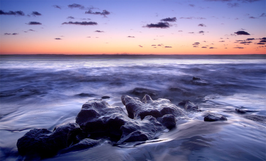
Published: 2008-10-22 00:18:34 +0000 UTC; Views: 742; Favourites: 37; Downloads: 0
Redirect to original
Description
I am using one of these images as part of my final uni project this year and need as much help as I can get which is why I am uploading a few that are very similar.I edited this one to the advice from
I really appreciate any comments on this one.
Related content


Comments: 21

Thanks, it works a lot better.
👍: 0 ⏩: 1

I think so too - main difference I see is in the lower left corner, much less dark
👍: 0 ⏩: 0


 (Smile)")
👍: 0 ⏩: 1
Yeah that is awesome, thanks
👍: 0 ⏩: 0


Hard to say ! Hard to say!
But I think I prefer the one with darker rocks
👍: 0 ⏩: 1
Do you have a reason for prefering that one?
👍: 0 ⏩: 1
I'm sorry for the confusion, but I like the "first" one better the one with darker rocks and foreground.
why ? Just told you hard to say but I think the contrast is more pronounced
👍: 0 ⏩: 1
Ah yep, I thought you were saying that you just like that one more not that you like it more because of the dark rocks, my mistake. Cheers for sharing your opinion
👍: 0 ⏩: 0

yep this has better balance overall.....i kinow you are concerened about 'brightenin' the foreground but it depends what youv'e got to go on ...if you only have a raw file that is very dark as shot you wont bring too much back by processing it to reveal more highlights, ie exposure, blacks, contrast, brightness, curve adjustments etc....it'll become obvious if your pushing it too far...
but this has better balance between the sky and ocean.....
what matters is what you think yourself as much as anything...
👍: 0 ⏩: 1
Yeah the raw file was pretty dark, the LCD screen on my 40D makes them look bright, then when I upload them to my computer they get loads darker. As far as quality goes I think I can get away with this at A2 but I will do some test prints to make sure. I definitely prefer this one, it’s a lot cleaner and the colours and composition work better.
Cheers for your help Stephen

👍: 0 ⏩: 1
well the camera shouldnt be wrong...is your computer screen calibrated correctly?
👍: 0 ⏩: 1
No, downloaded a program a while back but it didn't work so I deleted it, most of my photos look a lot different on the macs at uni.
👍: 0 ⏩: 0

Hell, I love them all!
Sorry I can't be much more help than that
")
👍: 0 ⏩: 1
Go on, give it a try, I'm sure you can think of something you dislike or like in one but don't in others?
👍: 0 ⏩: 1
Ok, looking back at them, I think I prefer this one the most because you've got all of the rocks in the frame. It just flows a bit better than the others, even though they're gorgeous too.
How's that?
👍: 0 ⏩: 1
Yeah good thanks ")
👍: 0 ⏩: 0

Hi George. To me, I liked the original version of Turbulence better with the darker rocks and water. They appeared more powerful and ominous than in the lighter version. I agree the dark cloud should have been removed, although I may have cloned it out rather that cropping it. Then again, it may just be my monitor ......
👍: 0 ⏩: 1
Hi, thanks, I think that making the foreground lighter has brought out more detail but it has taken away some of the 'romance' (not sure if that is the right word). I need to print this at least A2 size so need a high quality image and I'm not sure I can clone that cloud out and retain the quality.
Cheers for the comment Richard, greatly appreciated.
👍: 0 ⏩: 0