HOME | DD
 send — Pi
Published: 2004-05-02 21:26:46 +0000 UTC; Views: 2296; Favourites: 24; Downloads: 685
Redirect to original
Description
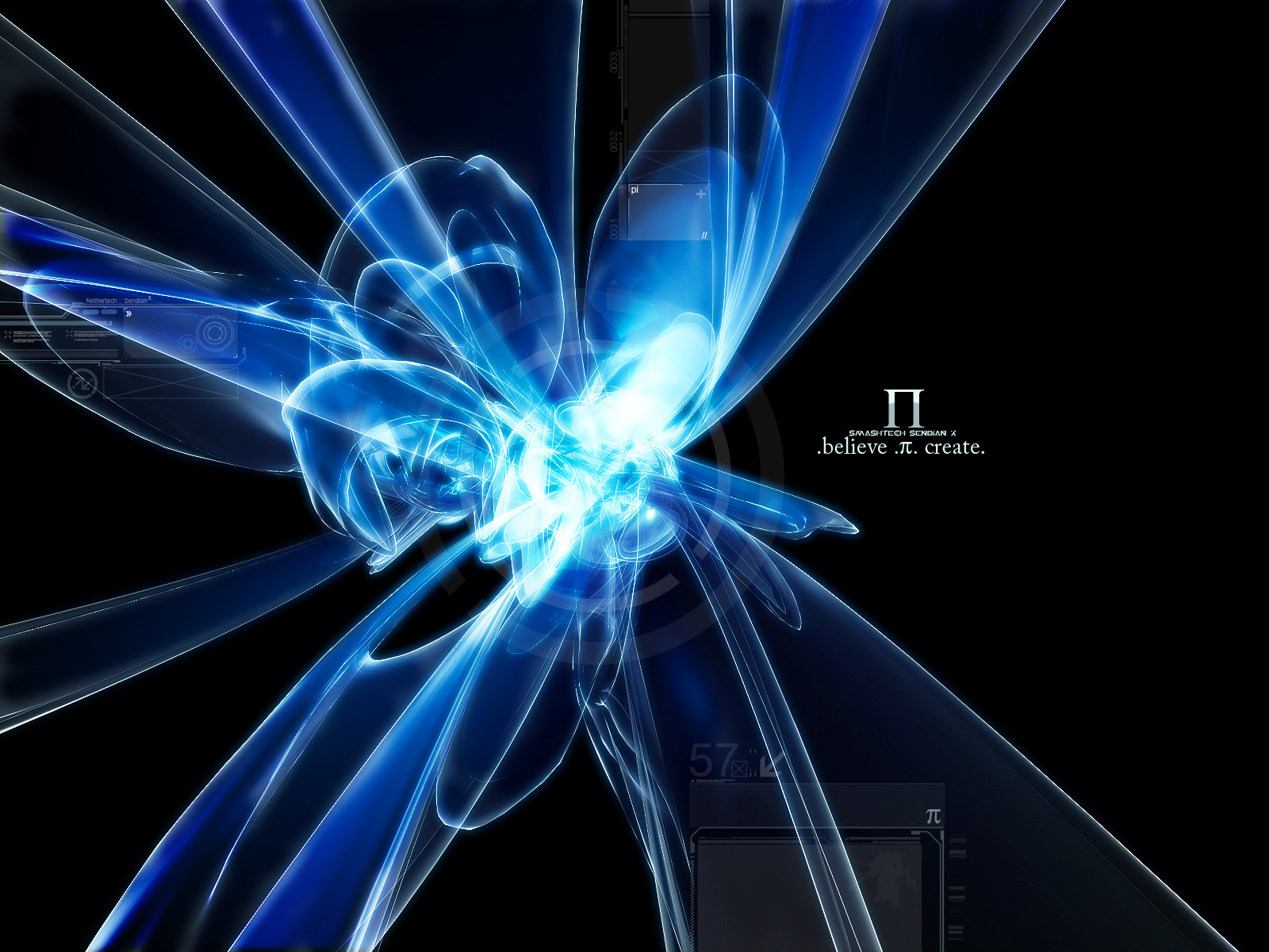
To accentuate duality in the universe and come up with a metaphor that would be able to accurately describe the inner workings of this universe, I am writing two stories called "Pi". In the end, it's all about you, you shape reality because you believe in certain things, which become either self-fulfilling prophecies or are actually formed through your belief.One of my last abstract pieces for a long time, since I, too, am getting sick of the main flow. My new style is more 2d.
Lots of resources by ~siner used. I don't know which render(s) I used but I did use some of them... gotta retrace that back, if anyone can find out please notify me.
The rest is just sendian
 (Wink)") .
.Check out my new website, too and give me feedback!
Related content


Comments: 17


that look pretty nice indeed ! looks like a abstract neon light somewhere in the city ;D
👍: 0 ⏩: 0


Not terrible, nice materials and lights. Lots of jaggies as first pointed out, and lacks a certain focus and volume of composition stability. Also, what does this render have to do with the "Pi" Number? Is it a visual interpretation? or a visual replication? Because I see no real connection beyond your text and that doesn't really make it all that more cohesive. Also the 2d is pretty lacking as well, there's no flow with the render, there's next to no viable grid work to keep things organized and it's in 2 very isolated locations use more minimal based 2d to "weave" your 2d from both sections together. And your font for "Smashtech Sendian" is pretty crappy for a choice, if anything I would have stayed with your serif font for the project title as it would not only have made more sense, but it throws off your type arrangement and composition. One thing to not do in abstract design, at least in this style of it, is to NEVER mix font types, unless they are used very well together, and in this case it's not very well thought out. Another thing about type design and composition, make sure to think through your word choices. They need to make sense to the user, if only remotely. But it has to stick and be easy to get rather than something cryptic and meaningless to the concept. I could go on but I think that's enough for you to start with. Keep at it and keep experimenting.
👍: 0 ⏩: 1

I love the eloquence of this comment. You just gave me enough to perfect and keep in mind, but most of all, I appreciate the fact that you actually took time for something you didn't like awfully much. And I have deep respect for that.
Of course, I disagree on some parts - but that's simply my style, and I'm sure it will develop later on into something else. Perhaps. Perhaps it won't - but then we would be discussing over opinions, which is useless, eh?
Thanks again!
ps. "Pi" is the visualisation of the core of the universe but that follows through about 600 pages of text, so I understand it's illogical for most people.
👍: 0 ⏩: 0

Very cool!
I ones saw a site with pi correct to like 1million numbers.
If I remember correctly it was a japanese project, they must be really bored if they want to calaculate it to that level..
👍: 0 ⏩: 1
Yeah, the file that contains all the calculated digits of Pi today is about a few terabytes in size - which is astronomous
👍: 0 ⏩: 0

very pretty light
looks real nice
I know about 30 numbers of pi because im badass ...
👍: 0 ⏩: 0


Sweet 2d. ")
👍: 0 ⏩: 0

Great work Send. The focal point is awesome. The 2D is awesome. It's very detailed.  (Smile)")
I'm looking forward to see more of your 2D designs. ^_^
👍: 0 ⏩: 0

awesome work man, that crazy blue stuff looks the business!
👍: 0 ⏩: 0

good work, kinda miss your awesome menu's just one this time...but i like it a lot!
👍: 0 ⏩: 0


Awesome job man. If it wasnt for the jaggies, i'd +fav this.
👍: 0 ⏩: 0