HOME | DD
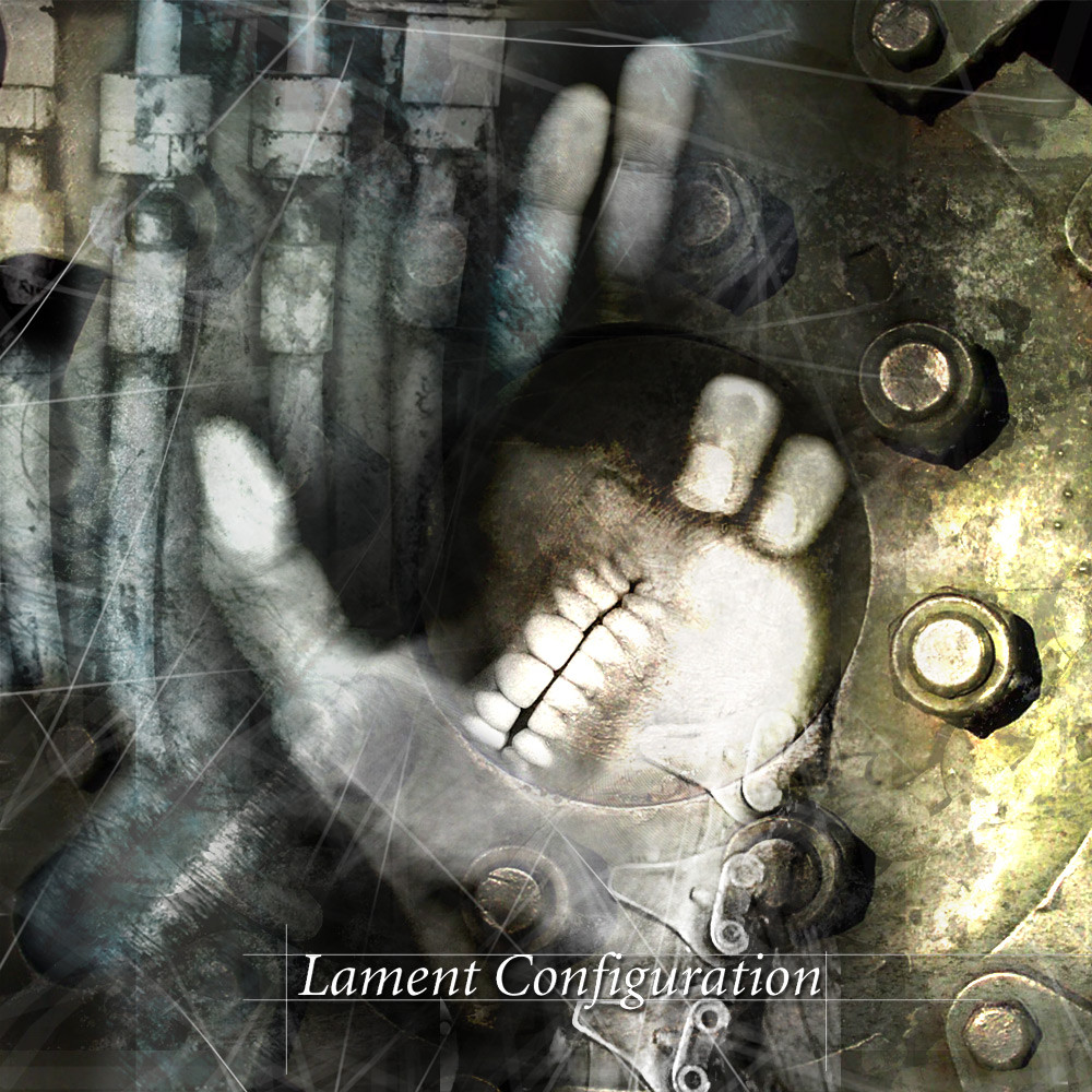
 shadowmageix — Lament Configuration2

Published: 2002-10-27 13:10:02 +0000 UTC; Views: 574; Favourites: 7; Downloads: 73
Redirect to original
Description
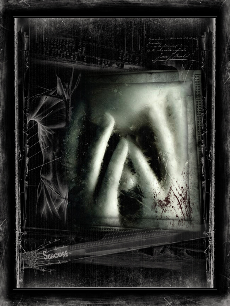
Second preview for my upcoming CD cover, slight changes compared to version 1(thanks to scarmind for the feedback)
*edit: uploaded slightly larger image
Related content


Comments: 16

Nice photo manip. I like the rock hands...they look great
👍: 0 ⏩: 0

Love it. This is a great piece. I love the way the pipes seem like another hand. I'm not sure if I like the mouth on the hand. It's been done to much to make it interesting. A scene of a tunel with strong perspective would create a visual unrest which would work really well.
👍: 0 ⏩: 0

This wouldn't look out of place on a NIN cd cover great piece!
👍: 0 ⏩: 0

That's awesome..... I love these kind of photo manips.... great job on this one
👍: 0 ⏩: 0

wow!! looks great to me, i really like it. and that is my expert opinion.
👍: 0 ⏩: 0

Good to see this is already an improvement on your previous version. Yet I think you should drop the box around the CD title. The lines (scars) look better now .. you did a good job.
My teacher of graphical design always told me that a design is _never_ finished. Some people will always see/find things to improve, change, remove, etc. It's up to you to decide when you stop working on it and when you say to yourself "I achieved my idea, the vision I had and the piece is finished for me". Try to keep that in mind when you're designing.
You can work weeks, months even perhaps years on something and realise it never gets finished.. you wouldn't look back what time you've lost in trying to get the max. out of your skills while you had a chance to do a dozen designs (paid!)
now after that lesson there are two things that really bother me about the general composition. One is situated in the top-left corner. Every pipe has the same colour .. except the left one has a top of another colour.. which looks a bit out of place there. Try making it the same colour as the rest and make that part a little (not much) darker.. that way you get diagonal lighting balancing.. and you have a used technique of master-painters of two centuries ago
Oh and never forget.. design should be fun!
👍: 0 ⏩: 0

thats so cool... I'm usually bad at commenting so beatr with me.
i love the mix of the machinery and the persons hand the teeth themself stick out, but i still like the flow of the whole picture...
yeah
👍: 0 ⏩: 0

Kind of scary, but very cool working. Love the manip. I'm going to check out your gallery.
👍: 0 ⏩: 0

real nice manip there, all the pieces seem to fit together very nicely. the only thing that seems a bit off to me is the mouth in the hand, it just looks odd in that location and at that angle, maybe see how it looks if you tweak with that part a bit, i don't know though ;p good work
👍: 0 ⏩: 0

Good to see that you haven't completely vanished
This is wonderful. I can't help but wish you'd teach me how you make such wonderful art. Thank you for sharing this.
👍: 0 ⏩: 0


Very cool looking. I love the colors. What did you use to make it?
👍: 0 ⏩: 0

very industrial, the whole pic looks absoloutly gorgeous
👍: 0 ⏩: 0

really great composition..it fits together very well!
👍: 0 ⏩: 0

LOL I was going to say this looks like something from a cd covere I like it....Kinda spooky looking with the hand and mouth deal....What kind of band is it??? Great job
👍: 0 ⏩: 0

aweeeeesssome work mate......... this one kick's ass
+fav for sure.
👍: 0 ⏩: 0