HOME | DD
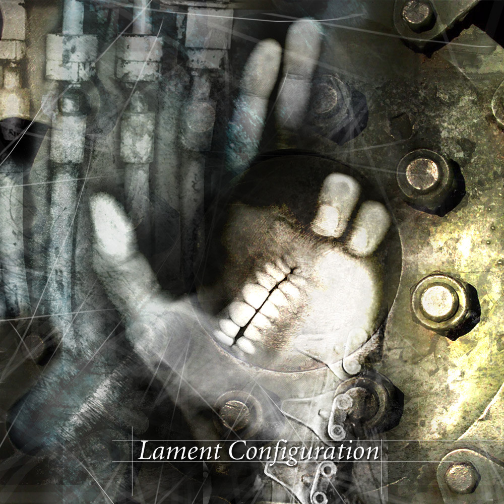
 shadowmageix — Lament configuration 1
Published: 2002-10-27 11:45:42 +0000 UTC; Views: 281; Favourites: 2; Downloads: 35
Redirect to original
Description
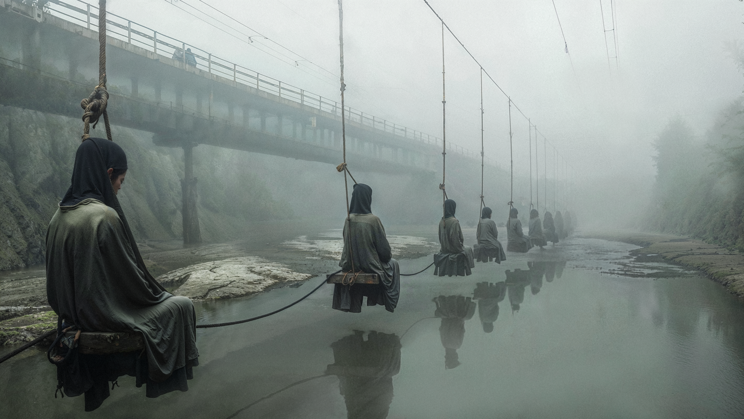
My first prototype for a CD cover I'm working on.Related content


Comments: 5

Yeah, a rougher font might be nice... but this is the kind of cover that gets me to buy goth/industrial music. It has a great feel to it. Kudos and 
👍: 0 ⏩: 1

i dont care what anybody else thinks.. i like it.. i like it alot
👍: 0 ⏩: 0

I don't like the white lines all over the place .. and yeah, you should indeed work on the text but the other stuff is nice.
👍: 0 ⏩: 0

I still need to work on the text area...I know
👍: 0 ⏩: 0