HOME | DD
 Shadowtm — Raven and Phoenix
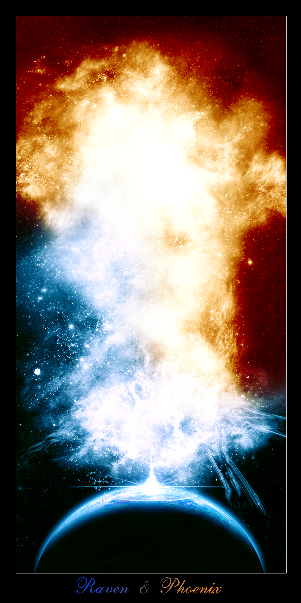
Published: 2005-06-25 18:45:46 +0000 UTC; Views: 2241; Favourites: 63; Downloads: 535
Redirect to original
Description
This image took me FOREVER! well.. not as long as the last one, because my PC was having a good day today, and i mean good as in, "it only crashed a little." So anyways, this image also has 2 versions, a big one and a small version. Enjoy (Smile)")
Please Fav it if you like it thnx, and if it's not appealing to you please state your reasons, and how i can improve.
Related content


Comments: 32


eh? lol? this piece is VERY old lol!
👍: 0 ⏩: 1

I know, was randomly browsing and saw it, still very good though
👍: 0 ⏩: 1
 (Wink)")


thnx m8
👍: 0 ⏩: 0

Very nice use of color and texture through the space.
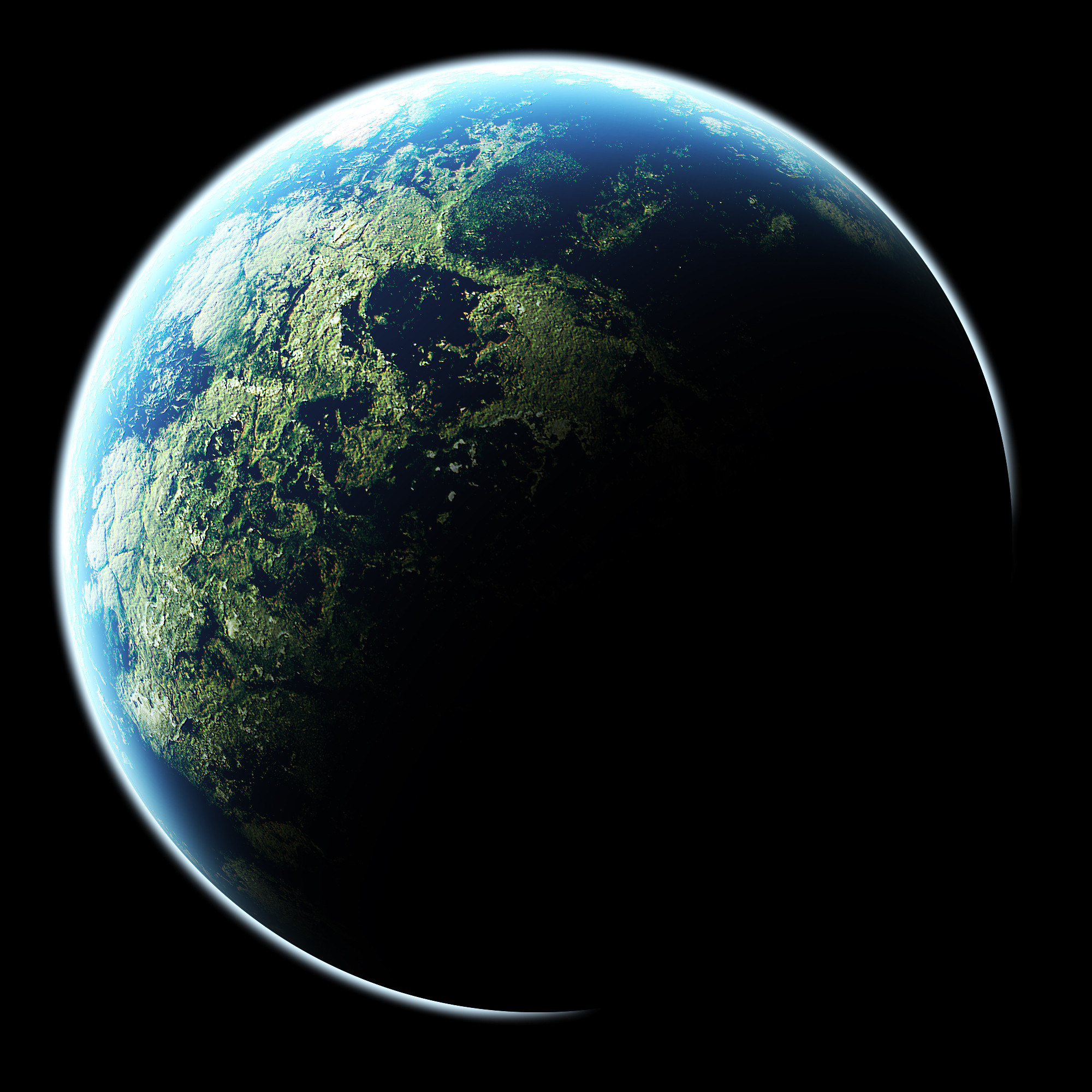
Planet also looks great, just wish I could see more of it
👍: 0 ⏩: 0

woah thats sweet, i love the clash of blue and orange/red, very very nice
👍: 0 ⏩: 1

i really dont like the text, but it looks freakin awesome
👍: 0 ⏩: 0


AMAIZING .................. am speachless
just amaizing ...... +fav
👍: 0 ⏩: 0


Damn you, damn you, damn you 
Hope to see more from you soon
👍: 0 ⏩: 0

wow man this is sweet! i think you should make one with only the planet and a tiny but of the blue parts. the impact effect is very cool
👍: 0 ⏩: 0
Ahhh, perdy. The transition from red to blue is very clean. good job. More later, must sleep now...
👍: 0 ⏩: 0

i like that shockwave on the planet...good job man!
👍: 0 ⏩: 0


I like how the...err...laser? I dont know, taht thing that hits the planet, I like it
👍: 0 ⏩: 0

this is so amazingly beautiful, your brushing skills are beyond belief. love the blue and orange, they go so well together. only thing i dont like it the font but i'm useless at picking them myself so i wont critisise.
👍: 0 ⏩: 0

That's really cool.
I'm clueless as to how you did this, so sorry I have no critique, but as someone who's completely oblivious I'm very impressed. (<

👍: 0 ⏩: 0

I really like the colors of the blue-white and the red-orange part, and the shapes just fit perfectly into on another.
But the source of light on the planet looks too planned, too geometrical to fit into the whole work.
👍: 0 ⏩: 0
I really like the colors of the blue-white and the red-orange part, and the shapes just fit perfectly into on another.
But the source of light on the planet looks too planned, too geometrical to fit into the whole work.
👍: 0 ⏩: 0

pretty damned cool
only suggestion i would make is the liquify filter on the red nova on the right doesnt quite match
👍: 0 ⏩: 0

Now this is some quality work right here. Definitely my new fave. XD
Only suggestion:
-The center is too bright, add a bit more texture rather than having it all white.
The planet is awsome.
Keep up the good work.
")
👍: 0 ⏩: 0

Great work shadow ")
👍: 0 ⏩: 0