HOME | DD
 shell-x — Derekmui Logotype
by-nc-nd
shell-x — Derekmui Logotype
by-nc-nd

Published: 2007-03-15 17:57:18 +0000 UTC; Views: 2790; Favourites: 37; Downloads: 0
Redirect to original
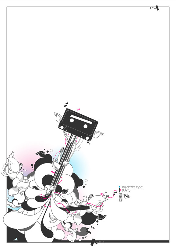
Description
Logotype for myself.Related content


Comments: 25


quite the mix -- like the way your mind imagines -- later days
👍: 0 ⏩: 0

ooo beautiful stuff.
second one seems more compact. i like both!
👍: 0 ⏩: 0

nice! i like the second one..
the k and m in the first one look kinda awkward? i duno but it still looks good thats for sure. i just prefer the second one better.
madd stuff as usual ^^,
👍: 0 ⏩: 0

 (Wink)")


Ok...that's weird. I've been working on something with an almost identical style...
👍: 0 ⏩: 1

Lol. Let me see when you're done.
")
👍: 0 ⏩: 1
It's still in development, but hopefully when it's done, it will look as slick as yours
👍: 0 ⏩: 0


i like the first one, especiaaly the "m" and "u" part!!!
👍: 0 ⏩: 0

 (Smile)")
like the way you blended -- the ideas -- but do you think that people might not recognize the letters -- because they have been merged? -- but then again a logo is meant to represent you -- later days
👍: 0 ⏩: 0


thats so hard to read. i dont know your audience or target but thats near impossible to understand. i really like the concept and execution of the lines. very modern and smooth.
but still hard to read.
👍: 0 ⏩: 0


Very nice, i do preferr the bottom one, but they both look so nice, technical yet simple, very nice style
👍: 0 ⏩: 0


The second one is the best. First just seems to mainstream(I keep on seeing more logotypes that have these circle elements in them.)
👍: 0 ⏩: 0

i love this kind of logos
pen tool or a font ? or both
👍: 0 ⏩: 1


