HOME | DD
 Shells124 — Kaladin

Published: 2011-07-16 22:51:30 +0000 UTC; Views: 3443; Favourites: 5; Downloads: 21
Redirect to original
Description
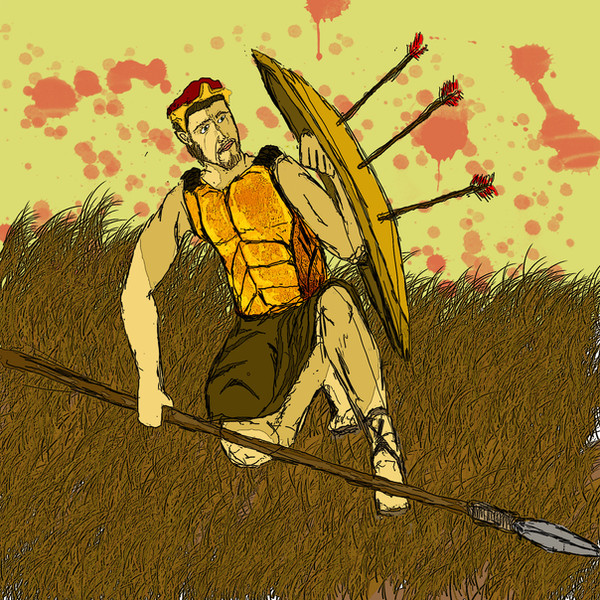
This is slightly worse than my non-sketches, but slightly better than most of my scraps. So, I apologise for those of you who believe this has no place in my scraps section.This is fanart of a really awesome book, "Way of Kings" by Brandon Sanderson. Any more details would be spoilers. So just smile and nod.
Edit: my vanishing point didn't match the horizon line. I fixed it. Tada. And my scanner added it's own imput to the sky. -_-
Related content


Comments: 7

looks good! ")
👍: 0 ⏩: 1

Thanks. I didn't distinguish the twenty or so bridgmen in the background simply because they are, in fact, background. There are too many details located in that one wpot, and if I had emphasized them too much, they would have overcomplicated the image and wouldn't have sunk back into the background where they belong.
👍: 0 ⏩: 0

It is the ultimate "kickass" moment, isn't it (though I wonder if the moment almost immediately afterwards, when he says The Words, isn't equally awesome). I almost wanted it to be the cover, but realized that this moment itself is kinda spoilertastic once you've read any bits about Bridge Four... a reader would get five pages into the first chapter about the Plains and the Bridges and the battles, and spend the rest of the novel waiting for this moment to happen. Better that it come upon the reader organically, building up from the scenes that lead to it.
Do you want some feedback on composition? Because the way you chose to frame this piece creates a few visual problems.
👍: 0 ⏩: 1
Feedback would be great! I know there are problems with it, especially while I was faced with having to draw the bridgeman, but I'm not entirely certain what exactly is wrong with it. And, yes, this has got to be one of the coolest moments in the book.
👍: 0 ⏩: 2
Okay... sorry this took so long, but I did come around to it (at last!).
The basic problem here is fundamental composition... your layout places everything level and in the center; the main character, the vanishing point, the background elements, the bridge, the chasm, etc. It's all centered, and nothing stands out effectively. It's also a huge invitation to tangent troubles (tangents are lines that come together in such a way as to blend shapes and effectively wreck the separation of planes).
When laying out the elements, it's a good idea to place them in such a way that you can focus on the various elements individually, while still allowing them to dominate in the order of significance. By placing everything together in the center, there's nothing else to look at, and everything bunches together. It's a compositional traffic jam.
Beyond that, laying elements out centered and level makes for dull draftsmanship. The dynamism is lost without some diagonal layout and depth cues.
If you choose to redo this piece, I suggest placing the VP to one side, and using two-point composition. Allow the line of action to run diagonally rather than directly towards the viewer (probably left to right, since in the west we read that direction more easily). You can place the viewpoint lower to provide Kaladin with a sense of dominance, or place it higher so that we're above everyone, which creates a sense of observational detachment.
What I suggest overall is that you focus some study into fundamental layout composition. Doing so will allow you to plan out an illustration more effectively at the very beginning, so that you can put the work into polishing the linework over a solid foundation. Practice and study of the fundamentals, beneath the elements of style, will help a lot. It can get a little boring, but it's vitally important.
I hope that helped some!
👍: 0 ⏩: 1
Thank you for your reply! I was getting worried that I had been forgotten!
I actually don't normally do a centered straight-on view that I did here, so I can actually see where your coming from. Part of my challenge was actually figuring out how to draw this straight on when I normally draw people from a 3/4 view.
I haven't actually taken many art classes, but hopefully I'll be learning more about proper composition techniques when I go into college as an art major this winter. I never thought that placing things so centered would be such a problem, but you are right that the bridgemen are becoming jumbled with Kaladin. I'm probably not going to redo this particular piece mostly because I have other projects to be working on, but I'm glad that you pointed out these things to me, and I will definitely keep them in mind in the future. Thank you for your time!
👍: 0 ⏩: 0
Wait. I found a problem that I am going to have to fix. The vanishing point marked by the bridge does not line up with my horizon line which explains the spacial problem I was having while trying to draw the bridgeman. That's why they look dwarfed. So if I lower the horizon line and make the rock formations and chasms follow the lines set by the bridge, it will look better. So I'll go ahead and fix that. I would still like to hear what you have to say, though. It's not often I get feedback from professionals. ^^'
👍: 0 ⏩: 0