HOME | DD
 sheorun — Serial Vision

#architecture #city #serial #vision #sheorun #cityscape
Published: 2013-04-28 19:36:24 +0000 UTC; Views: 2161; Favourites: 22; Downloads: 1
Redirect to original
Description
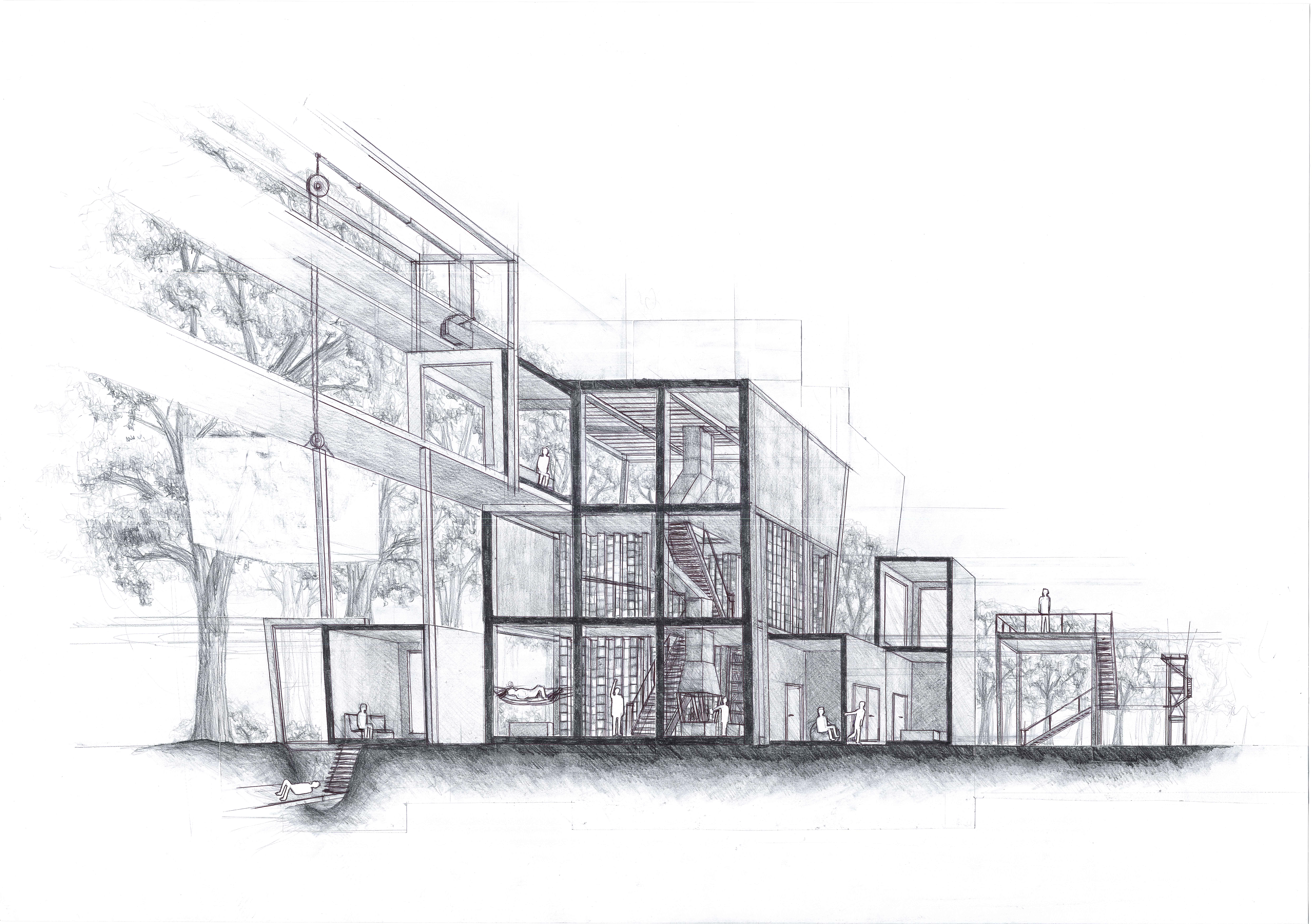
tools of trade: HB pencilA series of drawings, done for university. The task was indeed just that - to find a place in the city and display its quality in a series of 8 images that would build up on one another.
Related content
Comments: 14

Hello from ProjectComment!
Very enjoyable drawing! It really conveys a feeling of a city comfortable to live in. I have always envied people who can do urban sketches with nice structures
I like the negative figures of people and bicycles, they create a difference between the mobile and static. Does the one 'filled' bike on the second from the right panel mean something?)
You have a nice variability in line thickness when you reinforce the angles. It gives a cool impression of structure. But at the same time you might lose depth when you make little distinction between the lines closer to the viewer and farther away from them. For example in the fourth scene from the left, you have a sharp angle on the building and you do make it darker on the bottom and lighter further away, but the structures under the arch have darker lines than this angle - this cannot be so. It might be a good idea to make those lines lighter, but thicker in contrast to sharp thin dark lines in the foreground.
In general I like the arrangement of the eight scenes, there is a clear rhythm in that sequence. Although it seems that the leftmost panel looks a bit out of place in this collection. It is a single building rather than bits and pieces of what seems to be different structures, this building is dark against a white background (while your other backgrounds are at least a bit covered and it does not fill the whole panel. I like it on ts own, but it might be a good idea to have a second one like this on the right, or to put it in the center, or to get rid of it entirely. Or maybe it is just my feeling.
This makes me think of some books of novellas, something like modern-day Kafka (maybe not so desperate). I would love to see something illustrated this way!
👍: 0 ⏩: 1

You have an amazing way of uncovering those little bits and pieces that I would do wrong in one panel, but try to improve in another 

Thank you very much for your feedback 
👍: 0 ⏩: 1

I would love to see a virtual walk in the city drawn by you
👍: 0 ⏩: 1

Hello! Awesome work!! I love the lightly drawn lines, nice choices on where to leave blank space and great perspective drawing on the buildings! I think you must be studying architecture? If I understand the idea correctly, it's that you are supposed to show the quality of the place. I think that in order to critique that properly I would have had to have been there in person or at least seen pictures to compare what you express with it. BUT since that's not an option, I wanted to know if you tried placing the different views in different orders ? Like have you tried putting - the images with the building from far to close in order as if you are walking through it? I've taken the liberty in manipulating your image to show you what I mean - it might not be the order in real life but just to get an idea- you may even like it better the opposite order that i did. I was thinking of making it more of a image journey, as it is the series is more broken up shots of different views almost as if you are looking from one side to the other and drawing alternating views? I hope this makes sense. BUT if the place you visited has the feeling of a broken up kind of mix up of different views then your way will work better! So really it depends on what you are trying to show. Just think about the order and how the images effect the next one in line and as a whole what it says.
Then lastly, you have drawn this perfectly like the textures etc are all very readable and you can clearly see what is going on which is what you want the most I think- but I have one idea to improve on this -IF you want to. Add a little more character, like this could be a street anywhere in the world right now - there are a few things that make me think it's in Asia but I could be wrong! The bicycle, some building elements etc I would suggest putting in some more pointers for your viewers - to let them know what it's like to be there in person, what would you smell, is it dirty or has it just been garbage day? OR is it clean and you can sit on the ground (even if you didn't seen anyone at the time you can add it in to make a point) I think that if you added a few of these types of things it would make the drawing come more alive 
Again if I knew the place better then I would be able to say more 
👍: 0 ⏩: 1

Thank you very much for your comment and insights
You are right, I do in fact study architecture 


You are totally right about adding more staffage. It never came to my mind with this one, but now that you mention it, it makes perfectly sense to convey the place better. Actually things like people on the balcony or some kids would be a really great addiction, since this place is brimming with life most of the time 
Yup, thanks for your hints, they are always helpful 

👍: 0 ⏩: 1

Cool! Yeah I love seeing, talking and drawing architecture stuff so it was way too fun talking about your drawings 

My professor always told me to tell a story with the drawings - he would ask me all the time " yeah, it's a good drawing but where's the narrative? you're not playing to game!" lol..he was a great teacher. It's really true you need to engage your viewers so you have to "play the game" of seducing them with your story...so you should interpret what you see to match your project. I would sometimes even add floating plastic bags because I knew it was a street market for my site and it gave the feeling of movement as well as shopping obviously...and it was like colorful balloons visually...so you know, add some fantasy sometimes - it can help
All the best with your studies!
👍: 0 ⏩: 1

Yap, I definitely see your point, and you seem to have had a great professor 
All the best for you as well
👍: 0 ⏩: 1

Hey there, I'm from .
So first of all, whoa! Awesome job!
I love how you make the lines in general look so smooth, but still confident at the same time. The dimensions of everything are spot on, at when eyeballing it. The white spaces (that were clearly carefully measured) make it an easy transition between frames, unlike the sudden, clear frames that are separated with a black line. My favourite part was how you did the roads, which is strange, because it looks so natural that people will usually overlook it. In fact, that's why I like them the best; because it looks natural.
Good job not coloring in or adding details to the people; that would have ruined the theme;. Good decision on your part!
Honestly, the only thing I can criticise is that you need to go out of your way to think of what everything is, but tat isn't really a major issue.
So all in all, very well done!
👍: 0 ⏩: 1

Oh thank you very much for your kind comment 

👍: 0 ⏩: 0


