HOME | DD
 Shinybinary — Shinybinary version 2

Published: 2006-08-01 14:27:11 +0000 UTC; Views: 12388; Favourites: 84; Downloads: 983
Redirect to original
Description
shinybinary.comAfter many months of hard designing, coding, writing and slacking off playing pointless Flash games, version 2 is finally here. It's a fairly radical change in style from version 1, and I know some people will miss the nature orientated look that has come to be associated with this site. However change is nearly always a good thing, and I am happy with the direction I have taken things in.
--------------------
That's the general blurb, now a bit extra for you DA people. I actually layed down the first psd for version 2 almost 11 months ago, so as you can guess there has been an extraordinairy amount of slacking since then. Take a look at the first design concept which never made it past infancy:
[link]
what was I thinking?


and a close up of the header for some details:
[link]
A lot more effort has been put into this one in terms of code. I managed to do it all with compliant HTML and CSS and without a single table in site! IE and Firefox are recommended but I have made sure it works in Safari as well for all our Mac friends.
and to all those people who wanted more flowers and frogs and shit, tough!


Anyway I hope you enjoy it.
Related content
Comments: 73

you fucking rock Nik, that's the shit right there. Simple, to the point, with a rockin header. Total transformation and only improvements here. Congrats on the launch
👍: 0 ⏩: 1

That header is really neat! Good job!
👍: 0 ⏩: 0

the layout looks really clean, i love the complexity of your header.
👍: 0 ⏩: 0

Very nice. I like the new look, especially the banner.
👍: 0 ⏩: 0

sexy header, and clean and simple is good
👍: 0 ⏩: 0

the header looks wonderful with this great details but where the details in the rest of the site ? only a background with a typo... not more ?
👍: 0 ⏩: 1

Exactly, I've learned a lot about web design in the last few years, and the overly complex navigation of V1 always annoyed me. Clean and to the point is where I wanted to go for V2, I just couldn't resist sticking a great big header in
👍: 0 ⏩: 0

wow, you have come a long way in 11 months!
Good job, i really like the new version. The old version was also great, but it took my 5 minuites to find out how to access the rest of the site
This is very nice and simple (what employers or commissioners look for 
👍: 0 ⏩: 0

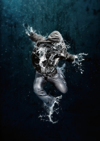
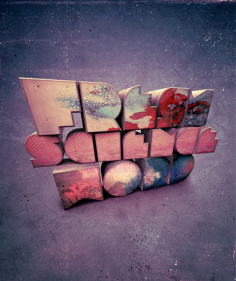
Very nice, did you do all the 3D work for the splash and headers?
👍: 0 ⏩: 1

It's all Photoshop, no 3D programs used.
👍: 0 ⏩: 1

I thought of that becuase I have seen things like that in PS before. Amazing work none the less, drink alot of coke and coffee making it
👍: 0 ⏩: 0
