HOME | DD
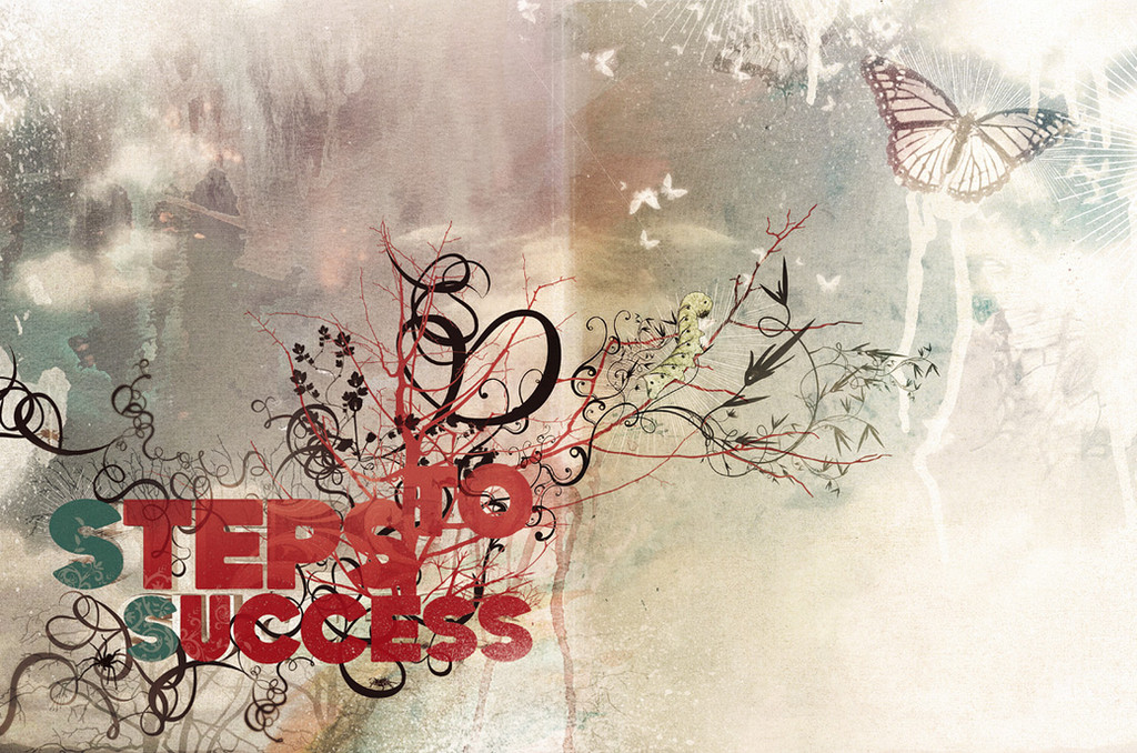
 Shinybinary — Steps to success
Published: 2006-11-22 11:58:30 +0000 UTC; Views: 18033; Favourites: 310; Downloads: 1040
Redirect to original
Description
Illustrations for an article for Digit magazine about moving from being a designer to creative director. Article's good actually, but scary for those of use just starting out as designers! (Wink)")
Related content


Comments: 68


lovely! what do you use to make this? be detailed please  (Smile)")
👍: 0 ⏩: 0


Great work. Colors, layout, just everything is awesome!
👍: 0 ⏩: 0

i was just browsing through digit, as you do. come accross this article and thought to myself 'hey that kinda looks like shiny's work. and lo and behold "artwork by nik ainley" crazy
👍: 0 ⏩: 0


I like it very much, but I think it's not *your best*
👍: 0 ⏩: 0

:::::::::::::::")
👍: 0 ⏩: 0


hey your the guy who drew that thing
ice and spice
makes this kinda nice
")

👍: 0 ⏩: 0


I could totally see this tagged against the side of a nice white wall. This is awesome.
👍: 0 ⏩: 0

very nice work...saw your work in arts projects very nice....
👍: 0 ⏩: 0


I have to admit, i`ve seen better work from you
")
👍: 0 ⏩: 1

Yeah I know, I didn't really like the brief and got over excited with the scanner I had. It'll buy me one of those new geforces anyway ;]
👍: 0 ⏩: 1


graaaaaaaaaaaaaaaaaaaaaaaaaaaaaaaaaat
so good so good so good so good
👍: 0 ⏩: 0


cool in visual. but not sure bout the concept.. hehehe.. cos that is natural live to be butterfly not goin success to be butterfly. overall awesome work.. love it
👍: 0 ⏩: 0


some really nice detail in here. I didn't even notice the caterpiller or the spider at first
👍: 0 ⏩: 0


I like this it has a great feel man. The light textures definitly make this peice
👍: 0 ⏩: 0

I guess the first step is getting other people to do the illustrations for you
unless this is your story?
")
👍: 0 ⏩: 1


")


i like it. the fact that its different makes it unique. well done
👍: 0 ⏩: 0

i love it. im not sure about the font though BUT i really feel the way you use color helps a lot.
nice work <3
👍: 0 ⏩: 0

the typo isn't so good for this type of artwork
the rest looks good
👍: 0 ⏩: 1

indeed. but it is very good looking; very very very good looking
👍: 0 ⏩: 0


| Next =>