HOME | DD
 Shinybinary — 2006 -Medusa-

Published: 2006-03-19 12:19:44 +0000 UTC; Views: 23651; Favourites: 240; Downloads: 4306
Redirect to original
Description
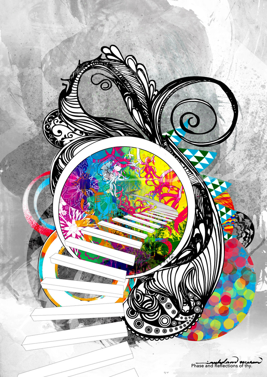
A Shinybinary wallpaper for 2006, seeing as it's over a year since I produced my last one... odd as I used to do so much more work at wallpaper resolutions, I think I'm just too fond of portrait now. Anyway I left this intentionally empty on the left so you have space for your icons, and with few colours as I prefer very neutral desktops myself. More resolutions available here and if you don't like the typography or colours then you can just fuck off! Only kidding, change them if you like.Related content


Comments: 48

I mumbled and I ask myself, if this masterpiece was five years ago, I wonder how magically could it be today?
")
👍: 0 ⏩: 0


wow really niceeeee
just like the rest of all your work
👍: 0 ⏩: 0


also, may I ask what programs were used in the creation of this piece?
👍: 0 ⏩: 1

Photoshop, Illustrator and Poser
👍: 0 ⏩: 0
I love your personal site, its so well designed.
much like this wallpaper.
hurrah!
👍: 0 ⏩: 0

 (Smile)")


For some reason I just want to poke half the pieces you produce, just to see what they feel like. Of course, I'm usually afraid of what would happen to me if I did. ^^ ;
👍: 0 ⏩: 0


realy cool composition
wires 2d and other gothic stuff
👍: 0 ⏩: 0

")


awesome wallpaper. i too like neutral wallpapers and space for icons
👍: 0 ⏩: 0


Fucking awesome!!! You're pretty much the most talented 2D artist I know...
👍: 0 ⏩: 0


The face doesn't seem to fit, but the rest looks good.
👍: 0 ⏩: 0


I'm not in the mood to comment, so i'll just say, you should be proud!
👍: 0 ⏩: 0


haha i love it. though when i see the type i keep thinking "shiny bindry?".. but maybe that's just me. it's still cool though
👍: 0 ⏩: 0

cool. the baroque twirls, did you draw them yourself? (and i do like the typography.)
👍: 0 ⏩: 1
A mixture, some drawn by me and a lot of vector-traced stock imagery.
👍: 0 ⏩: 0

You have heard this to many times man... but I don't know what else to say.. + you don't know me.
I love your work, you own man.. your articles on mags are awesome.
Well done!
👍: 0 ⏩: 0


excellent work... very usable as a wp. love it!
👍: 0 ⏩: 0


Is the hair rendered aswell or pencilwork or stockphoto or something. Looks Impressive man!
👍: 0 ⏩: 0

beautiful work...love the attention to detail despite the minimalism
👍: 0 ⏩: 0

Very cool! Love the face of the woman and the hair! Great Detail!

👍: 0 ⏩: 0

I <3 you very stylish very skilled damn and a nice concept,.. sorry i mostley try to give crit but i simply cant find much
👍: 0 ⏩: 0
