HOME | DD
 Shinybinary — FUNK

Published: 2004-09-10 21:59:56 +0000 UTC; Views: 15765; Favourites: 196; Downloads: 3842
Redirect to original
Description
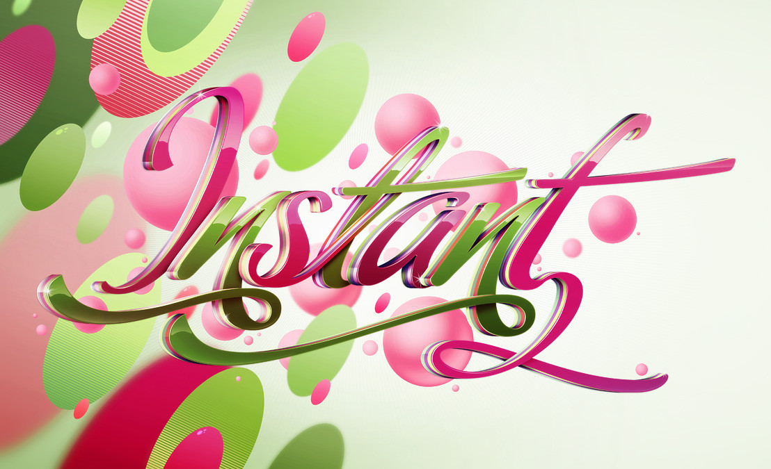
Possibly my least favourite from the latest Depthcore pack, possibly because I feel it lacks depth... and it's not shiny enough ;} Oddly enough it was the one that brought my pc closer to the brink of destruction that any of the others.... I actually cropped it down quite a lot at the end and it had a vast number of layers. Anyway go visit depthcore, there's a lot of fantastic stuff there, a lot of which won't appear on here.Related content


Comments: 58


this's soo good, loved it loved it loved it!
faved
")
👍: 0 ⏩: 0


The funk word shouldve been irregularly placed... BUT is still ROCKS---
👍: 0 ⏩: 0

I LOVE IT!!! I've been trying to the abstract thing for quite a while, but it never turns out so good! Wow! I must fav this!!
👍: 0 ⏩: 0
I LOVE IT!!! I've been trying to the abstract thing for quite a while, but it never turns out so good! Wow! I must fav this!!
👍: 0 ⏩: 0


yeah, in_ funk _we _trust. I actually found to your devart page because of this photo. I did a photo search in google by word "funk" and this catched my eye. really impressing. FUNK ON BROTHER!
👍: 0 ⏩: 0

wow! this one is nice! love it ! funky! is it all photoshop`???
where is the depthcore thingy? is it a webpage?
👍: 0 ⏩: 0

woah! no way man! i love this one! its great! phew!
👍: 0 ⏩: 0


amazingly funky !!!! extraordinary colouring and design !
👍: 0 ⏩: 0

wow! now that really is FuNkY!! heheh...i like it!
👍: 0 ⏩: 0


Looks like a circus,but what a fresh breath on the abstract scene,
👍: 0 ⏩: 0

Gorgeous. Wickedly fun and unique, (I love Verve and PIMP too.) Way too cool to not be +faved.
👍: 0 ⏩: 0


Awesome like all your stuff in the pack  (Smile)")
👍: 0 ⏩: 0

I agree with you on the lacking depth.
Other than that, its nice, but maybe a liiiitle bit too girly for my taste
No but seriously, nice theme, sumthing different.Thats always nice.
 (Wink)")
👍: 0 ⏩: 0

Looks awesome, I have no complaints about depth at all - the image looks great, vivid, especially with the duotone background - the letters are decorated to the feeling they issue to the viewer, and I think that's executed just perfectly. Vivid, radiant, brilliant, full of motion, and so colorful... a real drool piece, this is a fav!
👍: 0 ⏩: 0

sweet! I like the colors for this one better, but your right, not enought depth... but its still a great job!
👍: 0 ⏩: 0

That is alot of layers, but they are all blended well. I really need to check out the whole pack if this is one of your least favorites, because I like this one.
👍: 0 ⏩: 0

these are so beautiful! i like the guy pointing in the background! very festive!
👍: 0 ⏩: 0


Hmm This is my favourite of the dC pack. It doesn't need more depth. Did you work with illustrator or PS? Well i have to fav this because of the cool composition, colours and shapes.
👍: 0 ⏩: 1


how do you do that shit, it's just übernice, the colors, use
of gradients and efffects...etc. keep it up m8
👍: 0 ⏩: 0


Damn i love the style. Really original, keep this style. +fav
👍: 0 ⏩: 0


Hmm. Perhaps you're right about the other two being better. But to call this the "worst" of anything is a travesty. It's still Quite Shiny.
Plus it plays with some fun forms and music and etc. The text on these is probably some of the best and most playful I've ever seen.
👍: 0 ⏩: 1

i agree, i liked all your other pieces better than this one.
that said, i still love this one!!
👍: 0 ⏩: 0

i love the funk. and the detailing is great. awesome job.
👍: 0 ⏩: 0


You said it was your least favourite but I love the texturing here. The lines and the colors are more specific in the choices, strengthening the relationship between graphics and color-scheming. Very good
👍: 0 ⏩: 0


Great piece... you can almost taste the funky flavor on this one.
👍: 0 ⏩: 0

OHHHHHHHH How I wish this were wallpaper sized! It's very cool, my friend!
👍: 0 ⏩: 0
| Next =>