HOME | DD
 Shinybinary —
Type
Shinybinary —
Type

Published: 2006-05-31 12:32:28 +0000 UTC; Views: 126186; Favourites: 3254; Downloads: 6166
Redirect to original
Description
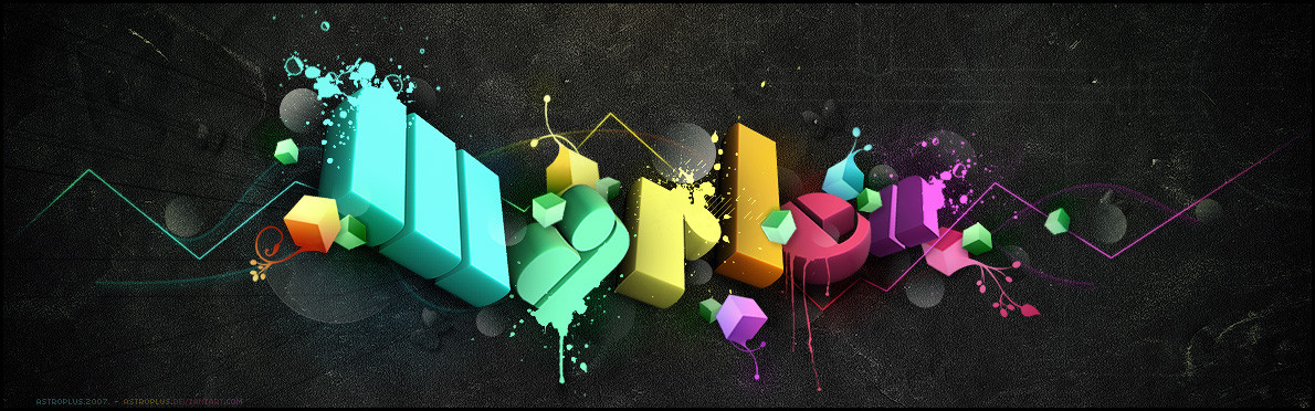
A piece produced on a commission for Computer Arts Projects typography issue. They basically wanted a copy of 'Pimp' with this lettering instead, so that's what I did while updating the style slightly. It was a bit of a rush as I basically had 2 evenings to do it but I am pleased with the result, I think it's technically a lot better than Pimp. Original size A4 @ 300dpi, I'll make it a print soon.Related content


Comments: 435


awesome piece ~ love the intricate detail
👍: 0 ⏩: 0


awesome Background. I love the colors and the light contrats with the typo. Excelente typo too.

👍: 0 ⏩: 0


Fantastic, I've saw that on Computer Arts, and I was like
Now I found it here
Lovely colors and I just love those flowers comming out from the letters, great job.

👍: 0 ⏩: 0


Very nice ! Job, i wanna know how to do that seriously !
3xistenZ alias Marcutio
👍: 0 ⏩: 0

this is gorgeous, was it all done in photoshop?
👍: 0 ⏩: 0

I love the color very much,and the frame is really good for the whole work.
👍: 0 ⏩: 0


[link]
Wow!wowww!!!it was a great thing you've done!! hi... im new here.. i little bit confused bout making vektor in photoshop... [link]
Sadness..... can u teach me...pleaseeeeee.....i had a job to make sign system... which is use flower...ok...
oh btw... Good job!![link]
Joy
👍: 0 ⏩: 0


love it love it love it, beautifull
👍: 0 ⏩: 0

I hate doing stuff like this in my graphic class, but this is outstanding. Amazing colors and I LOVE the text. Just beautiful work here.
👍: 0 ⏩: 0


zomg!
I love computer arts magazine, but it's so fucking expensive in Australia ($20 an issue)
and its $200 for a year subscription, bah.
Could hook me up man?
👍: 0 ⏩: 0

Mind If I use this for some college work, I need to do some research on type for the project I'm doing, And this is amazing
I'll put credit in to you and stuff
👍: 0 ⏩: 1


wow! this is awesome...took me about 10 minutes to scan through the details...nice work!
👍: 0 ⏩: 0


But with 'PIMP' you know from where all that pink came from  (Smile)")
👍: 0 ⏩: 0

Brilliant work! This is just mind-blowing stuff, which software(s) did you use during its composition?
👍: 0 ⏩: 0

that's very pretty ^_^
...not bragging or any, but i thought i made a letter 't' just like it.
👍: 0 ⏩: 0

eh ya am men warana elhagat elhelwa de
👍: 0 ⏩: 0

this is SO AMAZING!!!!!! ")
👍: 0 ⏩: 0

")
👍: 0 ⏩: 0


Hey,
i like your work alot
👍: 0 ⏩: 0

<= Prev | | Next =>