HOME | DD
 Shinybinary —
Type
Shinybinary —
Type

Published: 2006-05-31 12:32:28 +0000 UTC; Views: 126186; Favourites: 3254; Downloads: 6166
Redirect to original
Description
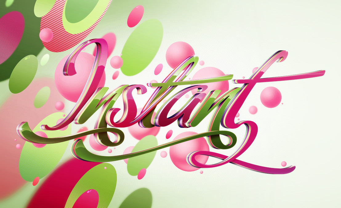
A piece produced on a commission for Computer Arts Projects typography issue. They basically wanted a copy of 'Pimp' with this lettering instead, so that's what I did while updating the style slightly. It was a bit of a rush as I basically had 2 evenings to do it but I am pleased with the result, I think it's technically a lot better than Pimp. Original size A4 @ 300dpi, I'll make it a print soon.Related content


Comments: 435


Awesome! What program did you make it in?
👍: 0 ⏩: 0


it's glamorous and colorful and playful...!
it's great!
really awesome job.
i love how clean it looks..
i don't know what else to say,
except for EXCELLENT!!

👍: 0 ⏩: 0

My GOd.
i watched your this gallery in the COMPUTER ARTS 10 2006 magazine.
very good.i like it very much.so for the fav..hehe
👍: 0 ⏩: 0


OMG
how u made this?")
I love it!!!!!! GJ!!!!
👍: 0 ⏩: 0

 (Smile)")

I knew this looked familiar!! I have the tutorial! You are truly an awesome artist! You are definitely in my 
")
👍: 0 ⏩: 0


")

Regrading the rip!!: well rencently on the mickm.com website someone claiming to be part of the studio 8 team? (dont know who) made a forum signiture from your image! its seems unclear to wether u r studio 8 or if u arnt then somebody stole your work!!! no1cromo
👍: 0 ⏩: 1

Thanks, I'll track this down, I hate rippers.
👍: 0 ⏩: 0

Yeah! I've find! I was onthe website on Computer arts and I see that : "[link] "
Now, we can try to do the same
 (Wink)")
👍: 0 ⏩: 0


holy shit. thats too cool. I just love the layout the texture behind the typefont and just the beauty throughout the whole piece.

👍: 0 ⏩: 0

unless your part of the studio8 team then uve been ripped m8!
👍: 0 ⏩: 1
hmm I'm not, where have I been ripped?
👍: 0 ⏩: 0

How do u create those white circular lines in the bg ?
👍: 0 ⏩: 1


im a typography fan, and i did see this in the Typo issue, lovely use of colour
👍: 0 ⏩: 0


the colors fit so well together and the vector shapes are so nice...
👍: 0 ⏩: 0


I've seen this work in Computer Arts -polish edition, but the main text was "pimp"
You are famous
Congratulation , very good work
👍: 0 ⏩: 0


i love it, i wish i had this print!
👍: 0 ⏩: 0

I have to admit that the first thing that drew me to this was the brightness and clarity of the colours, but most importantly, the text itself. It seems like a command, or rather, an encouragement - perhaps if read into or interpreted deeper, the depth at which using words to express has gone. That instead of 'write' its now the more contemporary 'type', as computers dominate the generation. But, at the same time, it also shows how far art has come with three dimensional shapes, even though it uses almost Victorian elements. I dont know...its a cachophony of things, that all comes together to show much more dimension than just three. Kudos.
Anyway. Yeah. It's better than Pimp.
👍: 0 ⏩: 0

Whoa! That's really good! Nice job!
👍: 0 ⏩: 0


hi, does anyone have or sell any kind of design elements as those great flourishes around type? I just love them!!! Great job!
👍: 0 ⏩: 1
<= Prev | | Next =>