HOME | DD
 Shinybinary —
Type
Shinybinary —
Type

Published: 2006-05-31 12:32:28 +0000 UTC; Views: 126214; Favourites: 3254; Downloads: 6166
Redirect to original
Description
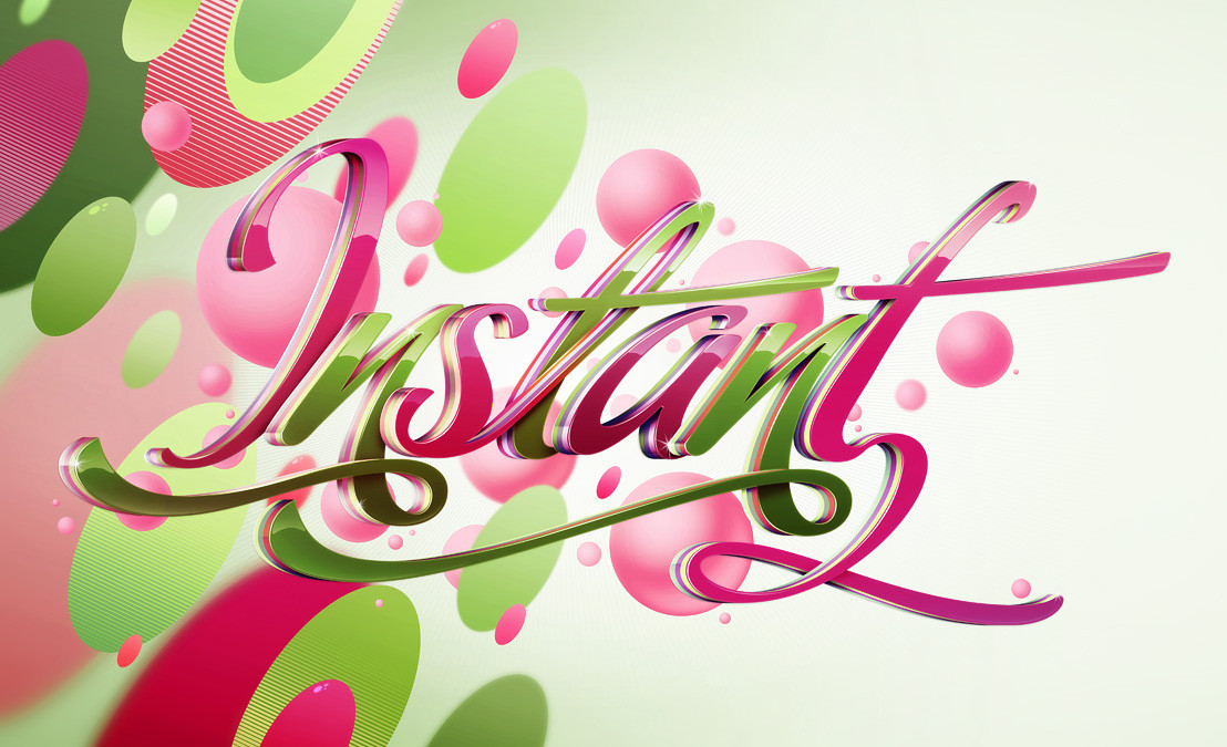
A piece produced on a commission for Computer Arts Projects typography issue. They basically wanted a copy of 'Pimp' with this lettering instead, so that's what I did while updating the style slightly. It was a bit of a rush as I basically had 2 evenings to do it but I am pleased with the result, I think it's technically a lot better than Pimp. Original size A4 @ 300dpi, I'll make it a print soon.Related content


Comments: 435

Love the dripping effect, well I love all of it but thats cool

👍: 0 ⏩: 0

wow, absolutely awesome! hopefully you got a great payment for this beautiful thing!
👍: 0 ⏩: 0


absolutly amazing! everything about this is fabtastic! i would buy the print if i had the money! excellent!
em
👍: 0 ⏩: 0


This one and "Type Tips" are beautiful. I've never seen typography taken to such a level. Very inspiring.
👍: 0 ⏩: 0


Wow, that looks amazing, and only two evenings work.
👍: 0 ⏩: 0

 (Smile)")


hey cool one man Love it.! and is it for Computer Arts?
cause I bought last month one. with the 50 ways to become a better designer lol.
nice you are in CA.
good job!
👍: 0 ⏩: 0

")

really I like the swirls and twists very smooth.faving it.
👍: 0 ⏩: 0

looks amazing!!! insane shit. congrats... i really love the floral pattern on the p - reminds me of nokia la'mour collection  (Wink)")
")
👍: 0 ⏩: 0

Love how it turned out, amazing detail.
👍: 0 ⏩: 0

this is so cool what program did you do this in ?
👍: 0 ⏩: 0


hey, that's pretty cool!! And really pimp, of course! ")
👍: 0 ⏩: 1

Well the basic letters came out of Xara 3D, then I made them a lot shinier in Photoshop. I did use Illustrator for some of it too
👍: 0 ⏩: 1
well the result is just wow!!!

👍: 0 ⏩: 0

greath detail....
keep doing it
👍: 0 ⏩: 0

Job well done on the outer details and deffinetly on those letters. Well combined styles.
Nice to have a CA hookup.
👍: 0 ⏩: 0


oh... this catched my eyes........ so precious
👍: 0 ⏩: 0


At long last you back LOL after all those scary faces
i love to see what i think you do best of all. You
i my humble opinion make some of the coolest
typo´s
Of course i think you need one that says GFXman he he
no serious more typo work plese
Regards GFXman

👍: 0 ⏩: 0


i always love your style
very nice 3d letters
great colors and i love the little details like the drip and the way the flowers although the look 2d seem to wrap around the 'y' at the top and the other letters. great touch having some if it be inside the 't' and the 'p'
excellent work as always from you!
👍: 0 ⏩: 0


AMAZING GALLERY, really. What kind of programs do you use?? I'm very interesting in testing new possibilities for images.
👍: 0 ⏩: 1
Photoshop mainly with some Illustrator.
👍: 0 ⏩: 0


This is really good as always. But i think the "E" should be next to the y, and not below it. but space issues there.
Great job
👍: 0 ⏩: 0

good job on getting into thei mag nik, congrats bro
👍: 0 ⏩: 0


<= Prev | | Next =>