HOME | DD
 Shinybinary —
Type
Shinybinary —
Type

Published: 2006-05-31 12:32:28 +0000 UTC; Views: 126220; Favourites: 3253; Downloads: 6166
Redirect to original
Description
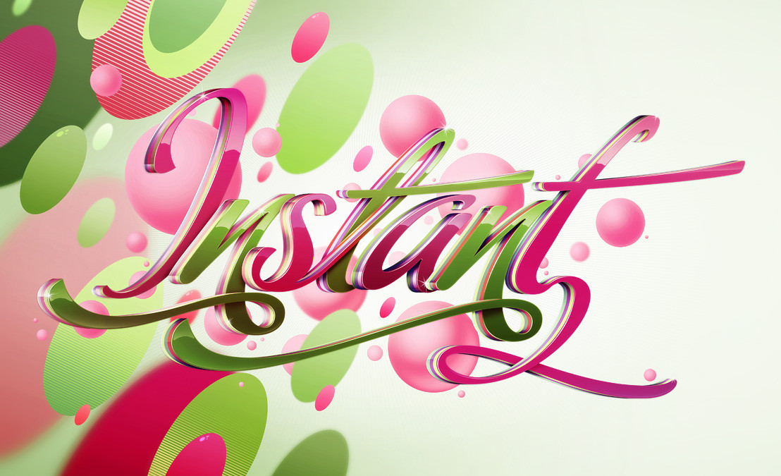
A piece produced on a commission for Computer Arts Projects typography issue. They basically wanted a copy of 'Pimp' with this lettering instead, so that's what I did while updating the style slightly. It was a bit of a rush as I basically had 2 evenings to do it but I am pleased with the result, I think it's technically a lot better than Pimp. Original size A4 @ 300dpi, I'll make it a print soon.Related content


Comments: 435

Xara 3d, photoshop and Illustrator.
👍: 0 ⏩: 0

Computer Arts Projects...I love that magazine..and this it's awesome I'm going to be the frist to buy a print ^-~..maybe second but up there somewhere.
👍: 0 ⏩: 0


It is very pleasing to the eye, and it has a great subtle depth to it. It feels like the letters are floating in a space rather than pasted on top of eachother on a flat surface.
👍: 0 ⏩: 0


obviously not a tutorial piece i'm guessing?
i've got pimp saved on my hard drive, there's different parts of both that i like. unique, with the same style.
👍: 0 ⏩: 0

nice, simple, clean & shiny....who could ask for more?
👍: 0 ⏩: 0

that is awesome, I love your style. reminds me of that mango..
👍: 0 ⏩: 0


That piece is extremely well done.
I think the light on the letters really adds a lot to the picture.
Definately a

👍: 0 ⏩: 0

oi. great work. very shinybinary.
'Pimp' was actually one of your first works I ever saw..
lovin it.
👍: 0 ⏩: 0


Oh MAN! This is beautiful. Right as I was about to fav it, DA went into Read Only mode! I saved the link so I could come back a nd fav it. It's so pretty and creative, I love it!
👍: 0 ⏩: 0


This is totallw freakin' awesome !!!!!
👍: 0 ⏩: 0

It's so pretty and gorgeous! I never knew letters could be so beautiful and design-ed!
👍: 0 ⏩: 0

dayum, I like this even better than the pimp one!
👍: 0 ⏩: 0

Looks great man. I think I'll actually buy this issue now.
👍: 0 ⏩: 0

Nicely done. Pops right off the screen.
👍: 0 ⏩: 0


i like this for some reason ^ ^ looks soooo pretty~
👍: 0 ⏩: 0

Absolutely awesome.
LOOOOOOOOOOOVE IT.
👍: 0 ⏩: 0


funny stuff but I like the colors and shapes ")
👍: 0 ⏩: 0


That looks sick! Very stylish typography.
👍: 0 ⏩: 0

 (Smile)")


you are the king of glossyness
👍: 0 ⏩: 0

I love this, all I can say.. I just love this.. Original, sweet and it looks like candy!
👍: 0 ⏩: 0


Thats nice really nice
::da' xaos one::
👍: 0 ⏩: 0


pornographic =o witch issue it will be in i need to be sure to not miss it =o
👍: 0 ⏩: 0


<= Prev | | Next =>