HOME | DD

Shinybinary — Why not

Published: 2010-11-19 12:57:59 +0000 UTC; Views: 14891; Favourites: 396; Downloads: 1122
Redirect to original
Description 
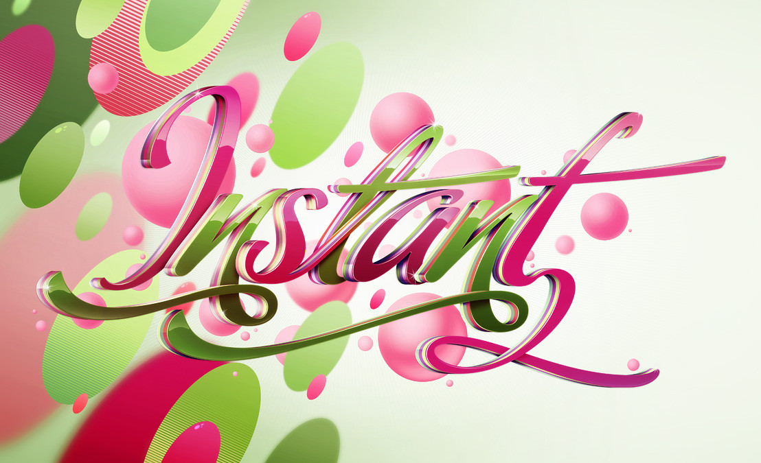
Illustration for Vodafone. Only the letters were needed which is why there are no extra or background details.

Still I had fun, although my obsession with pink and green is on the verge of becoming a worrying addiction!

Close up details here:

[link]
Related content
Comments: 82

mpk2 In reply to ??? [2010-11-19 20:54:14 +0000 UTC]

After all...why not?

👍: 0 ⏩: 1

Shinybinary In reply to mpk2 [2010-11-20 21:07:28 +0000 UTC]

Thanks :} Unfortunately I do not have the rights to sell it in any format.

👍: 0 ⏩: 1

mpk2 In reply to Shinybinary [2010-11-20 22:10:18 +0000 UTC]

that's too bad! superb job though

👍: 0 ⏩: 0

area105 [2010-11-19 20:24:04 +0000 UTC]

love it

👍: 0 ⏩: 0

coreper [2010-11-19 18:44:14 +0000 UTC]

thats awesome!
how did you do the 3D? really awesome!

👍: 0 ⏩: 1

Shinybinary In reply to coreper [2010-11-19 18:51:03 +0000 UTC]

Just standard tools in 3DS Max, nothing fancy.

👍: 0 ⏩: 1

coreper In reply to Shinybinary [2010-11-19 18:57:12 +0000 UTC]

Awesome Must have been some work getting all those objects together

👍: 0 ⏩: 0

beaucoupzero [2010-11-19 18:36:05 +0000 UTC]

looks great man!

👍: 0 ⏩: 0

Awooo [2010-11-19 17:09:44 +0000 UTC]

This is masterfull. Is this Adobe illutrator work or some 3-D app?

👍: 0 ⏩: 1

Shinybinary In reply to Awooo [2010-11-19 17:53:30 +0000 UTC]

Thanks, it was done in 3DS Max :}

👍: 0 ⏩: 0

dolfingz [2010-11-19 16:41:03 +0000 UTC]

And very nice pink and greens they are!

Love the Y - that's really cool.

👍: 0 ⏩: 0

maxzon [2010-11-19 16:29:25 +0000 UTC]

FUCKIN' AWESOME

👍: 0 ⏩: 0

DerekEmmons [2010-11-19 16:21:49 +0000 UTC]

that is great man..why not try brown and green next time...

👍: 0 ⏩: 0

UnlimitedCake [2010-11-19 15:31:12 +0000 UTC]

really amazing, very inspirational

👍: 0 ⏩: 0

Apein [2010-11-19 15:27:38 +0000 UTC]

looks cool

👍: 0 ⏩: 0

aliather [2010-11-19 15:06:18 +0000 UTC]

it should be a daily deviation
superb job

👍: 0 ⏩: 0

saltyshadow [2010-11-19 14:08:31 +0000 UTC]

pink and green are perfect together here

👍: 0 ⏩: 0

XLordAndyX [2010-11-19 13:55:24 +0000 UTC]

awesome work

👍: 0 ⏩: 0

stphnwlkr [2010-11-19 13:49:56 +0000 UTC]

This is really nice, yeah i also have an addiction to pink, its crazy really...i might need to see some sort of a therapist. D:

👍: 0 ⏩: 0

FallenMystic [2010-11-19 13:43:33 +0000 UTC]

this looks really cool, especially the close-ups!
which program did you use?

👍: 0 ⏩: 1

Shinybinary In reply to FallenMystic [2010-11-19 13:58:11 +0000 UTC]

Thanks :} I used 3DS Max and Photoshop.

👍: 0 ⏩: 1

FallenMystic In reply to Shinybinary [2010-11-19 14:16:11 +0000 UTC]

cool, too bad I can't use 3dMax on Windows 7 ://

👍: 0 ⏩: 1

Shinybinary In reply to FallenMystic [2010-11-19 14:39:04 +0000 UTC]

Why not? I do.

👍: 0 ⏩: 1

FallenMystic In reply to Shinybinary [2010-11-19 18:17:37 +0000 UTC]

really? It won't run on Windows 7 for me, did you download any particular version? (if you could provide me with the download link I'd be most thankful!)

👍: 0 ⏩: 1

Shinybinary In reply to FallenMystic [2010-11-19 18:50:30 +0000 UTC]

Weird, I use 3DS MAX 2010 64 bit version and it works fine. Sounds like you might have a dodgy copy...

👍: 0 ⏩: 0

rus-star [2010-11-19 13:15:55 +0000 UTC]

great typo experiment
my favorite is "y"

👍: 0 ⏩: 1

mdemirst In reply to rus-star [2010-12-19 17:07:01 +0000 UTC]

vodafone likes squares

👍: 0 ⏩: 0

Skeware [2010-11-19 13:12:36 +0000 UTC]

I love it.
...and I'm obsessed with pink too (and other "light & shinny" colors)

👍: 0 ⏩: 0

unscenemedia [2010-11-19 13:09:53 +0000 UTC]

That typo looks good enough to OMN NOM NOM NOM NOM

👍: 0 ⏩: 0

jk3y [2010-11-19 13:03:48 +0000 UTC]

haha, love it.

👍: 0 ⏩: 0

c-quence [2010-11-19 13:00:06 +0000 UTC]

Interesting

👍: 0 ⏩: 0