HOME | DD
 shiroboi — Cave

Published: 2008-02-23 17:59:12 +0000 UTC; Views: 927; Favourites: 3; Downloads: 34
Redirect to original
Description
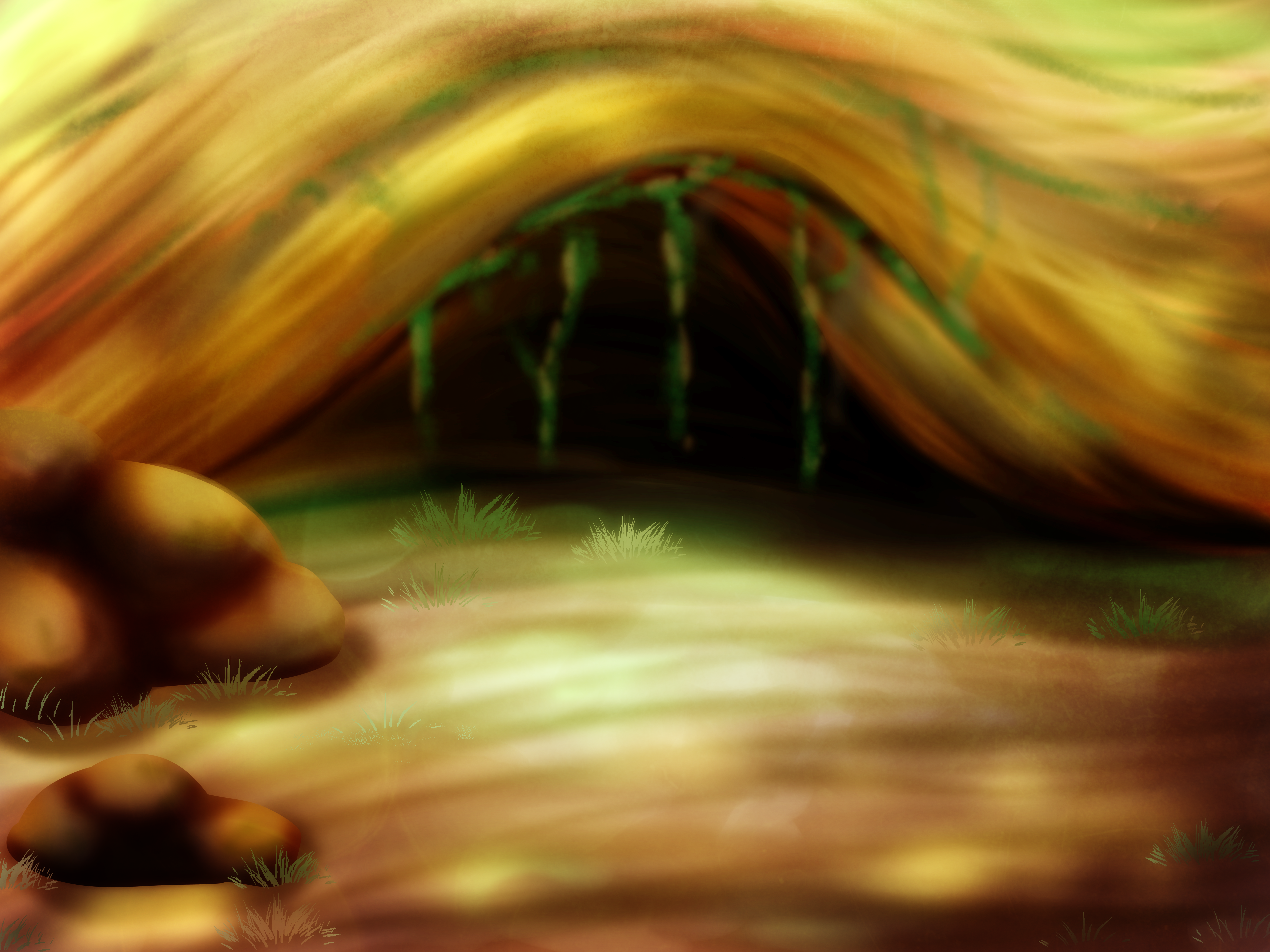
This is my first attempt at a digital landscape painting in oils. I'm trying to be a bit more diversified and thought I'd try my hand at it. Go easy on me, I was learning. Any tips especially from veteran painters would be greatly appreciated.Done in Painter IX
Under 5 hours
Related content


Comments: 34

The foreground looks really good, especially the closer grass and rocks. However once you get past the cave every thing looks a bit too blurry and out of focus. I wish I had advice but a painter I am not.
I really like the colours you used though, especially in the sky.
👍: 0 ⏩: 1

Thanks for the comment. I'm working on being a better background painter, I haven't had much practice at it. I did want things to be less in focus as they go back, especially the background. Maybe I overdid it a bit though.
👍: 0 ⏩: 0

I don't know if you wanted it to be photorealistic or not, but now it seems like from a fairy-tale. I think the colors should be less saturated and more shades of the green could be there.
👍: 0 ⏩: 1
Yeah, I really struggle with colors, I can never seem to get them natural enough. I'll keep working at them. Thanks for the comment.
👍: 0 ⏩: 0

I like it. I think it looks really good as well. The roots from the tree coming down in front of the cave is a really nice touch. For a first try this is damn good 
Sadly, I can't really critique this as I am no BG artist myself
But anyways, great work!

👍: 0 ⏩: 1
Hey, thanks for the comments, I really appreciate them. One day, i'll be able to create realistic stuff. Just gotta keep trying.
👍: 0 ⏩: 1
Exactly ")

👍: 0 ⏩: 1
Yeah, i'm getting the hang of it. I just need a bit more practice and technique.
👍: 0 ⏩: 0


I can definitely see a lot of improvement here from your other PS works! Great job!
I love the realism you put into this, and the colour combinations/texture of the rock is sporkin' in my book
Can't really give you more 'tips' on this because I'm a traditionalist meself (primitivity, ftw!)


👍: 0 ⏩: 1
Well, I'm more looking for painterly tips, not so much in the Photoshop department. I do need to mix up my color pallette much more than I'm doing here and use alot more warm highlights and cool shadows. It was good practice, I'll leave it as is and move on. Thanks for the comments.
👍: 0 ⏩: 0

Well, the color scheme just screams of your style, if that makes any sense. It reminds me of a few Charred Dirt maps mixed together. I'm impressed with the hills in the background, as I've always had trouble with those.
👍: 0 ⏩: 1
Yeah, hard to get away from my own art style since its, you know, mine. hehe. For background hills, just make sure they're really desaturated and a tad out of focus. You also don't want alot of detail back there. Makes it seem far away.
👍: 0 ⏩: 0

Great work!
I think that the hill just behind the cave could use a little more attention. I see some lines that kinda look like squiggles (I really don't mean that in a bad way). There's good shading underneath the wiggly lines. I think it'd be just as good with that shading alone if you don't want to do individual blades of grass.
I think it's a great start though. And I envy your ability to digitally paint on one layer. I can paint on canvas just fine, but with Photoshop, I know I have the safety of layers and have yet to resist using them.
 (Smile)")
")
👍: 0 ⏩: 1
Yeah, I see what you mean. I like the treatment of the left side of the hill but the right is a tad lacking. If you've ever painted with real oil paints, its all on one layer of canvas so its not a huge step to do so in photoshop or painter. Its kindof refreshing getting back to straight painting. You should try it. Thanks for the comments, very well thought out.
👍: 0 ⏩: 0

It looks great for a first attempt. I think it would be much better if some details were added so it can be more realistic (batches of grass in the foreground).
Anyway keep it up
 (Wink)")
👍: 0 ⏩: 1
Thanks. I'll keep trying to make these better.
👍: 0 ⏩: 0


Wow thats really good for a first try!

👍: 0 ⏩: 1
Thanks! It is a painting. I only used one layer.
👍: 0 ⏩: 2
Wait, so I'm a bit confused yarr. A painting in PS is classified by the number of layers? So if it has more than one is it just called 'digital' art or whatever?
👍: 0 ⏩: 1
Digital is anything done on the computer. Even if I'm painting on one layer its technically digital although I'm approaching the piece just like if I would a normal oil painting, without using layers or any sort of photoshop magic.
👍: 0 ⏩: 0
Youre welcome!
Yes, but I tought of a traditional painting 
👍: 0 ⏩: 1
Oh yeah. Could have done it that way but I don't have any paints at the moment. Its faster and cleaner on the computer.
👍: 0 ⏩: 1

It really depend on what you want to use it for. If it's a backdrop for a cartoon, I'd say leave it as it is. If you were shooting for a more traditional feel, you need a.) more darks: if you totally desaturate this, how much contrast is there?, b.) color variation. Right now it looks like you just used the values of one portion of the color wheel (which isn't a bad thing in certain situations). Try making the things that are being exposed to sunlight or reflected sunlight a little yellow, and the things in shadow a little blue or purple.
Whew, sorry for the long-winded comment. That's pretty much everything I learned in my landscape painting class.
👍: 0 ⏩: 1
Don't be sorry, that was dead on. I worked in some yellows on the highlights but not much on the cool shadows. I was aware of that. I also noticed how little value contrast I had in the picture. Originally it was alot duller but I popped it into photoshop and adjusted the levels. I wasn't really intending this picture as a backgdrop for anything, just practice. Thanks for the awesome critique. I really appreciate it and will take it to heart.
👍: 0 ⏩: 1
Any time, my friend, any time.
👍: 0 ⏩: 1

I'm not a great bg artist myself, & for a first try it's pretty well made. Textures, especially in the rocks are well defined, & the color depth further back makes it more convincing
👍: 0 ⏩: 1
Thanks, I appreciate the well thought out comment. I feel the depth isn't quite as good as I was expecting but turned out alright.
👍: 0 ⏩: 0