HOME | DD
 Silvervest — A Local...
Published: 2010-06-25 22:10:54 +0000 UTC; Views: 22890; Favourites: 138; Downloads: 66
Redirect to original
Description
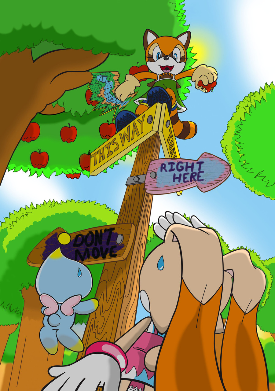
(Just pretend there is an exclamation mark in the title...)I was going to have this picture as a follow up to a previous one I would have done where Cream is getting hit on the head by an apple while walking but I figured that would be a waste of gallery space since it doesn’t really convey anything you would need to know or want to see.
I shouldn’t need to tell you all what kind of mindset I was in when I drew this but since I went through all the trouble of strapping in and ball gagging yall’s asses I might as well…
This is arguably my first relatively successful venture into perspective as I practically knew exactly what I wanted.
(What’s that you say, the bondage is too tight? I hope so.)
It was the first picture of the new series of pictures I was doing and I knew exactly how I wanted the colors, bright and storybook-like. Unfortunately, how I knew how I wanted to do the colors and how I know how to do colors were two completely different things.
(What’s that, you’re asphyxiating? Yeah, I’m excited too!)
Strangely and ironically enough, the colors would actually end up abruptly getting darker than I seemed to be going for here so savor this lighthearted storybook-like setting while it last.
And btw, ignore the map in this pic, it tells lies.
(The safety word is Jasonjenson. *Whip Crack!*)
Related content


Comments: 8

👍: 0 ⏩: 0

No, I want Cream to be hit on the head with an apple!

👍: 0 ⏩: 0


(Ball gag? How cliche. In this day and age, I expect a litt-OWGODTHATHURTS!)
I don't believe my eyes...You have returned...again. I don't know if you remember, but I left you a lengthy comment on your first story's pic "Pinned Him Again..." Ever since, I've been waiting feverishly for you to deliver on your "next series." Well, maybe not feverishly but I HAVE been anticipating it. At first, I was afraid it'd be a series I couldn't relate to but seeing you continue with "The Morally Ambiguous Adventures of Cream and Cheese" has been the highlight of my entertainment consumption ever since I ran out of subtitled "Zyuranger" episodes to watch. Confused? You should be.
(A cat of nine tails? Puh-lease! Wait...w-w-what are you doing with that shaft!?)
First thing's first, I'll discuss your technique. I concur that nothing in your gallery has attempted perspective like this. As a semi-seasoned viewer of art, I must say that your execution of the angle is spectacular! The size of everything changes perfectly as you climb up the picture; neither too big nor too small from what you'd expect from the angle. The placement and perspective we get of everything from the sign to the apples to the characters themselves are also expertly executed and look like they’re where they should be; for example, Cream's semi-upskirt shot is a perfect shot from where the "camera" is in relation to her and seeing the base of the apples helps conveys depth and height.
The colors look pretty much exactly as they do in official Sonic Team art and your shading is very well-placed, especially on the trees. Can you tell me how you do those outlines? Every time I do outlines for a pic, they always look pixilated but you and other artists manage to make your lines look smooth, like they're supposed to be. Do you just make the picture FRAKING HUGE so that when DA blows them up, they're not getting stretched?
Unfortunately, I have some critiques to give. Cream's hand closest to the "camera" is great but the hand shading her eyes seems a bit off. The way people usually shade their eyes looks like a military salute (at least the way I do it). From the "camera's" angle, we should be seeing mostly just the tips of her fingers, not the underbellies as you have. Another problem with Cream is that it's hard to tell she's looking up. OBVIOUSLY, the angle, her hand placement, Marine's position and knowing that Cream has big eyes to look all over with tell viewers that she's looking up. However, the same way a character wearing a mask would want to overdo their movements and gestures to make them easier for people to notice, Cream's head be tilted just a teensy bit more upwards to compensate for her obscured face. Marine’s apple-holding hand is a tad off. The pinky seems to be hidden by the apple rather than holding it. The last things I'll poo-poo are your "Don't Move" and "Right Here" signs. While the wooden arrows themselves are great, the coloring and letters you put on them kind of feel out of place. It's not that I don't like them but they feel very chalky and rough. They don't seem like they belong in the same pic as your smooth, streamlined lineart and colors. I don't mean to be a sore ass, nit-picking minute details that nobody notices but I figure you can use constructive criticism more than you could a meaningless praise-shower.
(Speaking of "sore ass"....Ooooow!!!)
Now for my favorite part: analyzing the story! I was a big fan of your first story and this one doesn't seem to be disappointing anytime soon. I've always wanted to see a Cream and Marine story and with you penning...er, drawing the narrative, I know it's bound for childish cuteness so sweet, it'd give you type 2 diabetes blended with your own unique mature themes and humor.
This pic is a great starting point. Meeting by accident and then going on a multi-day adventure is so quaint that you can't help but get caught up in it. The colors, while accurate to what Sonic Team uses, are also heart-warming as are the shapes of background elements like the apples, signs and trees (I especially love the breeze you gave them). Once again, you've mastered the art of the "storybook" style! The only thing I'm gonna say to the contrary, however, is that your new, streamlined presentation looks more ready for action. The first story looked like it was colored in with crayon, giving it a look as folksy as the story itself but this one is too polished and professional-looking. Balancing this out though, are your fantastical colors and the fact that your stories haven’t lost their cute factor. Seeing a style more accurate to Sonic Team’s will be a nice change of pace.
Despite the new style, you seem to have a great deal of continuity here from the last story. You kept the heroine from last story and the same "everyday life" premise so this feels just like the story I fell in love with. You brought back one of Cream's dresses from season 1 (my favorite to be exact) and Marine seems to have a few stylistic similarities to Klonoa. As far as the plot's concerned for this pic, I guess that some time after the "Tails arc" concluded, Cream took a stroll around South/Emerald Island with Cheese until an apple hit her head. Looking skyward, Cream and Cheese were surprised to see Marine climbing on signs and picking apples with her bare hands like someone out of an adventure movie. Marine comes from afar, stopping at Island in search of something but isn't too familiar with the terrain (hence the map) and asks Cream, the titular "Local," for directions. That sound about right?
(I can’t wait to see this story as it develops and the cute/drama/humor builds up. In the meantime, however, I’d REALLY like to get out of this gimp attire…WHAT WAS THE FRIGGIN’ SAFETY WORD AGAIN!?)
👍: 0 ⏩: 1

Sorry for the incredibly long delay of the responce, but you see I've recently come down with a bad case of the "fuckits" to which I never fully recovered. So yeah, I'd been responding here and there but there are comments much shorter than yours I still haven't even finished reading, and not just because I can't read but because it's an effort to care. (Nut cancer for me.)
So let's make this quick. Take off your things and let's get to it. ("Dear Mr. Hudson," colon:...
):
Aww, you know wait feverishly for my pictures? Now I go cut myself. T_T
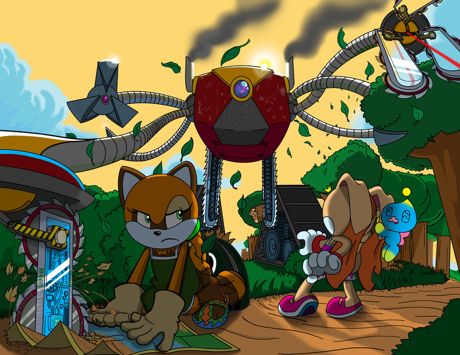
While I am still pursuing the other series’, I have decided not to post the pictures on this channel. So don’t worry, this channel will be nothing but Tails, Cream and Friends or Cream, Tails and Friends or Friends, Tails and Cream or Tails, Friends and Cream or Tails Cream on Friends, or Friends Cream on Tails or Larry, Moe, and Curly.
You get the idea. Unless you're Sarah Palin...
Yeah about the perspective thing, I really didn't know what perspective was when I sat down to draw the picture. I probably should've explained this in the description: The first thing I drew when I sat down was the shape for the sign pole since it was basically the center of the picture but I didn't finish it. Instead, next I drew Cream since her ass was going to be taking up a huge part of the foreground. Marine and that damn apple followed shortly after and once that was done I easily jotted down trees and was ready to start inking. After that I was ready to start colo--fuck, I forgot Cheese!
Naw, the colors in official Sonic Team art have these weird white lines near all the edges, true, I did try to apply this color scheme to Cheese but only because I hate him or her. My method? If I tell you how I create pictures then they won't come true! So sorry, I can't tell you that first I draw them on paper and scan them into the computer and "ink" the lines with Adobe Illustrators vector based line making pen and brush tools and then color them in Photoshop before going downstairs and raping a clown. Although I wish I could, but then I'd lose my FAIRY GODPARENTS!
lol, I like how you treat me like a competent artist. I hardly think about this stuff when I'm drawing the line art. Most of the reason, logic and frustration come AFTER I draw it and while I'm coloring it and usually in the final freaking stages of development that I see a fatal flaw with the picture. The hand solute thing, I figured since she was looking up her hand would have hindered her vision, instead I tilted her head back. I like a balance of negative comments, they are much more useful than the positive (ass-kissing) comments.
I had no clue what I should do about those god damn signs, so I just put down the first thing that came to mind…and then common sense and decency made me erase it and change it to something oh-so witty and totally appropriate. With the colors I was TRYING to make it sloppy, although it I couldn’t find that damn crayon brush. I fully admit the letters on the top signs are terribly angled, I know I can’t hide that fact (my look-over-there-in-the-opposite-direction pixie magic isn’t that powerful.)
Constructive criticism ftw!
"Childish cuteness"? Well, for now, yes. Though I didn’t intend it for this picture, the action will pick up soon as I can dedicate the time to just this series but right now I’m dividing it amongst other series. The continuity should be fine as long as Rob Liefeld isn’t writing and drawing it.
P.S. There is no safety word, only safetyER!
(Man, you gotta try some of these psychedelic brownies.)
👍: 0 ⏩: 0

I like this one a lot, because it has that whole"Alice in Wonderland" sort of feel to it. Vibrant and colorful, while delightfully confusing (classic, that sign is, no matter how cliche).
I especially love the dress that you gave Cream, and the perspective of the picture as a whole. But, this picture isn't my favorite of this little series that you have made, although it is one of the best artworks that I've seen of Cream and Marine on this entire site.
👍: 0 ⏩: 0

Its good to finally see some art from you again! I stumbled upon your gallery during your time away and found it to be truly amazing. I would have to say your art style indeed stayed the same, which I think is pretty cool.
Also I have to give you your props on this picture because this looks like a challenging angle to draw from. I could never pull this kind of angle off, I've tried before but it never turns out right. Awesome work!
My favorite part of this picture would have to be the words on the sign. I laughed to myself when I read them.
👍: 0 ⏩: 0