HOME | DD
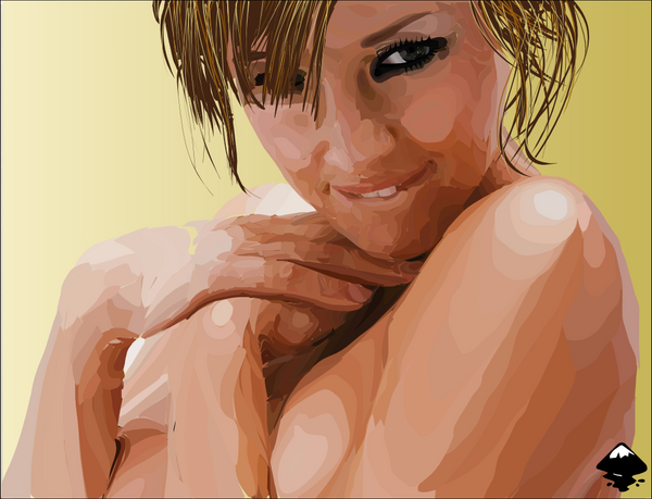
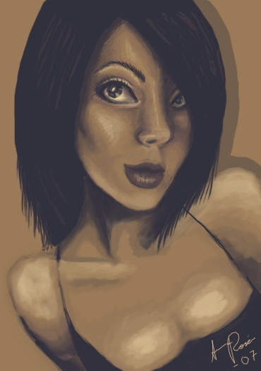
 Simarilius — Susan Ward

Published: 2005-05-11 21:50:20 +0000 UTC; Views: 17809; Favourites: 30; Downloads: 1076
Redirect to original
Description
A hot female as requested by =ScislaC .Manual vectorisation done in Inkscape, 2 1/2 hours.
Related content


Comments: 21


Thanks, glad you like it
")
👍: 0 ⏩: 0

Well done....
P.S. I would really love to see this same piece re-done from a photo with allot stronger side lighting on the subject...
The best part of this piece are the highlights.....
i was itching to see the whole side of her face fully lit up and bleached out....
Your getting the beginnings of what i would call a painterly style....(you have a fair bit of natural tallent.)
I like your stuff....(and for some reason i always feel a yearning for more... its almost like i can feel your at a "water shed" or something and that your about to explode or something...
Sorry to crap on..perhaps i should have just said cool pic...LOL keep it up....2 hours im envious)
👍: 0 ⏩: 1
I'd love for her to drop by in her bikini so I could put some stronger side light on her, dont think I'm gonna be quite that lucky tho
👍: 0 ⏩: 1
you never know your luck in the big city
👍: 0 ⏩: 0


OOH, when I saw this from afar I thought it was a photo. Well done, this looks really realistic. Very hot.
👍: 0 ⏩: 1
thanks, yeah it definitely works better from a distance (or scaled down)
And yeah, susan ward is a major hottie
 (Smile)")
👍: 0 ⏩: 1

Lovely! If you applied a bit of blur to the layers of skin tones except for the bottom layer, it would give a more realistic, fluid feel to the skin. Nice work!
BTW, thank you for the flattering comment on my Django pic!
👍: 0 ⏩: 1
Yeah, have played a little with that. Problem is tho that there isnt so much layers as a bunch of disorganised shapes all next to each other
👍: 0 ⏩: 1
Know what you mean. Have you tried the Alt+click feature? Alt+click switches between the layers, so once you've bitmap traced an image (make sure "stack scans" is clicked), Alt+click between layers rather than moving them, leaving them stacked. I love the bitmap trace feature, but the drawback is every object has millions of nodes even after simplifying, which can be frustrating (processors working on overdrive-ha!). On my portraits, I actually prefer to line/curve tool hand trace the tones of skin (less frustrating nodes), and using layers of gradients, the Alt+click feature, and so far, most of the portraits were originally black and white, which seems to be easier to trace and then render the colour to the objects. I learn something new each time I work with Inkscape. Before I started Inkscaping I hadn't really done any vector art since most of the progs had such steep learning curves and frustrating tools, but Inkscape is a wonderful tool! You might also enjoy Rotoscope (found on Source Forge or Freshmeat). I did a few Rotos, tweaked the colour in Photoshop, and then bitmap traced them in Inkscape, which came out nicely. Looking forward to seeing more of your work!
👍: 0 ⏩: 1
Its a manual trace, rather than the autotrace. and my workflow is too disorganised to have nice orderly layers
👍: 0 ⏩: 1
Hey, sounds like my method- ha! It's all good.
👍: 0 ⏩: 1
[link]
gives a pretty good example of how the images are built up. slightly deceptive tho as some of the first shapes shown there are some of the last I draw, where I put big blocks of color in behind every thing else to fill in any gaps
👍: 0 ⏩: 1
Nifty to see it all come together! Inkscape on YouTube- yay!
👍: 0 ⏩: 0

suhweet!! truly excellent bro! how could I not 
Psssst, you need to add another colon to the end of the ":devscislac"
 (Wink)")
👍: 0 ⏩: 1
Glad you like it mate, had wondered what i did wrong with that tag, thanks for explaining ot the noob
ta for the +fav too.
👍: 0 ⏩: 0

Very nice vector. I do like the shading style, though in some areas it doesn't feel as fluid as it should.
👍: 0 ⏩: 1
agreed, i should really put some more work into it, but it was getting late and I was hungry
I might rework some of the areas a bit.
👍: 0 ⏩: 0