HOME | DD
 simone4390 — Jan

Published: 2011-03-24 15:43:46 +0000 UTC; Views: 609; Favourites: 15; Downloads: 13
Redirect to original
Description
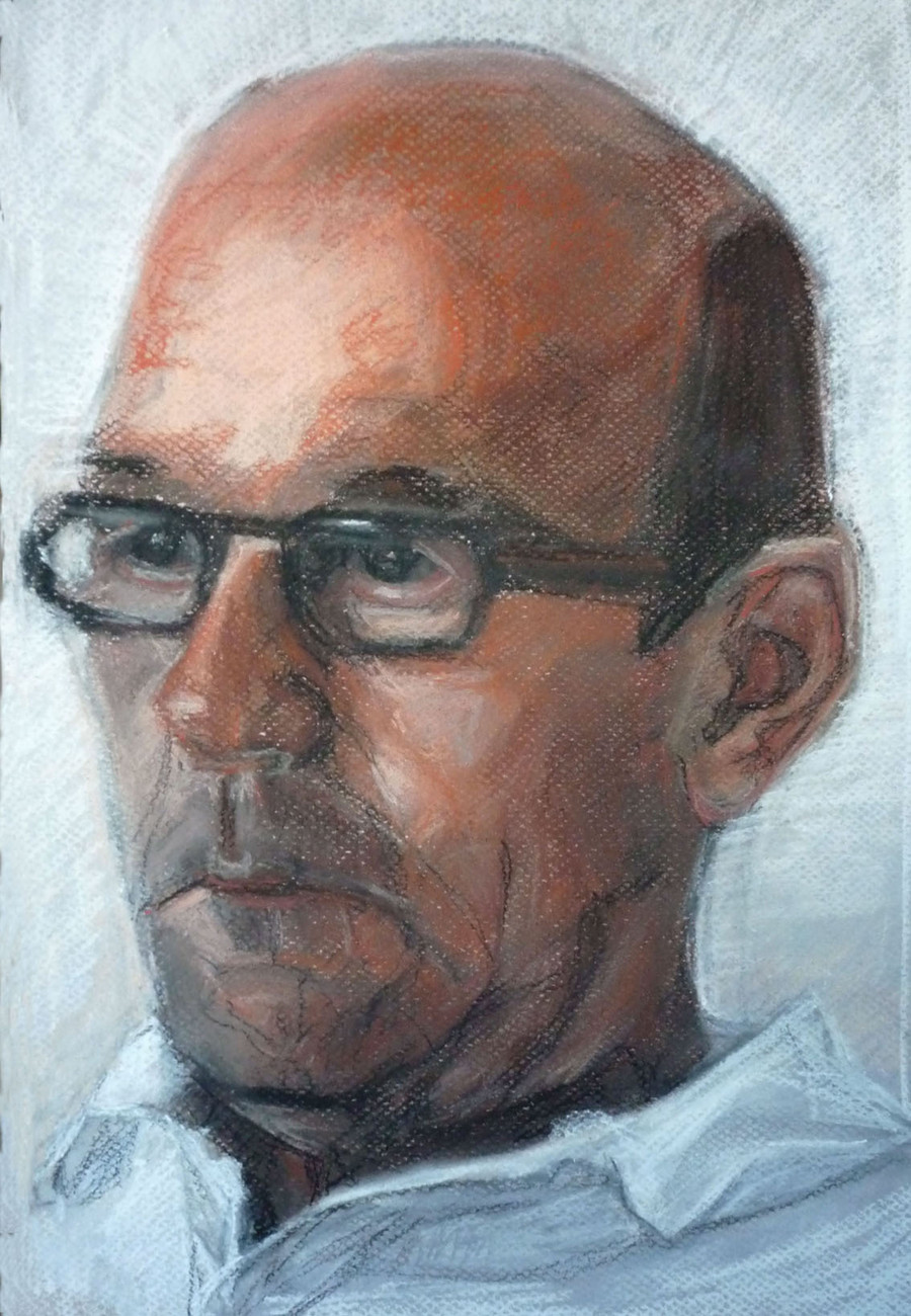
From life. Pastel and conte on Ingres paper.Feed back and suggestions much appreciated!
Related content


Comments: 18

This is very good work! But if you want some feedback on it, as mentioned below, the clothes could maybe have a little more detail, and also the far ear looks to be at a bit of an odd angle but maybe that's how he is! Still, well done though, great piece!

👍: 0 ⏩: 1

Thank you. I will keep it in mind.
👍: 0 ⏩: 0


My first thoughts on this piece is that it's rather dark - is that from producing it digitally or is it actually that dark? Either way, you have handled this portrait beautifully. He appears lifelike, especially in the way you have shaded his features and kept the expression to his eyes. The wrinkles and general facial structure has also been shaded beautifully. Another lovely piece!
👍: 0 ⏩: 1
Thank you. I have drawn this from life on gray paper and it is actually that dark. But I may have exxagerated it.
👍: 0 ⏩: 0

wonderful blending of different colors and having it all come together as one. i like how you gave the piece colors to match the atmosphere
👍: 0 ⏩: 0

You have really great skill in creating structure. The eyes are very expressive, and you captured the wrinkles and folds in his face well. It looks like an impressionist painting ^^
I also like the lack of detail in the clothes on this one, since it draws more attention to the face.
👍: 0 ⏩: 0

Wow, I didn't know Ingres had a type of paper named after him. Learn something new every day...
Love your method of laying down the color. Very energetic. You also did great with the contours on the surface of his face, especially around the mouth and eyes. I find older people with wrinkles have more character and are more fun to do portraits of.
Great job keeping his eyes focused, too. That's something I have a lot of issues with, portraits or otherwise...
👍: 0 ⏩: 1

This is great- the wrinkles look real on him ")
👍: 0 ⏩: 0


Wonderful expression in his features and eyes. I like the combination of blended curves and angular planes that you used here Simone.
👍: 0 ⏩: 1


This is very well drawn! :higfive: high fives are in order  (Smile)")
👍: 0 ⏩: 1
Thank you for your feed back and compliment
👍: 0 ⏩: 0