HOME | DD
 sinthux — DIGG

Published: 2008-04-04 04:44:41 +0000 UTC; Views: 11596; Favourites: 17; Downloads: 67
Redirect to original
Description
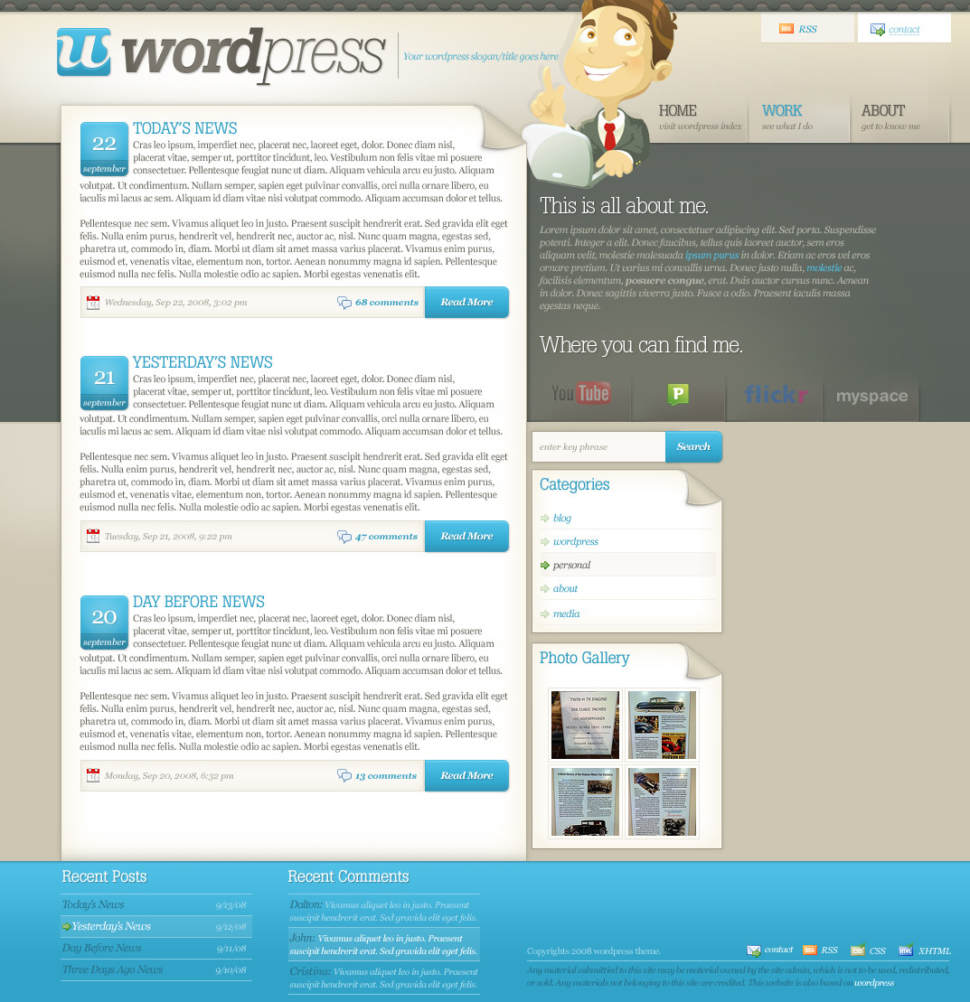
It's a shovel. (Smile)")
This was not designed for DIGG by any means.
Related content


Comments: 16

hello i featured your work here on my journal [link]
👍: 0 ⏩: 0


TashiMohashi [2008-09-25 19:24:37 +0000 UTC]
This is so simple at yet I think it's one of the coolest things I have ever seen lol. that's awesome!
👍: 0 ⏩: 0

dude, cool, lol. also reminds me of how the death note logo words are written
👍: 0 ⏩: 0


Very creative how you came up with the idea on how to make it look like a shovel
👍: 0 ⏩: 0


that's a damn good concept...puttin the word to represent what it is
👍: 0 ⏩: 0


lol its looks sweet man!...seruisly nice idea u had there!
👍: 0 ⏩: 0

Neat! I think the glyph after the eye is too weighty compared to the rest though. Maybe if that was pale blue it'd help to give it less importance!
👍: 0 ⏩: 1

do you mean the actual eye without the dot? i wanted to make it vertically taller than the rest, because it seemed a bit fragile being the normal weight.
👍: 0 ⏩: 1
I mean the glyph on the right of the "i" (the handle).
👍: 0 ⏩: 1
yea, i felt like it was fragile in the normal weight. if you have any other suggestions feel free to note me with them though. open to any changes
👍: 0 ⏩: 0