HOME | DD
 sinthux — RapidCraft Interface

Published: 2008-08-14 14:30:23 +0000 UTC; Views: 35047; Favourites: 172; Downloads: 1176
Redirect to original
Description
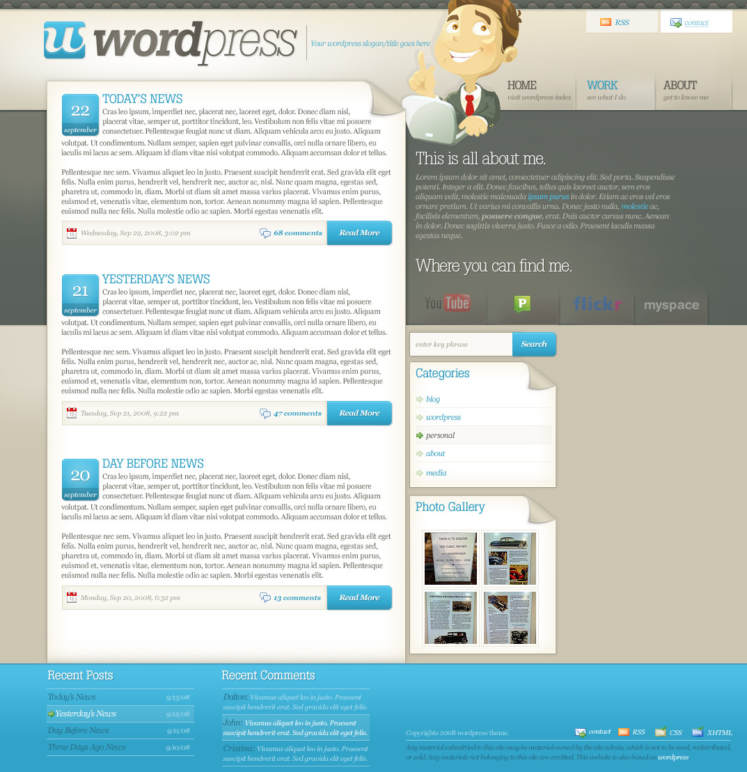
This is a project I've been working on for just over a month. I designed the company logotype, interface, and their current products. They wanted a simple interface that was 'flashy' and showed purely what the company was about in simple viewing. This is what I ended up with and I'm pretty satisfied with the outcome.There should be a coded version up soon with all of the tabs working. The rest of the pages weren't really as graphic intense so I won't be showing those.
enjoy!

Related content


Comments: 43


i love it! can i use your design as my reference? its the purpose of my education.. :wow!:
👍: 0 ⏩: 0

wow the gradients're perfect !
what a perfect job !
👍: 0 ⏩: 0


it looks good, makes a look like some 3D effect or some thing like that..
👍: 0 ⏩: 0


This is very well done. Bold, unique, bright and yet different due to the lack of white background. There are really only two things that strike me..
It feels slightly busy.. part of it is the header.. i love what you've done with the faded text.. but maybe fade it just a hint more? As it stands now it's competing for attention.
The bubbles that i'm assuming pop up on click or roll over... being see through is cool.. but it makes it a little harder to read for some. Perhaps find a more contrasting type of text or decrease the transparency.
I love the overall color scheme. The layout is easy to navigate and easy to use. Well done!
👍: 0 ⏩: 0


")


It's not bad but I think you should use a bolder font for the left text parts.
👍: 0 ⏩: 0


It's beautiful to see contrast edges, deep colors and icons're so attractive.
But 2 cons:
1.There bachground logo duplicate is only doing "garbage" in header (and its unable to read it)
2. There is 3rd color only in left-menu, you should use it wider in the whole layout
Good Luck!
👍: 0 ⏩: 1

each menu button has its own color, which is why you see the green and orange on the navigation.
👍: 0 ⏩: 1

Very cool!
I love all the graphics, and the blue is sexy!
👍: 0 ⏩: 0


Very nice! Incredibly professional! You hit it spot on - perfect
👍: 0 ⏩: 0

Fucking brilliant. Thank you for telling me about this too, although of course I would've seen it, since I watch you
I really like the slight "chunkiness", the bold and very well executed "3D" aspect to all the elements that make up the overall layout. Everything's big, and the flow seems easy to follow.
My only criticism is that it feels a little too busy. Generally I like to leave 1/3 free space. Though of course, there's always the possibility that this was your intention, so I'll just leave it at that, and tell you once again, that it's awesome, and your efforts were worth-while.
I'd love to see the site when it's up

👍: 0 ⏩: 1
i always love long comments for my work
i'm kind of surprised myself that i used such a bold look. usually i'm too shy to go bold
i know what you mean by it needing more space, but it seems like one of those things where i have to grow into giving an abundance of space
that seems like the main criticism when i upload work to here; 'it feels a little too busy.' maybe i should work on that?
")

👍: 0 ⏩: 1
My friend `niteangel is the first person to ever teach me anything about design and the first thing he ever told me, was to always when possible leave 1/3 amount of free space 
Perhaps you could experiment and see what comes of that  (Smile)")
👍: 0 ⏩: 0

The blue gradients are sexy. Both blues, and grays go great with each other.
👍: 0 ⏩: 0


omgg i JUST got on bitch jeez
and again, this is amazing! ur so gooooood at this

👍: 0 ⏩: 1


Awesome mister.. O_O
I love that font! What's it called?
👍: 0 ⏩: 1
neo sans
👍: 0 ⏩: 1
Thanks a lot mate.. great job, it's so sexy.
👍: 0 ⏩: 0


insane!!! if i eva need webpage im gonna go to u man... been seing sum pages getting DD here on dA, and here i am wondering why the fuck u havent gotten one yet, ur probably the best webdesigner out thr forthe moment
👍: 0 ⏩: 2
i know, i saw a design get DD'ed a couple weeks ago. maybe there's a D&I gallery directory now?!
thanks though
")

👍: 0 ⏩: 1
