HOME | DD
 SiriuslyArt — Positivity
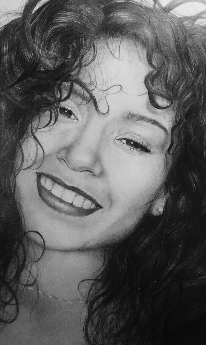
#fabercastell #graphitedrawing #graphitepencil #portrait #portraitgirl #realisticdrawing #realisticportrait #strathmore
Published: 2017-08-09 01:12:45 +0000 UTC; Views: 2538; Favourites: 38; Downloads: 1
Redirect to original
Description
So I'm finished. Sorry about the shine its a pain to photograph graphite. I tried my best.😒The reason I named it positivity because the photo I used for me represented a positive mind. I think that's its really important to stay as positive as possible. The photo I used came from pinterest the girl's named is Irene Aguilar. Hope you guys enjoy.
I used graphite pencils mainly tombow mono and Faber castell Pitt graphite on strathmore 200 series mixed media paper.
Related content


Comments: 26

this portrait turned out really nice! you have perfectly controlled the values - the image looks very realistic - very well done!
👍: 0 ⏩: 1

This is a beautiful piece! The detail in the hair and how it was used to frame her face is very elegant. All of the flyaway hairs and details help make this realistic. You also did a great job blending and making the skin smooth, it all looks fantastic!
The only thing that appears off to me, though it may just be my preference, but I wish that this piece was wider. It has so much going on, and with such attention to detail, that I want to see more of it. However, I also really like the composition on this.
Extremely nice!
A critique from: opinionstation.deviantart.com/
👍: 0 ⏩: 1

A short - a bit delayed, sorry for that - critique from :
This is a really good piece! I love how you've drawn the hair! Also, all the prepositions and shadows seem good. I general, just a stunning piece!
There are two things you could improve. First, dare to go darker on the shadows! Make some real contrast between the darkest shadows and the highlights!
You've already mentioned the second thing - the glare. Having worked with graphite myself I know how irritating and difficult this can be. Take a photo in daylight, as I find that it's almost impossible not to get glares when you use lamp light. Just try a bit around, and eventually you'll find something which works. Another thing you could try is to take a photo of the drawing with the surrounding desk, and crop away the desk afterwards. I find that this works, at least to some extent.
Anyway - this is a really great piece! Continue like this!
👍: 0 ⏩: 1

Thank u the contrast is something I notice as well. And thank u for the tip to avoid the glare.
👍: 0 ⏩: 0


Incredible Clariece! I cannot make a difference if this one is a drawing or a picture. Really amazing.
👍: 0 ⏩: 1


")
 (Smile)")