HOME | DD
 sis — handout

Published: 2003-01-10 09:25:59 +0000 UTC; Views: 1086; Favourites: 16; Downloads: 161
Redirect to original
Description
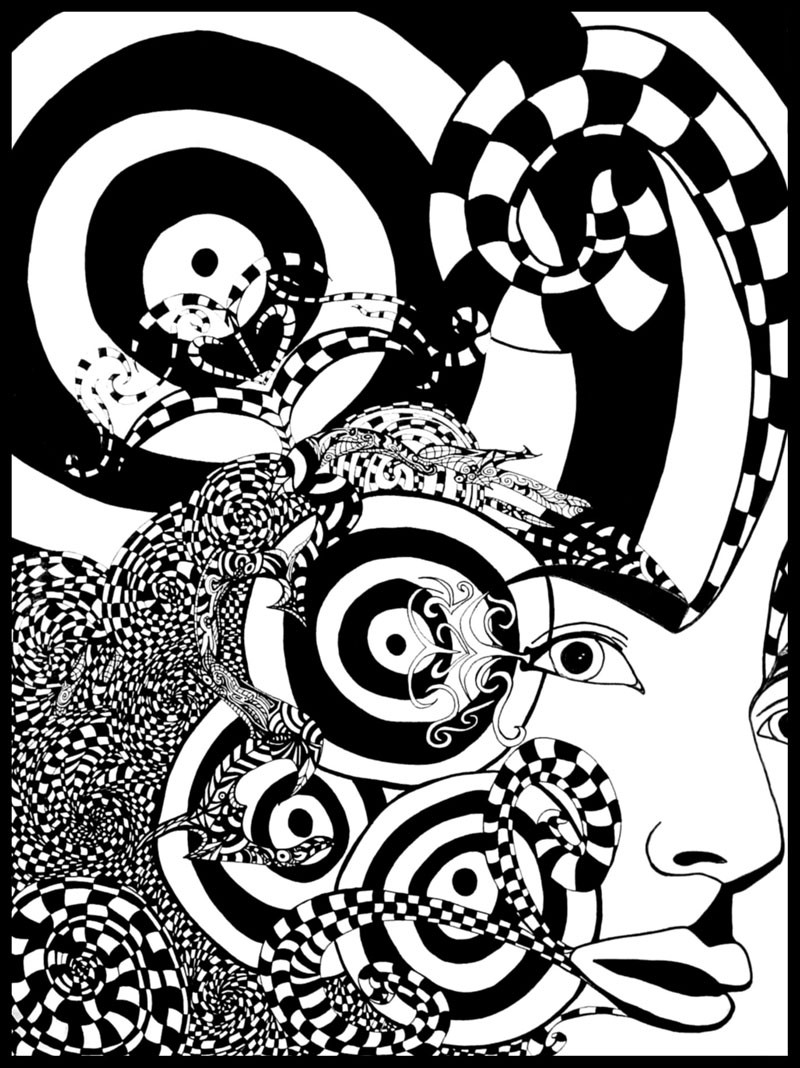
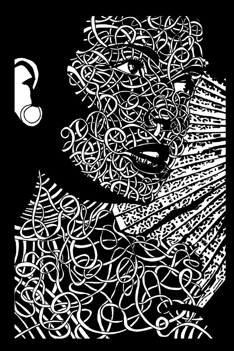
updating with a better pic.INK
Related content


Comments: 46


very cool, i dig it. i really like how you handled the pattern, great work...
👍: 0 ⏩: 0


that is just SO cool!
COOOOOoooooooooOOOOOoooool!


👍: 0 ⏩: 0


bloody marvellous
i love the fact that the black is sporadic but you can still make out the pose of the person
really nice work my dear


👍: 0 ⏩: 0


Sweet, very sweet. I love the detail in the skirt, contrasting with the overall sparse look. As always, your work is beautiful sis.
👍: 0 ⏩: 0


i love that the only suggestion that she even has an arm is one line and 2 lil dots. very groovy
 (Smile)")
👍: 0 ⏩: 0

I love the face and how we see just parts of the hand outstretched . . . really cool!
")
👍: 0 ⏩: 0

I really like this one.. Of all your inks. It's really got a grace, almost a slickness to it. Very nice.
👍: 0 ⏩: 0


EXCELLENT two-tone!!!!!!
Ugh. What I would DO to be able to get the hang of this.
So clean and professional.
I love the pose and expression too.
Like some strong, wild, exotic dance pose.

👍: 0 ⏩: 0

")

very nice sis. i love freehand...and i would love to try it someday...not the best drawer though!! 
👍: 0 ⏩: 1

practice practice and then practice some more
Thanks
 (Wink)")
👍: 0 ⏩: 0

oh sis!..taht is awsome..very nice inking...adn hte implied lines..very nice ^^
👍: 0 ⏩: 0

very groovy indeed love....i too dig the contrast and whatnot, gravy style

👍: 0 ⏩: 0

thats very good, u caputered the light very well, nice job
👍: 0 ⏩: 0

Veeeeery nice. I dug like you recommended and was not disapointed...not that i would have been anyway but...eh.
👍: 0 ⏩: 0

Okay, so I came here to look at our stuff after the jab in the fourms 
👍: 0 ⏩: 0

that skirt rules me. The tight lines and curves over the light are incredible and edible. I also love the line that drops from her left. But that straw weave and how the black reacts to it are unbelievably good. this rocks.
👍: 0 ⏩: 0

excellent work
your "doodles" are growing on me hehe
👍: 0 ⏩: 0

This is awesome... dunno what else to say. beautiful work.
👍: 0 ⏩: 0

"Hello. My name is Negative Space and I'll be your spiffy effect tonight."
Very nice. I'm loving the pose and the clothing.
👍: 0 ⏩: 0


how nice! I love this so much. I am adding this to my favs!
👍: 0 ⏩: 0

amazing reduction...minimal use of lines, whilst still retaining all the important details. the shading on the skirt (?) is exquisite. completely freehand or photo reference ? who cares, amazing stuff !
👍: 0 ⏩: 0

you do such great things with ink! oh do more!
I love the pose.
👍: 0 ⏩: 0

Mmm! Another lovely! I really, really love te purity of the white and stark black shadow! Beautiful yummm!!
👍: 0 ⏩: 0


OK, now I'm just going to break down and cry. lol I love your doodles.
👍: 0 ⏩: 0

ya.. . your pen+inks are easily your strength.. . all of your "doodles" kick ass. . excellent use of negative space. . . you should do ALOT more work like this. .
👍: 0 ⏩: 0

Wow! If this is what you call a doodle...
The contrast is amazing...how she seems to merge into the background and become one with it...and at the same time she seems to extract herself from the background...I like the cold and stern look on her face...this is a very very strong piece...
👍: 0 ⏩: 0

That's neat! I agree with boxxor, the contrast is awsome! Nice job
👍: 0 ⏩: 0

strong is the word! not stron! now spank my ass everybody
👍: 0 ⏩: 0
really cool one
i like the stron contrasts
great pic
boxxor
👍: 0 ⏩: 0