HOME | DD
 Skeptic-Mousey — OC cutie mark design

Published: 2013-04-15 13:50:19 +0000 UTC; Views: 13029; Favourites: 250; Downloads: 131
Redirect to original
Description
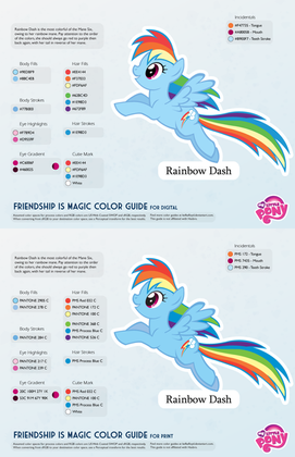
It's been a very, very long time, and for that I apologise. But let's get right back into it with something that's hopefully useful.Much like the saturation and brightness OC guide thing I did a while back [link] I thought i might have another go at helping the budding artists within the community. Plus hopefully reduce the more... design challenged OCs around. (says the guy who doesn't have one.


 ) Just trying to help.
Admittedly this is very word heavy. However I tried to make it as relevant, and as understandable as possible. That said if you catch any grammar errors or the like, point them out and I'll go back and fix them up. Like everything I do, I make these late at night, when I probably should be sleeping so some mistakes are expected


 . (Before anyone points out that "colour" is spelt "color" without the U it's "colour" down here in Australia. Such are the quirks of the English language.)
Vector credits.
Rainbow Dash and Applejack cutie marks.
Celestia cutie mark
Octavia cutie mark
Rarity
Cheers everyone.
Related content
Comments: 33

I get what your saying with regards to it making sense with the established universe, I think my OCs would be fine, considering they are all spec-ops types. Like my OC Alembic, his is a reticle over a heart. Or Cheytac, her's is a sniper reticle. Or Fallout, cause her's is a radiation symbol.
👍: 0 ⏩: 0

The pony's name is Pumpkin Spice,is it a good idea to give her a pumpkin with a coffee cup for a cutie mark?
👍: 0 ⏩: 0

Lol this actually helped me focus on my upcoming design.
👍: 0 ⏩: 0

I have one problem with the bit about "originality": There are only so many ways you can show a talent like "writing" or "drawing" without it being redundant. A lot of people have to use feathers or pencils or a brush if they want to keep it simple.
There should have been more tips on how to vary these simple images and how to portray their messages. Applejack's cutie mark, for example, just depicts a simple apple three times, showing her devotion to apple bucking, apple growing and the Apple family as a whole. Meanwhile, RD's cutie mark combines her hair colour with a lightning strike, both leading back to the Sonic Rainboom that made her get her cutie mark.
👍: 0 ⏩: 0

hooray! i see so many people's ponies with an entire picture as their cutiemark take notes :3
👍: 0 ⏩: 0

What would be an okay example of a cutie mark for an ice-based pony?
I have a character in mind, but I feel like the mark being an ice crystal would be way too cliche. If anything, it also could get me flamed for being too similar to Rarity's mark appearance.
Any ideas would be great
👍: 0 ⏩: 4

Good idea, and thank you, but my pony character no longer exists lol
👍: 0 ⏩: 0

I think I might redesign my OC's cutie mark 
👍: 0 ⏩: 0

Spiffy! I think that cutiemark design and logo design share many things in common. A good logo is pretty simplistic, symbolically connect to the company or product, etc, and can be recognized even when printed in only black and white, and seen from far away. Though... I suppose cutie marks have a bit more leniency toward color and recognizing them from far away.
Mention might be made that vectors are ideal for cutiemarks. Though you did kinda mention it indirectly, when you talked about the example ‘needle and thread’ cutiemark, used. I guess you don't have to worry about it, it's just a tip really, not fundamental to designing cutiemarks.
👍: 0 ⏩: 0

ANd I've seen alot of people's mlp oc's with cutie marks that represent their name.. ='P
👍: 0 ⏩: 0

That is one of my biggest problems with making ocs, right up there with diversity in character design! I haven't really posted any because of it. (oh, and laziness) I think I'm getting the hang of it though. These are all really good points.
👍: 0 ⏩: 0

I made a related one without knowledge of your work. [link]
👍: 0 ⏩: 0

First of all, let me tell you that when I draw OCs, the cutie mark takes top priority. And you've nailed all the design principles I use on the head. Congratulations.
This is also a sheer masterpiece of graphic design. (I'm from Singapore, which uses British English pretty much, so no problem with that "colour".) I'd like to see what you think of my own OC, Parcly Taxel (cutie mark here ; Parcly is a rather introverted chemist). Besides that, what font was used in the body, and where can I download it?
👍: 0 ⏩: 1

Thanks! It's always great to hear people like my work. The colour scheme of your OC is good, nothing like the red / black / highly saturated monstrosities I've seen. (Nice to know some people have some sense of design 
I had a quick look through your gallery, and you say in this [link] deviation something that I've always thought. If an OC pony was placed in the background of an actual episode, and they (easily) stand out, then the OC is poorly designed.
The font used in the body copy is "Quan" and I got it from here. [link]
Thanks again.
👍: 0 ⏩: 0

I'm an aspiring game developer/designer and even I don't think my cutie mark would be "video games". That's just silly.
My cutie mark is obviously being a lazy shit.
👍: 0 ⏩: 1


👍: 0 ⏩: 0

Good to see the wiki being used well, and very good "how to". Too bad I already have an OC, maybe I'll use this for a later one
👍: 0 ⏩: 1

Thanks, and yes, the wiki has served me very well, pretty much everything I've done I've checked with the wiki to make sure it's correct. The transcripts in particular are a huge time saver when it comes to grabbing quotes and the like.
👍: 0 ⏩: 1

Well, that makes me feel good knowing I help out with the wiki a lot. If you ever have problems with the wiki, you could always contact me
👍: 0 ⏩: 0

If I'm correct, it's also spelt 'colour' (and armour and favour...) in the UK. And it might be 'spelled' instead of spelt', but I'm not sure on that...
I think my own oc's cutie mark follows along with this. It is a gear, which isn't present in the show (as far as I know). But the show does have some machines: trains, printing presses, and even airships. The mark represents his talent with such things, the shooting star etched into it represents his whimsical side, and it's overall angular design represents his logical mindset. It also consists of only two colors, and since I'm a vector-based artist to begin with, the cutie mark is saved as a vector file by default (and has indeed been copied into several pictures already).
👍: 0 ⏩: 2

Yeah, I think that it's also 'colour' in Canadian English. (Maybe it's only 'color' in the US?)
Having something like a gear for a cutie mark makes sense. Like you say, there are machines, but they aren't extremely prevalent. I rather like the pseudo - Victorian era type of design. The trains look like classic steam trains, (if I remember correctly) the printing presses are modeled after the big cast iron examples, and instead of modern era looking planes, we have airships. (Which arguably would be easier to design.)
👍: 0 ⏩: 1

The US does tend to be rather contrary on many things, so I wouldn't be surprised if it is 'color' in the US only.
👍: 0 ⏩: 0

Spelt is British, methinks,#. Not sure though.
👍: 0 ⏩: 0


