HOME | DD
 Skeptic-Mousey — Ponies teach typefaces 2 avoid

Published: 2011-07-09 13:58:55 +0000 UTC; Views: 3720; Favourites: 34; Downloads: 100
Redirect to original
Description
First of apologies for using the number "2" in the title. Only way I could fit everything in.")
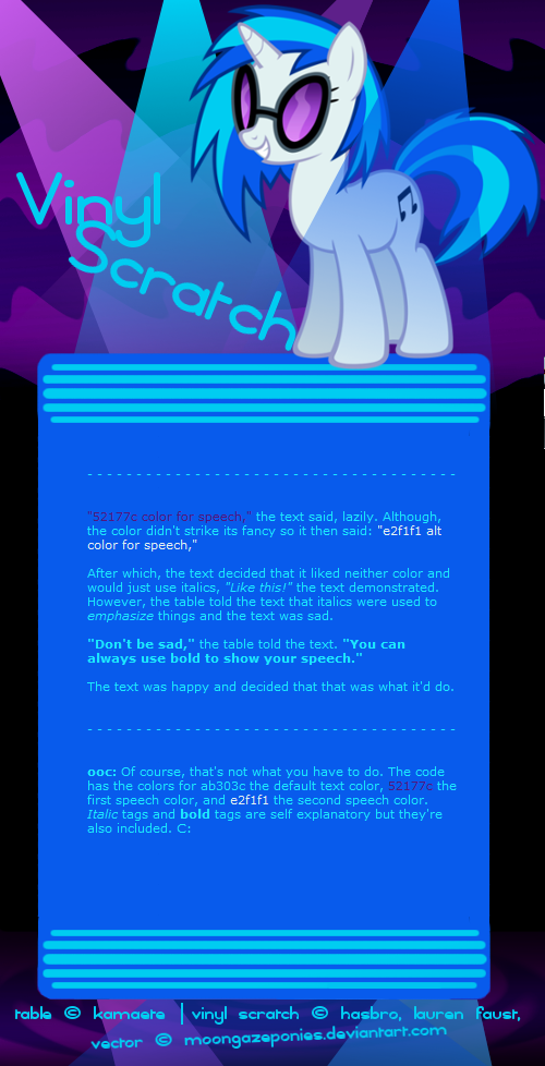
Twilight Sparkle Vector
This took quite a bit longer then I expected it too.
I tried to keep the writing more close to what Twilight would sound like. (Hopefully; well as much as a purple unicorn pony can be while giving a brief history of typefaces while referencing Microsoft, graphic novels, famous type designers and Adolf Hitler.
)Copperplate Gothic is seen as one of the better fonts in existence, and I agree with that, it is well designed, but like I said, it's starting to feel overused. (Well from what I've experienced, I can't help but see it everywhere.)
Hope you learned something!
Cheers!
Hasbro owns the ponies, not me. Obviously.
Related content


Comments: 19

I must be immune to the fonts because I've never had a problem with them nor understood why this selection is so hated. Especially Copperplate Gothic and Papyrus, I used to use them in school as my choice font when it came to projects. Then again, it wasn't in schools that I realized they were so severely disliked. Regardless good list buddy!
👍: 0 ⏩: 0

For some reason, I remember in one dream, I shouted, "Oh no, Helvetica!" (I'm no typographer) I guess that was during a period when I was fighting a mountain of electronic forms...
👍: 0 ⏩: 0

Comic Sans isn't that bad. But right now it's getting high with Papyrus.
👍: 0 ⏩: 1

It is that bad as a comic font it's too distracting to read naturally because of all the weird half-serifs and the wobbly way some lines were made. As anything else it feels inappropriate, safe for a sign pointing towards the "Kidz Korner".
👍: 0 ⏩: 0

I use Copperplate Gothic, but only in small amounts...
👍: 0 ⏩: 0

I've always wondered why it's call Comic SANS.
Is there a typeface called "Comic" that includes serifs?
👍: 0 ⏩: 1
Comic serifs are often slab serifs, like Rockwell, except they might be less inclined to put the serifs at 90 degree angles.
[link]
👍: 0 ⏩: 0

Thanks for taking the time and sharing this....very informative!
👍: 0 ⏩: 0

Uh, no. Wingdings and Webdings are just icons, they can be very useful. They're never used as actual writing characters safe for in puzzles.
👍: 0 ⏩: 0

Great Again! The only one I use much of hose is Papyrus. And that's because it's the only one the Greeting Card site I use has in the editor that looks elegant! Interesting bit about the blackletter type. I tend to associate that with dragons and castles for some reason!
👍: 0 ⏩: 0

Wow, I have so much to learn! Thank you Twilight! Very informative.
And I read everything in her voice! Learning is fun!
👍: 0 ⏩: 0

I learn more and more everyday. Even out of school.
👍: 0 ⏩: 0

Excellent stuff.
Something else which may be helpful is a set of definitions (using ponies going through cheerleader-like contortions to physically illustrate the point being made, of course!). Layout and typography are their own arts, and deviants wanting to make poster-images, text documents pre-formatted for visual impact (i.e. PDF files) etc. would find those terms useful in having intelligent discussions with their fellow typonies about what's going on in their work. Picking a few of the most common that I think might benefit from "the treatment":
Anatomy of a character (ascender, descender, X-height, etc.)
Difference between a "font" and a "typeface"
Drop-cap
Kerning
Leading
Ligature
Monospace (and when to use such a typeface)
Point-size (and why two 12-point typefaces may appear to be radically different in size but still both be "12-point")
Rainbow Dash: "Now you gotta cheer like you mean it! Gimme an 'R'!"
Twilight: "Which typeface? According to my book, a monospace font family is inappropriate, but if each pony is a single glyph--"
Fluttershy: "Can I do mine in lower-case? ...if that would be okay with you..."
Applejack: "'Ahrrr?' What th' heck is this, Equestria 'Cheer Like a Pirate' day?"
Rarity: "An 'R'? Darling, the letter 'R' is SO last-year. An 'S' would be so much more elegant, don't you think?"
Pinkie Pie: "Okey-dokie!" * contortion* *sound of cracking spine*
👍: 0 ⏩: 1

That is brilliant!
And great minds must think alike, I was planning on doing another one of these concerning type anatomy and the more intrinsic details of typography. (like you said kerning, leading, etc.)
Also, the term 'typonies' is now official.

 (Smile)")
👍: 0 ⏩: 1
I've quietly been waiting ever since you made this post ._.
👍: 0 ⏩: 0

I've seen Copperplate Gothic used, in all places, for the logo of a group in pro wrestling! Anypony who knows current pro wrestling knows what group I'm talking about. Either way, doesn't take away from this selection. I 100% agree.
👍: 0 ⏩: 1
I'm glad that I'm not the only one!
👍: 0 ⏩: 0
