HOME | DD
 sketchpimp — rouges in the making

Published: 2009-04-10 17:26:55 +0000 UTC; Views: 3068; Favourites: 87; Downloads: 85
Redirect to original
Description
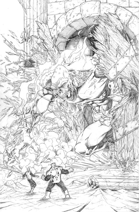
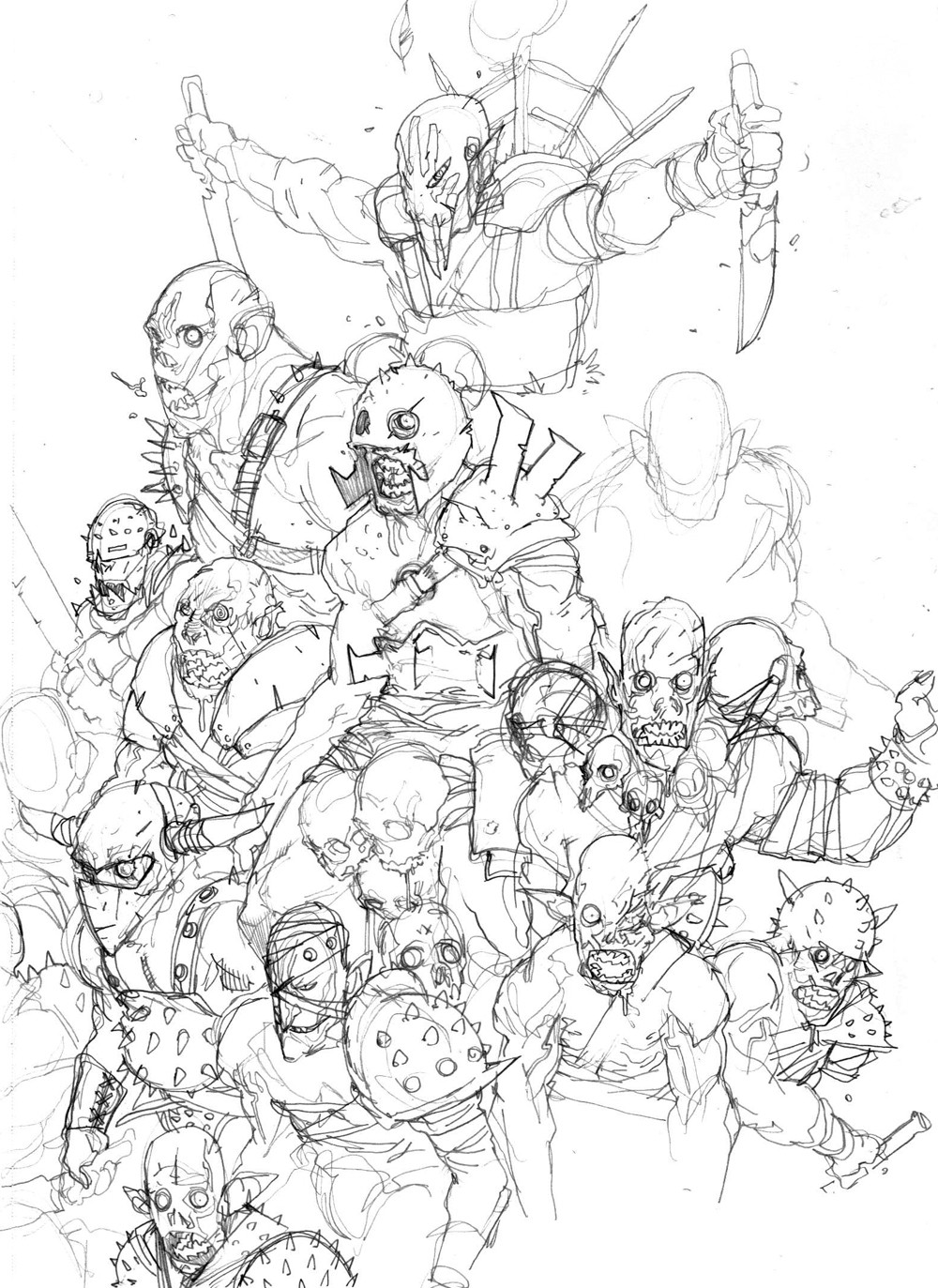
this is a sketch i did a while back. i was wanting to make a big rouges gallery pinup to make as a print. although, i'm not real sure about the composition now that i look at it more.im up for any suggestions. i will probably move this into the scraps in a week or so.
Related content


Comments: 26

I would love to see this colored, but Poison Ivy seems a little last minute
👍: 0 ⏩: 1

hah, very good observation. yeah she was last minute on this one. once i get some time for myself i will be redrawing this composition completely, i love the idea of all the villains in action but i came back to this last week actually and didnt like the way it was laid out at all. so there will be changes....some day.
👍: 0 ⏩: 0


my suggestion is to move harlequin to the left where the big leg is so that her right hand just barely hides behind hush, and the center beast's (swamp thing?? i dont know who that is...)left hand fingers can grasp her left shoulder. Then enlarge the penguin to fill the space left by harley's original spot. his feet should end behind her left wrist and his umbrella should end in front of the bottom half of the jokers left hand with the jokers right hand knuckles in front of the edge of the umbrella. The penguin should be in front of the hammer. Maybe change the position of the hammer if you like to see more of it, but its not a necessary detail for the piece. And last but not least, a little adjustment to 2face. Add his hand holding the two headed coin between his pointer finger and thumb to the bottom left where the cape is currently. That way the cape doesnt completely frame his head.
👍: 0 ⏩: 0

I like that the "importance" of the villains doesn't really seem to dictate their relative sizes in this piece. Overall I think it works pretty well, I'm sure there are a few shifts and so forth that you could make that might balance it out a little better -- but it does work like it is! Look forward to seeing it finished some day!
👍: 0 ⏩: 0


Hm, well I'm not to best at composition either, but Ivy and Harley's stark whiteness in comparison to everything else make them pop out a bit more than I think they should.
👍: 0 ⏩: 0

haha, yeah. but the original has already been claimed by [link]
👍: 0 ⏩: 0

OMG,
dude I just started hating you
instant fave! great stuff man!
 (Smile)")
👍: 0 ⏩: 1

Is the classical line-up of the Bat-foes. TO me, two-faces could be out of place. There is some unbalance in the composition, but could be him or the penguin.
👍: 0 ⏩: 1
yeah, my composition skills arent what i would call "good". i really have no idea about the mechanics of putting something like this together. just draw until it looks right has always been my philosophy. heh.
👍: 0 ⏩: 1
An excellent philosophy I must admit. The better one.
👍: 0 ⏩: 0


The art looks great, but who is the guy wrapped in bandages? I recognize everyone else.
Oh, and unless they're the color red in French, I think you mean "rogues."
👍: 0 ⏩: 1
that is Hush.
also. im an artist. not a writer. i spell like shit
👍: 0 ⏩: 1
I'll give you some of my writing skill if you'll give me some of your art skill. T_T
👍: 0 ⏩: 0


OMG dude..this is awesome...love the look you did for Joker and Harley.
👍: 0 ⏩: 0

I like the perspective, and how everything is placed... it's JUST NOT FINISHED!!!, GET ON THAT!
👍: 0 ⏩: 0

Great drawing so far. ")
👍: 0 ⏩: 0