HOME | DD
 skmonteiro — Things That Scare Me -Colors2-
Published: 2007-07-15 04:30:59 +0000 UTC; Views: 734; Favourites: 10; Downloads: 12
Redirect to original
Description
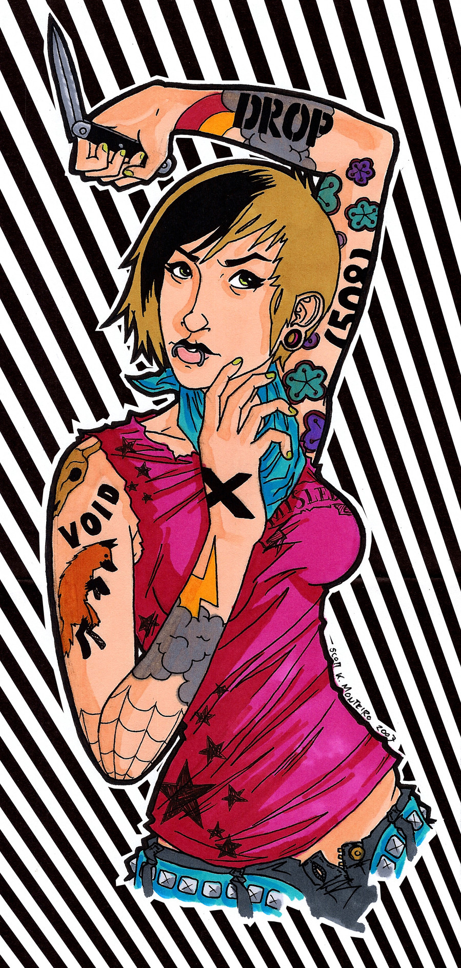
Same thing.Ink, Prismacolor Markers, Photoshop, 2007.
Related content


Comments: 13

This is awesome.
Is that part of the DROPDEAD logo on her arm?
👍: 0 ⏩: 1

Actually when I do graffiti I write DROP, my gf writes VOID and 508 is my home area code.
Thanks for the comment.
👍: 0 ⏩: 0

I agree with candiice.
in the one the contrast is far greater because of the lighter colors.
The striped background..i don`t know...u should try something else, like blending a paper like texture with the right color and one or 2 brushes.
It looks great.
👍: 0 ⏩: 0

Hmm, I think between them, I like this color scheme a bit more. Probably because in this one it's easier to see the black piece in her hair.
👍: 0 ⏩: 1
yeah thats something i noticed too. if i'd have thought about it, i probably should have made the black streak blonde on the other one.
👍: 0 ⏩: 1
I think that would look pretty cool
👍: 0 ⏩: 0

I like the hair on this one but I prefer the green shirt.
great job anyway! both are very cool colorings!
👍: 0 ⏩: 1
thanks. yeah the black streak stands out a lot more on this one. i gave them different shirts to try and make them a little different other than just the colors.
👍: 0 ⏩: 1

thanks, that seems to be the consensus.
👍: 0 ⏩: 0

