HOME | DD
 sm00chie92 — 'Experiment' Corporate Identity - Logotype

Published: 2012-08-22 15:23:16 +0000 UTC; Views: 4879; Favourites: 32; Downloads: 80
Redirect to original
Description
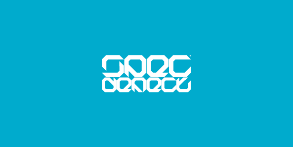
So this is the logo, the first one I designed for my 'Experiment' Corporare Identity magazine (and my first logo ever in a concept).I based on something structural & serious but that shows off some playfulness.
Related content


Comments: 26

Hi it's looking awesome i like this ...sorry to say that ..can you tell me the name of 'Experiment' fonts??
👍: 0 ⏩: 1

Great color palette, and even greater concept. The title experiment really stays true with the playfulness yet professionalism of the logo. Are you really designing a magazine? That would be really, really neat!
👍: 0 ⏩: 1

Thank you
Unfortunately no, this was given to us as a project for a 'fictional' magazine that needed a Corporate Identity. But I might try it in the future
👍: 0 ⏩: 0

I really like this one a lot. It works perfectly for a magazine that focuses on art & design. I could also see this as the logotype for a technology company or something related to that. It's simple, yet each letter is different (With the exception of the letter "e"). It looks professional, but the colors add a sense of "playfulness" as you said yourself. I really enjoy the colors on this a lot. Overall, I think you did a good job.
👍: 0 ⏩: 1
Yes,thank you, I appreciate how you explained your opinion.
I assumed 'playful'was essential especially for an art & design magazine, too serious might end up being boring/'heavy'. But in this way, the logo can change various colours, depending on the theme that the cover will have each month
👍: 0 ⏩: 1
It'll works out perfectly.
👍: 0 ⏩: 0

")


i think it worked. the grid like structure keeps it balanced and business, while the colors pop and give the eye a little excitement. it comes off as a very creative logo.
👍: 0 ⏩: 1
Exactly,
thank you I'm glad you liked it.
👍: 0 ⏩: 1

haha yes it is a really interesting & flexible font.
👍: 0 ⏩: 0


I don't know why it happened but this logo made me stare at it..for like a long time...it got something
For sure unique as I said ^^and showing off playfulness is even better
👍: 0 ⏩: 1
haha you're adorable alex
thank you so much
👍: 0 ⏩: 1
Wait...who got a adorable cat as avatar
👍: 0 ⏩: 1
haha looks a bit pissed off actually
👍: 0 ⏩: 1
What have you done to it ")
OH and finally I found a person who got the same obsession like me...music..it's something like...something amazing..wow it's hard for me now to express how I feel with music xD
For me if I work with music I am way more focused and get much more ideas..inspiration
When I am depressed or sad...and then hear music I get pumped and it makes me feel I have to do stuff...music is...hmm..Music is the best friend of our mind, it's our soulmate.
Or it's just me being way to strange what to think of music ^^
👍: 0 ⏩: 1
no you r right  (Smile)")
indeed it defines who we are
👍: 0 ⏩: 0