HOME | DD
 woweek — SPECDEFECT: Logotype

Published: 2008-02-16 12:49:30 +0000 UTC; Views: 2430; Favourites: 25; Downloads: 58
Redirect to original
Description
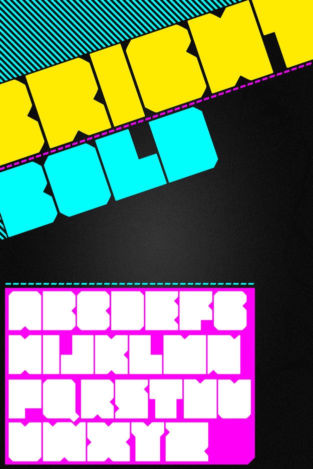
SPECDEFECTCopyright © Vladimir Ilnitzki 2008 Febrary
Related content


Comments: 22


its awesome - maybe the f could be a little different, but thats just being picky haha.
keep it up!
👍: 0 ⏩: 0


Yes. You´re in the a-class of the typographers around here. Great logo you did here!
Take care and good luck with further projects
Marius-
👍: 0 ⏩: 1

thanks a lot!!! ^_____^ really appreciate your opinion! good look to you and 4impressions! nice stuff!
 (Wink)")
👍: 0 ⏩: 0


Goddamnit skills you got! I was playing around with typography to make a logo for the new project. Still can't get anything good so guess I'll spend some more time surfing your gallery.
👍: 0 ⏩: 1
thanks BRO! ^____^ and what project do you mean? very interesting
 (Smile)")
👍: 0 ⏩: 0

")


Dude, most of your stuff is too similar. Try to adopt a new style maybe?
👍: 0 ⏩: 0

It does look very good. I was wondering what the F and the C's might look like had they been opened up a bit. The F especially, might become easier to read/see if it didn't close up there, and to balance the shapes, the same might need to be done to the C's. if you know my meaning.
It may not make it better, just wondering.
👍: 0 ⏩: 1

the "C" is O.K. the problem is with the F, looks like a "P"
👍: 0 ⏩: 0


It's so hard to read but cool I like strange ideas like that
Manolyaa
👍: 0 ⏩: 0


Very very hard to read.. but what the hell, it looks good!
👍: 0 ⏩: 0

