HOME | DD
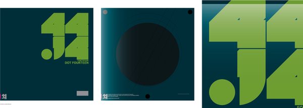
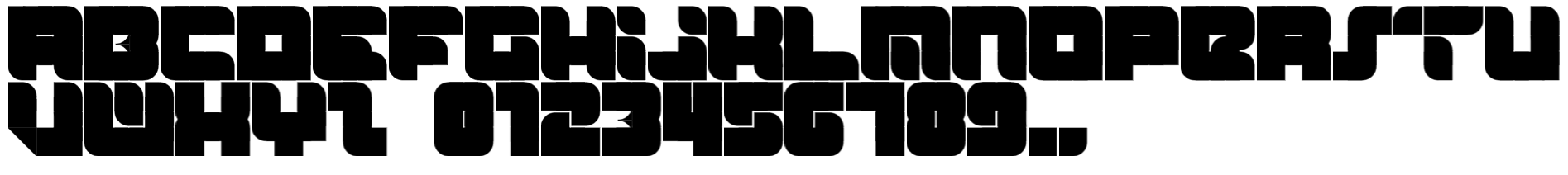
 woweek — Octet Typeface

Published: 2008-05-01 22:35:51 +0000 UTC; Views: 2701; Favourites: 37; Downloads: 172
Redirect to original
Description
Octet TypefaceCOPYRIGHT © 2008 VLADIMIR ILNITZKI
Related content


Comments: 34


Thank You my minimal man!  (Smile)")

👍: 0 ⏩: 0


I really love love... but is a little bit unreadable
👍: 0 ⏩: 0

love your logos man, this typeface kinda reminds me of the spokes font
👍: 0 ⏩: 0
love your logos man, this typeface kinda reminds me of the spokes font
👍: 0 ⏩: 0

Really like the minimal letter forms!
Great to build constructvism piece with it!
👍: 0 ⏩: 0

wow, nice one.
i thought that will be better if being colored..
:d
👍: 0 ⏩: 0

love it , apart from the G :/ looks great other wise
👍: 0 ⏩: 1
Thank You very much!
👍: 0 ⏩: 1
so is this going to be an open type ? , you should read my journal maybe you would be interested
👍: 0 ⏩: 0


Thank You e-l-u-s-i-v! really appreciate
👍: 0 ⏩: 0


great one mate but i think you should work on the kerning
👍: 0 ⏩: 1
thank You man! but kerning is adjustable parameter
👍: 0 ⏩: 0


its very nice, unreadable tho
")
👍: 0 ⏩: 0

It takes too much concentration to read the font. Maybe if you tone down the bubbliness, or something? o.o
👍: 0 ⏩: 0

i guess its good, but its so unreadable. maybe its just me.
did you like create this font?
👍: 0 ⏩: 1
thanks! it is readable.
👍: 0 ⏩: 0


do you mean i should increase image size twice?
👍: 0 ⏩: 1
arcticTransfuse In reply to woweek [2008-05-04 12:38:20 +0000 UTC]
No, I meant downloadable too.
")
👍: 0 ⏩: 1