HOME | DD
 woweek — MONOCHORD: Logotype

Published: 2008-01-19 20:08:11 +0000 UTC; Views: 6065; Favourites: 71; Downloads: 142
Redirect to original
Description
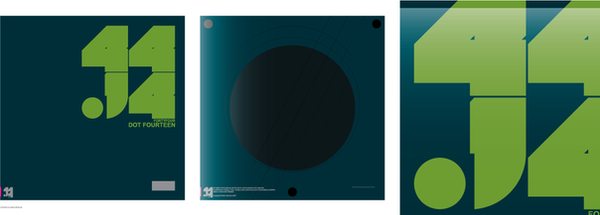
MONOCHORD: Logotype[100% HM]
ENJOY AND ADD TO FAV' ^_______^
Feel free to comment this one.
Copyright © Vladimir Ilnitzki 2008 January
Related content


Comments: 34

 (Wink)")

мне офигенно нравится вот эта типографика. можно таким же дуальформ написать. просто секс.
👍: 0 ⏩: 0

"Enjoy and ADD TO fav" of course, what else could be done, there is only one word to describe it stunning, better in this way STUNNING
👍: 0 ⏩: 0

 (Smile)")

")


Hello ! Your logo is here [link] in the Logotypes News Session 3 !
Please 
@ Soon
👍: 0 ⏩: 1

Wow!) Really appreciate your choise! ^_____^ Thanks mate!!!
👍: 0 ⏩: 0


OGROMNOE SPASIBO druzhische!!! o4en' rad !! ^______^
👍: 0 ⏩: 0


I'll be honest with you, I'm glad you choosed another font
good work!
")
👍: 0 ⏩: 0


Thanks A LOT BRO! ^____^ really glad U like it !
👍: 0 ⏩: 0