HOME | DD
 woweek — Logotype07

Published: 2009-05-24 13:27:03 +0000 UTC; Views: 5385; Favourites: 46; Downloads: 119
Redirect to original
Description
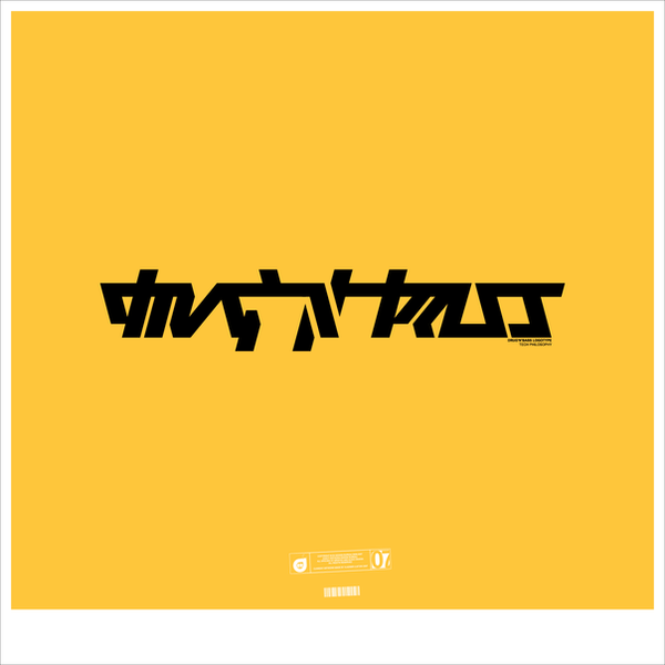
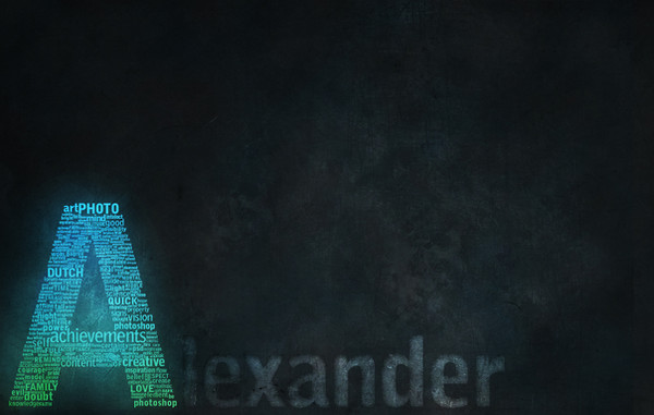
Logotype07--
It was made for a client. Rejected.
And now it is for sale.
 (Smile)")
Related content


Comments: 23


Looking awesome although I sense a lack of connection between the two words. The romantic and italic feel don't combine very well with the tech and bold of the top word.
👍: 0 ⏩: 2

i disagree, the relation between that custom type and italic font is what I find the best about this logotype. it's not obvious, and it gives it really cool feeling. I'd keep that the way it is for sure - but that's just my opinion.
👍: 0 ⏩: 1
I understand your point of view, being "non obvious". The thing is, there's a rhythm with the Mohammed word that should either be reflected on Photography or just a simpler and straight design, but should never struggle for attention by speaking a different language. Besides, the size ratio could lead to an uncomfortable level of readability. What I like the most about woweek work is, he tends to "break the rules" of type design and he can really achieve amazing and surprising results, on the other hand he "neglects" certain aspects of logo design which should be taken into consideration if we are to speak of a commercial logotype and not some cool personal experimentation.
👍: 0 ⏩: 1
yes, I basically agree with that
👍: 0 ⏩: 0

Appreciate your opinion!
👍: 0 ⏩: 0


fine work. I'm just finishing logotype for a photographer myself
👍: 0 ⏩: 1
Thank You! Looking forward to see fresh stuff from you!
👍: 0 ⏩: 0

 (Wink)")

Great custom typo again man. This time it wasn´t so hard to read tho 
👍: 0 ⏩: 0


hehe) Thank You! And what's the type name? )
👍: 0 ⏩: 0