HOME | DD
 SmarTramS — Personal Website v6

Published: 2010-06-15 07:14:34 +0000 UTC; Views: 14900; Favourites: 114; Downloads: 455
Redirect to original
Description
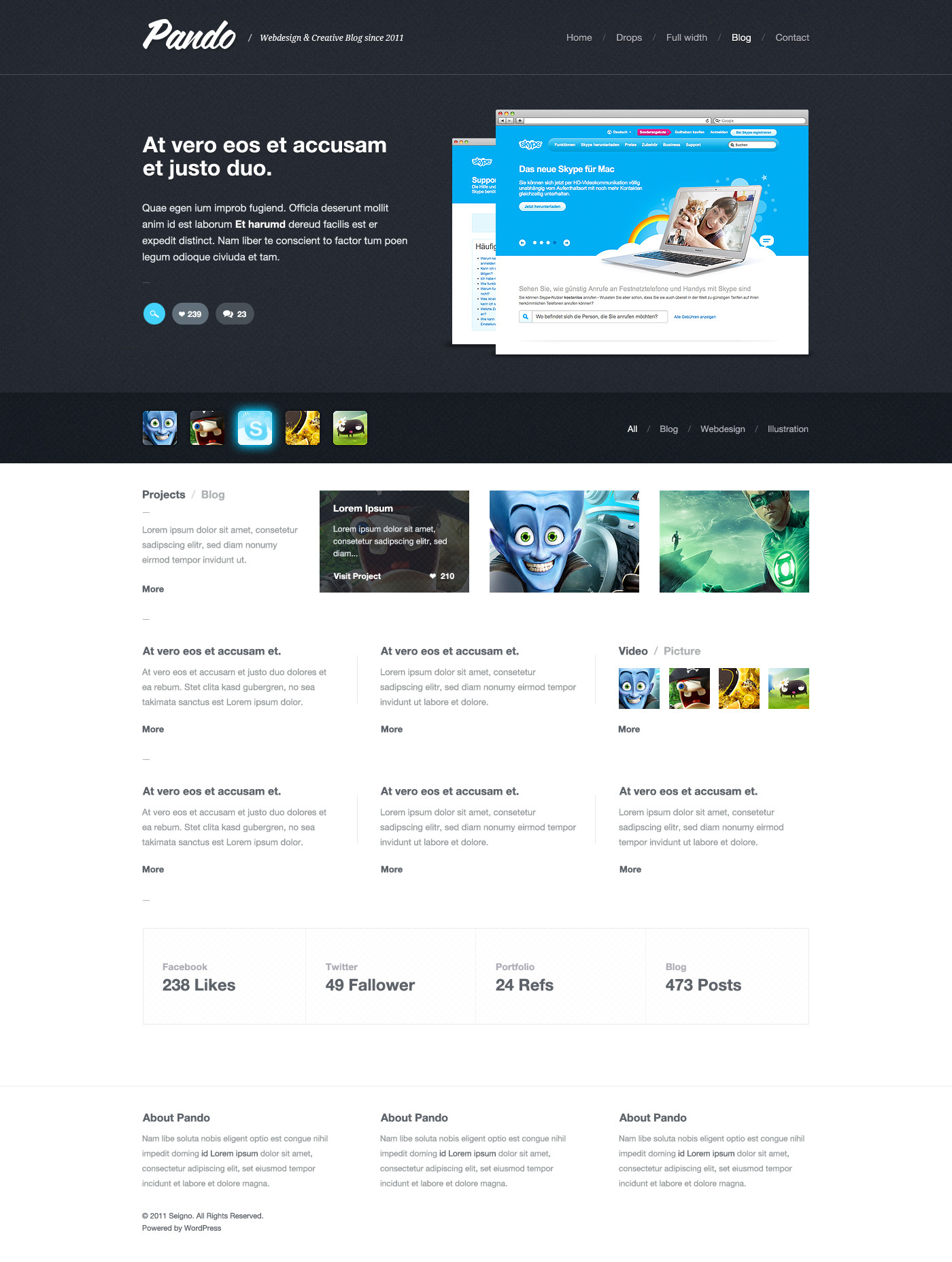
My new site just went live!!! It's been a long time coming, but it's finally up. I’ve spent a considerable amount of time getting everything up to snuff. The goal was to have a web home that represents me well and be something I can be proud of. Hope you like it!
Check it out LIVE here: danwiersema.com
Related content


Comments: 74


Nice. Think you're missing a stand out call to action in the footer. I would consider making the twitter, rss, downloads and contact icons bigger for them to stand out more.
👍: 0 ⏩: 1

Thanks, though I don't really want the footer to stand out.
👍: 0 ⏩: 0


")
 (Wink)")
 (Smile)")

Featured in my new collection: Web Design Wall

👍: 0 ⏩: 1

Can I add anything that people haven't say already? Great job!
👍: 0 ⏩: 1


Im always a fan of the scroll through gallery, so you might think of allowing that on the live site, hate having to click in and out
👍: 0 ⏩: 1
Yea, I know what you mean, I like scrolling much better too. I felt it didn't match with the theme.
👍: 0 ⏩: 0

I like the design.... but what if someone resizes the window?
👍: 0 ⏩: 1
It just stays aligned to the left.
👍: 0 ⏩: 0


love it. absolutely amazing, actually feels like its under water
👍: 0 ⏩: 1

Love the left navigation bar.
I see the site pretty nice overall, also the not centered page align looks good.
Innovative, i like.
👍: 0 ⏩: 1
Thank you, love being different
👍: 0 ⏩: 0

You had nice inovative ideas, but the overall concept does not fit. I like most the left navigation, but you should have continued that minimal glossy look on the other elements. The 3d logo doesnt fit in the shaded background too, because the perspecives changes. Dont get me wrong, youve got some good skills but those elements just dont work with each other.
👍: 0 ⏩: 1
Well, I disagree, but thanks for your comment.
👍: 0 ⏩: 0


love it!
i reminds me a little bit kde air plasma ^^
👍: 0 ⏩: 1

REALLY GREAT!
lol i'm now making myself a new website with similiar design.. only more "girly"
👍: 0 ⏩: 1
Thanks T, so glad you like it
👍: 0 ⏩: 0


simple, nice and effective, exemplar !
how is the gallery made ? some web gallery you customize ? home made ?
thx for the answer
👍: 0 ⏩: 1
Thanks a lot! The pop-up is a modified version ofshadowbox , which uses jQuery.
👍: 0 ⏩: 1
fine, ok, i will look at this one, thank you really for your answer, that's very kind to take the time for it !
👍: 0 ⏩: 1


very nice work man, love the new layout and structure far more than the old ... and haha I see you got an iPad already lol apple hoar
")
👍: 0 ⏩: 1
Thanks enzu, glad you're liking it. Haha, guilty... I'm an applehoar indeed.
👍: 0 ⏩: 0


| Next =>