HOME | DD
 SmileyBear6 — Halter at Dawn
Published: 2013-10-30 21:50:43 +0000 UTC; Views: 490; Favourites: 6; Downloads: 0
Redirect to original
Description
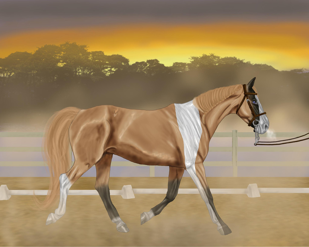
Horses name - Apollo's Chariot
Link to ref - smileybear6.deviantart.com/art…
Riders Name - Cheyenne Mission
Stables name (if you have one) - Valdemar Equestrian Centre
Class - Cream & Champagne Class ( lone-onyx-stardust.deviantart.… )
Arrival Image: Arrival at LVS Autumn Show
Story
Cheyenne yawned as she groomed her favorite horse for the cream and champagne class at Valley Lace Stables. It was a little early in the morning for the class but she knew that his coloring was best in the morning. She followed the rest of the class into the arena a few minutes later. She was amazing at the different breeds of horses, she saw a moon paint- the first that she has seen with her own eyes. Sasha watched them from the fence, cheering them on. Cheyenne saw her raise her camera a few times during the performance. After the show, Sasha showed her, her favorite picture that she got. Apollo looked amazing.....
Horse Pose Reference: fav.me/d5cztk8
Related content


Comments: 13

I like the coloring on the horse! It's really pretty. However, I think the flip of the tail, while nice, is a little unrealistic. Also if the rains are in front, I think the chains connecting it would be at a slight angle towards the reins. I know they are heavy but they are still connected, so pointing down is unrealistic. The angle of the back front hoof is also odd, i'm not sure what, but it doesn't look right. I really like the shading on back and the flank, and I think that the trees in the back look very nice as well.
👍: 0 ⏩: 1

thanks for the critique. that hoof was giving me problems.
👍: 0 ⏩: 1

^^ This is a nice clean picture, your stallion is clearly the focus and I love the double fences.
The horse looks really good, however your lines are a little wobbly & the 1st & 3rd hooves from the right look to be angled differently than the rest of the body. *Maeix2 I think that's what was bothering you, the shine on the hoof really accentuates the angle.
I love the shading, it's always nice to see artists use some, I use a really nice coloring tutorial that might help you blend the colors together a little better. fav.me/d6gvxou
With the background I love the sillouette, however it looks photomanipulated or done with a brush and clashes with the very natural feel of the rest of the background and the horse. The use of fog was brilliant, it just gives this whole new feel to the image and isn't distracting.
I think the only thing that you might need to work on is to keep the horse from floating, he's totally disconnected from the background. I suggest to add some hoof tracks, make small piles of dirt on the grounded hooves and to sprinkle some falling dirt from the lifted hooves.
 (Smile)")
👍: 0 ⏩: 1
Thanks so much for the critique. Like I was telling Maeix2 , Hooves are my Achilles heel, so they do not come out right. I will have to try that tutorial it looks like something that I can do.
I keep forgetting some times to cover up the hooves, do you know of some great tutorial for makes tracks/piles of dirt, I can never get them to look right.
👍: 0 ⏩: 0

I love the faded feel to the background and the way the sunmist just sort of swirls around and how you can track it from anywhere in the painting, even mixing with the sand being kicked up as the horse moves

Anatomy of the horse looks very good, though something about the furthest right front hooves bothers me, but I can't say what it is...or even if it is. Could be just my eyes.
Great detailing on the bridle as well.
The one thing I'd note is the 'shine' on the horse - it's very strong considering that the light of the whole image (and the sun) is more sort of hazy. Less shine and greater emphasis on shadows and I think the horse would blend in more to the setting. But, overall...very nice
👍: 0 ⏩: 1
Hooves are my Achilles heel, I can never draw them right. Also I did get a little carried away shining the horse up.
Thanks for the critique.
👍: 0 ⏩: 0

Wow wow wow ! That shading is wonderful and I love how you did the mane ! So many details in there ! And the background ... have you seen this sky !? Wow !
On the dark side, I feel the trees looks too much like brushes ... I don't know if it is the case or not .. but maybe blur them a bit since your horse is moving and the background is far away ?
👍: 0 ⏩: 1
yeah the trees are brushes, I can not draw them as good as I want to. I think that it would look better a little blurred.
👍: 0 ⏩: 1
 (Wink)")
👍: 0 ⏩: 0

")